
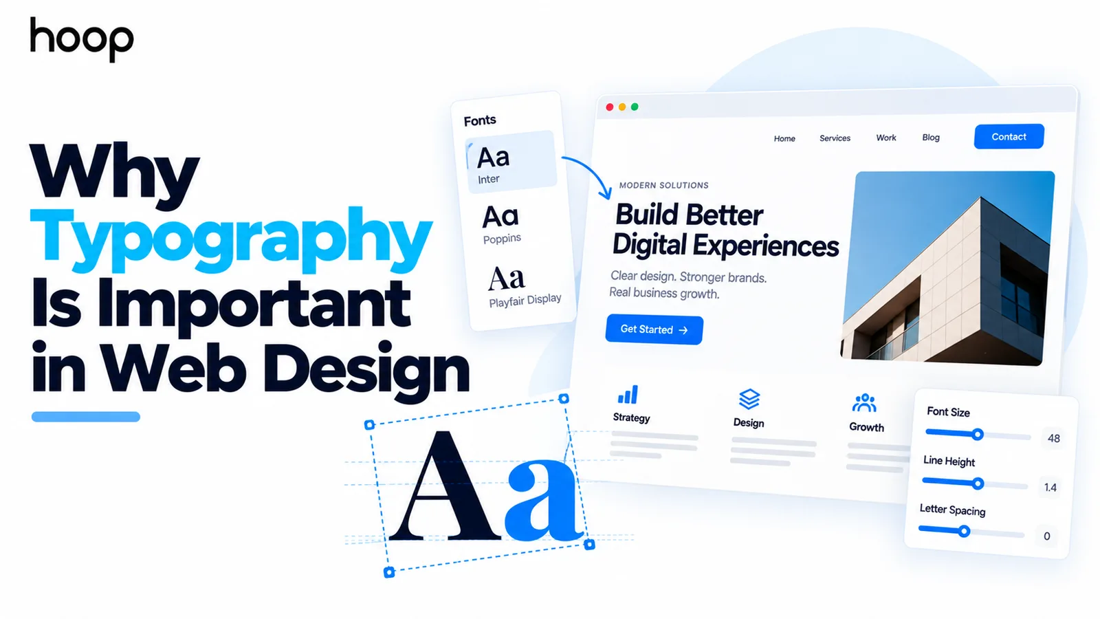
Why Typography Is Important in Web Design: 10 Reasons It Matters
Typography controls how people read, scan, and act on a website. A complete type system covers size, weight, spacing, line length, contrast, responsive behavior, and font delivery — not just the typeface.
Sahar
Content Writer
Why typography is important in web design comes down to helping people read, scan, understand, and use a website. Strong typography creates clear hierarchy, improves accessibility, supports brand perception, and guides users toward useful actions.
Typography includes far more than choosing an attractive font. A complete web typography system controls size, weight, spacing, line length, contrast, responsive behavior, and technical delivery.
What Is Typography in Web Design?
Typography in web design is the system used to present written information across a website. The system controls how text looks, reads, behaves, and responds across different screens.
A website typography system includes typefaces, sizes, weights, line heights, letter spacing, line length, contrast, and heading scale. Designers also define how navigation, buttons, forms, labels, captions, pricing cards, and error messages use text.
A font can look attractive and still create a weak reading experience. Good web typography combines visual character with clear communication and predictable interaction.
Why Is Typography Important in Web Design?
Why typography is important in web design becomes clear when you watch how visitors use a page. Most visitors scan headings, labels, links, and actions before reading long paragraphs.
Typography creates that reading order. Size, weight, spacing, and contrast show which information deserves attention first and which information supports it.
Good typography also reduces unnecessary reading effort. Visitors can focus on the message instead of struggling with crowded lines, weak contrast, unclear headings, or inconsistent styles.
10 Ways Typography Affects a Website
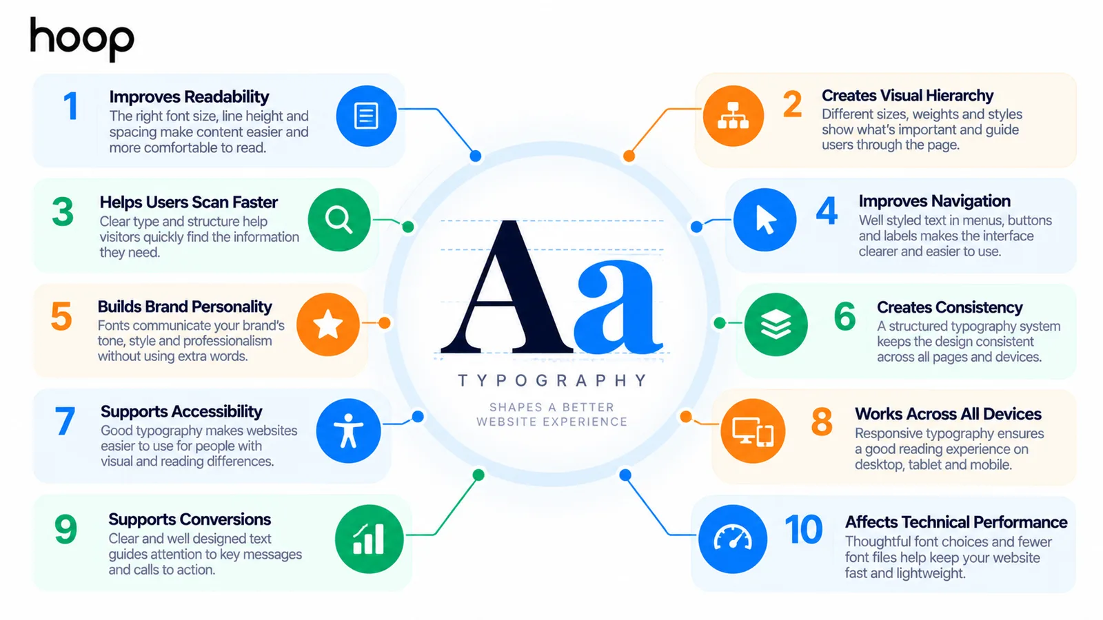
1. Typography Makes Content Easier to Read
Why typography is important in web design starts with readability. Visitors cannot benefit from strong copy if the page makes that copy uncomfortable to read.
Readable body text uses a suitable size, comfortable line height, controlled line length, and sufficient contrast. Designers also choose letterforms that remain clear at normal viewing sizes.
A paragraph that stretches across a large monitor forces the eye to travel too far. A narrow column creates excessive line breaks and interrupts reading rhythm.
2. Typography Creates Visual Hierarchy
Why typography is important in web design also depends on hierarchy. A strong type system tells users what to read first without extra instructions.
Headlines need more emphasis than body copy. Section headings need less emphasis than the main headline but more emphasis than supporting text.
Designers create hierarchy with size, weight, spacing, contrast, position, and repetition. A good hierarchy remains obvious even when the design uses only 1 typeface.
3. Typography Helps Users Scan Faster
Most website visitors do not read every sentence from top to bottom. Visitors scan for relevant answers, proof, pricing, features, and actions.
Why typography is important in web design includes helping those visitors find the right information quickly. Clear headings, short labels, and visible links reduce search effort.
Scanning becomes harder when every text element uses similar size and weight. The page then forces visitors to inspect every line equally.
4. Typography Supports Navigation and Interface Clarity
Typography does not only style articles and landing-page copy. Typography also shapes menus, buttons, form fields, tabs, alerts, filters, cards, and account interfaces.
A button label must look actionable. A form label must remain connected to the correct field. An error message must stand out without competing with the entire page.
Hoop Interactive’s UI UX design work shows how typography connects with design systems, accessibility, and product interfaces.
5. Typography Communicates Brand Personality
Why typography is important in web design also connects to brand perception. Type choices influence whether a website feels formal, technical, editorial, playful, premium, or approachable.
A financial platform and a children’s product can both use readable typography while expressing very different personalities. The distinction comes from typeface choice, scale, weight, spacing, and supporting visual decisions.
Brand expression still needs limits. Decorative display type can work well for short headings, while body text needs sustained readability.
6. Typography Builds Visual Consistency
A defined typography system prevents every page from making new decisions. Consistent heading levels, body styles, labels, and buttons make a website feel intentional.
Consistency also helps teams publish new pages without rebuilding the visual hierarchy each time. A design system can define repeatable styles for marketing, product, and support content.
Why typography is important in web design becomes more obvious as a website grows. Inconsistent type rules create visual drift across pages, templates, and product areas.
7. Typography Supports Accessible Web Design
Why typography is important in web design also involves accessibility. Text needs to remain readable for users with different visual, cognitive, and reading needs.
WCAG 2.2 includes requirements around contrast and text spacing. Users should be able to adjust spacing without losing content or functionality.
Normal text generally needs at least a 4.5:1 contrast ratio under WCAG Level AA. Large text generally needs at least 3:1 contrast.
Accessible typography also avoids clipped text, unreadable zoom states, and layouts that break when users increase text size or spacing.
8. Typography Adapts Content Across Screen Sizes
Responsive design changes more than column width. Typography needs to respond to mobile screens, large desktops, zoom, orientation, and changing content lengths.
A large desktop headline can wrap badly on a phone. A mobile body size can feel oversized when copied directly onto a wide desktop layout.
Why typography is important in web design includes maintaining hierarchy across these changes. Responsive type scales preserve emphasis without forcing fixed sizes everywhere.
9. Typography Supports Conversion Paths
Typography supports conversion by making key information easier to notice, understand, and act on. Typography does not create conversions through font choice alone.
A clear heading can communicate the offer quickly. A readable pricing section can reduce confusion. A visible call to action can guide the next step.
Strong web design connects typography with layout, navigation, responsiveness, accessibility, and conversion-focused page structure.
10. Typography Affects Technical Performance
Web fonts are downloadable assets, so typography also creates technical decisions. Heavy font files can increase page weight and delay visible text.
A site that loads 6 font families and many unused weights wastes bandwidth. A smaller type system usually reduces font requests and simplifies delivery.
Why typography is important in web design therefore includes performance planning. Designers and developers need to coordinate font files, fallbacks, loading behavior, and layout stability.
Legibility vs Readability: What Is the Difference?
Legibility describes how easily users can distinguish individual characters. Readability describes how comfortably users can read connected words, sentences, and paragraphs.
For example, a decorative typeface can remain legible at headline size. The same typeface can become tiring across 600 words of body copy.
Why typography is important in web design includes both qualities. Designers need clear characters and comfortable reading conditions.
How Typography Creates Visual Hierarchy
Typography creates hierarchy by assigning different levels of emphasis to different content roles. Users should distinguish page titles, section headings, body text, labels, and supporting notes quickly.
Size creates one layer of hierarchy, but size alone produces weak systems. Weight, spacing, contrast, alignment, and placement also control emphasis.
A strong H1 does not need to be dramatically larger than every other element. The surrounding whitespace can give the H1 enough visual priority.
Why typography is important in web design also connects to semantic HTML. Visual headings should match logical H1–H6 structure whenever the content supports that structure.
How Typography Affects User Experience
Typography affects user experience because almost every website task involves reading. Visitors read navigation, filters, forms, product information, help text, prices, and error messages.
Clear text reduces hesitation during those tasks. Users can identify what a field requests, what a button does, and what changed after an action.
Poor typography creates small friction points that accumulate. Tiny labels, dense paragraphs, inconsistent buttons, and unclear hierarchy make simple tasks feel harder.
Why Typography Is Important in Web Design for Accessibility
Accessibility involves more than selecting a readable typeface. The complete system must tolerate zoom, resizing, and spacing changes.
Text contrast needs enough separation from the background. Line height needs breathing room. Interactive text also needs clear states for hover, focus, errors, and disabled actions.
Designers should test real pages instead of checking type samples in isolation. Accessibility problems often appear when long headings, error text, and dynamic labels meet constrained layouts.
How Typography Affects Brand Perception
Typography affects brand perception because letterforms carry visual tone. A serif can feel editorial or established, while a geometric sans serif can feel modern or technical.
Those associations are not universal rules. Context, spacing, color, imagery, and wording change how users interpret a typeface.
Why typography is important in web design for branding comes from consistency. Repeating a coherent type system makes the brand easier to recognize across pages and campaigns.
Does Typography Affect Website Conversions?
Yes, typography can support conversion by improving comprehension and reducing interface friction. Typography does not guarantee a higher conversion rate by itself.
Visitors need to understand the offer before they can act. Strong hierarchy can surface benefits, proof, pricing, form instructions, and calls to action more clearly.
Why typography is important in web design therefore includes conversion support through clarity. Better clarity helps users evaluate information and choose the next step confidently.
Does Typography Affect SEO?
Typography itself does not act as a direct ranking shortcut. However, typography connects with semantic headings, responsive design, accessibility, and page usability.
A visual heading should normally use appropriate HTML heading markup. Clear structure helps users scan the page and helps search systems interpret content organization.
See Hoop Interactive’s good web design guide for typography within navigation, accessibility, and page performance.
How Does Responsive Typography Work?
Responsive typography adjusts text behavior across different screens while preserving hierarchy and readability. Designers can change size, spacing, line length, and wrapping at different breakpoints.
Modern CSS can also use fluid sizing so text scales gradually within controlled limits. The type system still needs minimum and maximum values.
Why typography is important in web design becomes clear on narrow screens. A poorly sized heading can consume the full viewport before users reach meaningful content.
How Many Fonts Should a Website Use?
Most websites need fewer typefaces than designers initially expect. One flexible family can handle headings, paragraphs, labels, navigation, and buttons through size and weight changes.
A second typeface can create useful contrast for display text or editorial sections. Additional families increase visual complexity and create more font-loading work.
Why typography is important in web design includes restraint. A smaller system usually creates stronger consistency and easier maintenance.
Quick Reference: Website Typography Checks
| Task | When to Check | Method | Difficulty |
|---|---|---|---|
| Body readability | Wireframe and QA | Test size, line height, and line length with real paragraphs | Easy |
| Hierarchy | UI design | Compare H1, H2, body, labels, and buttons at normal zoom | Easy |
| Contrast | Design and QA | Check text and background combinations against WCAG targets | Medium |
| Responsive type | Breakpoint QA | Test headings, body copy, forms, and buttons on narrow screens | Medium |
| Font loading | Development QA | Audit font families, weights, requests, fallbacks, and layout shifts | Medium |
Common Typography Mistakes in Web Design
Many typography problems feel like general design problems because users rarely name the cause. The page simply feels crowded or tiring.
- Using body text that feels too small on common screens.
- Using weak contrast between text and its background.
- Using too many typefaces or unnecessary font weights.
- Using tight line spacing that makes paragraphs feel dense.
- Using lines that stretch too widely across large displays.
- Using mobile headings that wrap into awkward multi-line blocks.
- Using visual headings without consistent semantic HTML structure.
- Using all caps across long passages that need comfortable reading.
Why typography is important in web design becomes easier to understand after fixing these issues. Small adjustments can make the same content feel clearer and more credible.
How to Build a Website Typography System
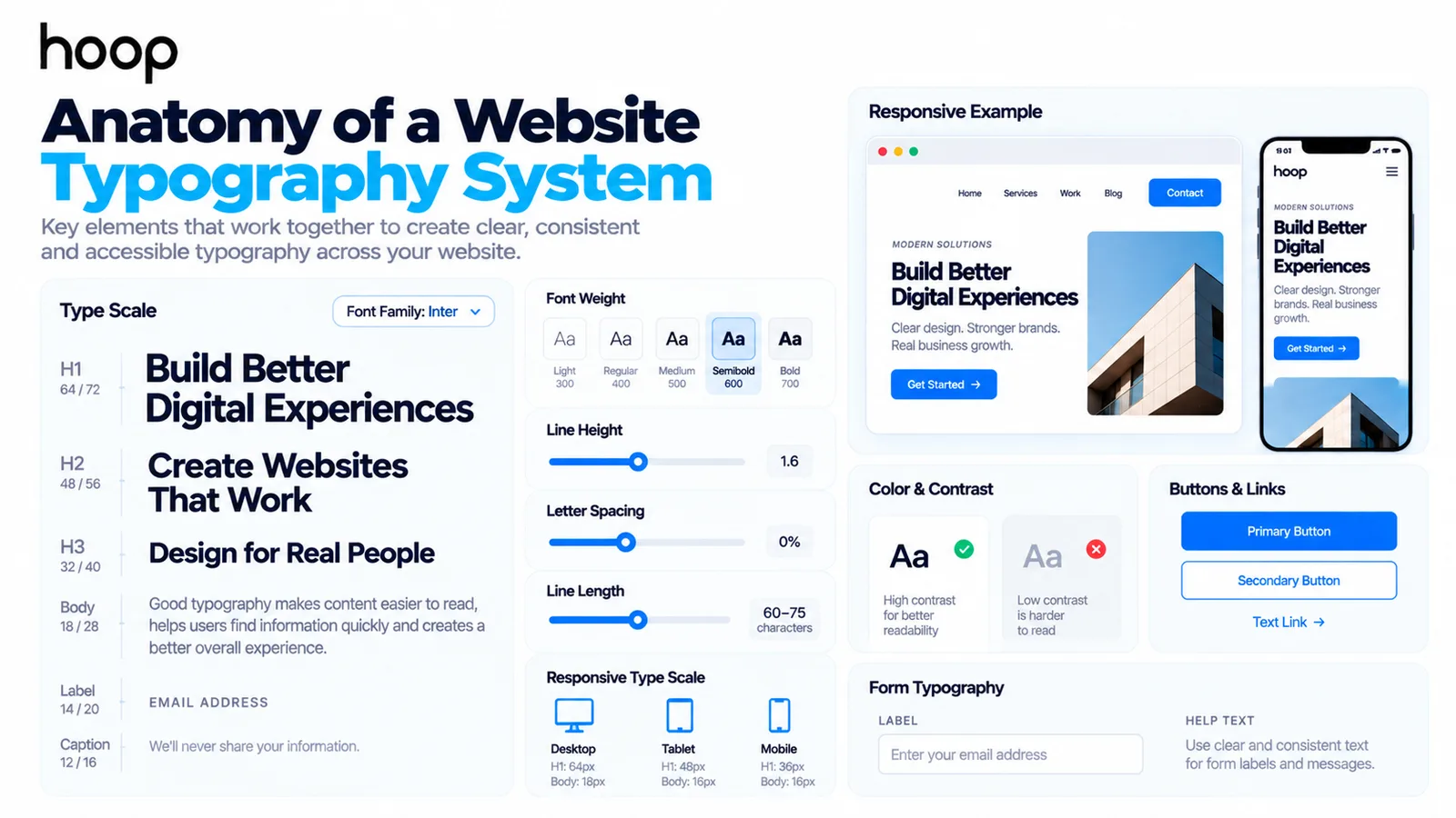
To build a website typography system, start with the roles text needs to perform. Then match typefaces to the content and interface.
- Choose 1 primary family that remains readable across headings and body text.
- Define a type scale for H1, H2, H3, body, labels, captions, and buttons.
- Set body line height and line length using real content instead of placeholder text.
- Define responsive rules for long headings, narrow screens, and zoom states.
- Test contrast, spacing changes, forms, errors, and interactive text states.
- Limit font files and weights to the styles the website actually uses.
A typography system should survive real publishing conditions. Test long titles, short labels, translated text, form validation, and unusual content lengths before launch.
Why Typography Is Important in Web Design for Long-Term Consistency
Why typography is important in web design also becomes clearer after launch. Websites keep changing through campaigns, products, and new pages.
A documented type system gives editors and designers repeatable rules. New content can preserve the same hierarchy without copying old pages manually.
Typography therefore becomes part of the website system, not a finishing detail. Strong rules keep the experience coherent as the site expands.
Build Typography Around the User
Why typography is important in web design comes down to communication. Users need to find information, understand meaning, and act without fighting the interface.
A strong typography system gives every text element a clear role. The system also protects readability, accessibility, brand consistency, and performance across devices.
Explore Hoop Interactive’s web design services for clearer hierarchy, responsive layouts, accessible interfaces, and development.
“A font can look attractive and still create a weak reading experience. Good web typography combines visual character with clear communication and predictable interaction.”
Key takeaways
- 01Hierarchy comes from size, weight, spacing, and contrast together — size alone produces weak systems.
- 02WCAG 2.2 asks for 4.5:1 contrast on normal text and layouts that survive user spacing changes.
- 03Most sites need only one or two typefaces; extra families add visual noise and font-loading weight.
- 04Typography supports conversion by making offers and actions clearer — it cannot repair a weak offer.
Written by
Sahar
Content Writer
Frequently Asked
Questions
Everything you need to know before booking a strategy call. Can't find your answer? Contact us directly.
Typography makes written information easier to read, scan, understand, and navigate. It also supports hierarchy, accessibility, brand consistency, and interface clarity.
No. Typography includes font size, weight, spacing, line height, line length, alignment, contrast, hierarchy, responsive behavior, and technical font delivery.
Yes. Typography can support conversions by clarifying offers, prices, proof, forms, and calls to action. Typography cannot repair a weak offer.
A website often works well with 1 or 2 typefaces. The right number depends on the brand, content, interface, and performance requirements.
Yes. Typography affects contrast, spacing, resizing, text wrapping, legibility, and reading comfort. Accessible typography also needs layouts that tolerate user adjustments.
Keep reading
All articles →
Website Design in 2025: Modern UX/UI and Conversion-Focused Design
Aug 6, 2026 · 7 min read
What Is Good Web Design? Usability That Wins More Leads
Sep 9, 2026 · 10 min read