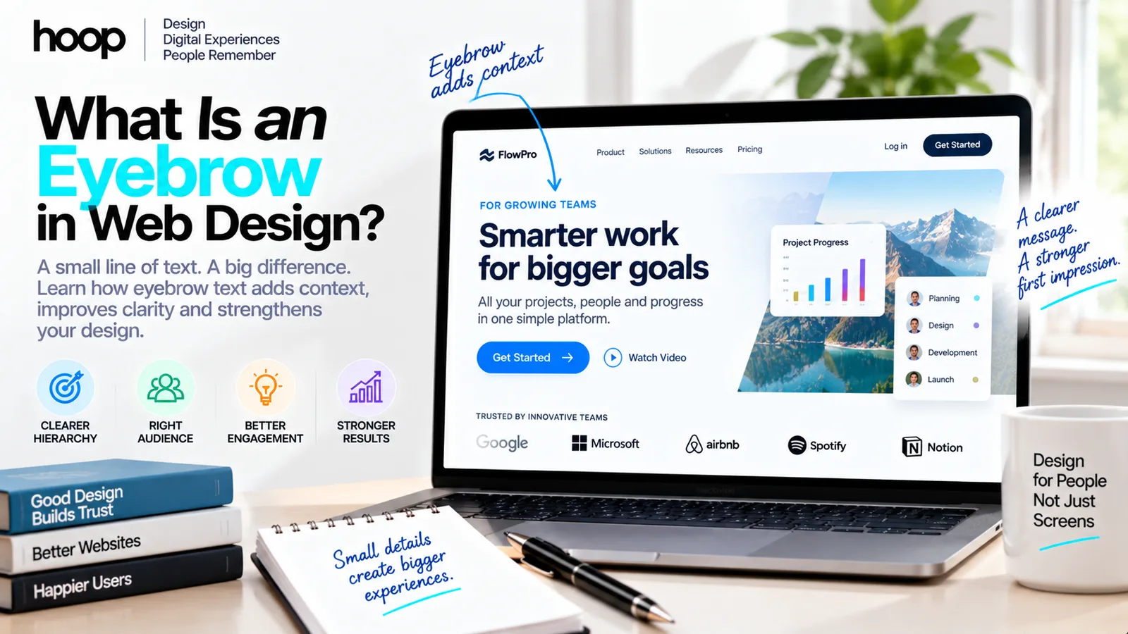
What Is an Eyebrow in Web Design? Stronger Hierarchy
An eyebrow is the short label above a web headline. It strengthens hierarchy and clarity when it supplies context the headline cannot — and becomes clutter when it repeats the headline or appears above every section by habit.
Sahar
Content Writer
An eyebrow in web design is a short line of text placed above a headline. It usually identifies a category, audience, feature, stage, or theme before the larger heading delivers the main message. You may also hear it called a kicker, overline, preheader, pretitle, or section label.
That definition is simple. Using an eyebrow well is not. When it provides context the headline cannot communicate quickly, it strengthens the page. When it repeats the headline, relies on vague language, or appears above every section by habit, it becomes visual noise.
This guide explains what eyebrow text does, where it belongs, how to write it, how to style it, and when the better design decision is to remove it.
What Does an Eyebrow Look Like on a Website?
An eyebrow normally sits directly above a main heading or section heading. It is smaller and visually quieter than the headline, but distinct enough to be noticed. Designers often use a compact font size, medium weight, restrained color, uppercase lettering, or a small amount of letter spacing.
For example, a project-management platform might use the eyebrow “For remote operations teams” above the headline “Keep every moving part under control.” The headline carries the promise; the eyebrow tells the visitor who the promise is for.
The same pattern appears in several contexts. On an editorial card, an eyebrow may name the content category. In a pricing section, it might read “Built for growing teams.” On a product page, it may identify the feature discussed below. In a hero, it can establish context before a concise, expressive headline.
Eyebrow vs Headline vs Subheading
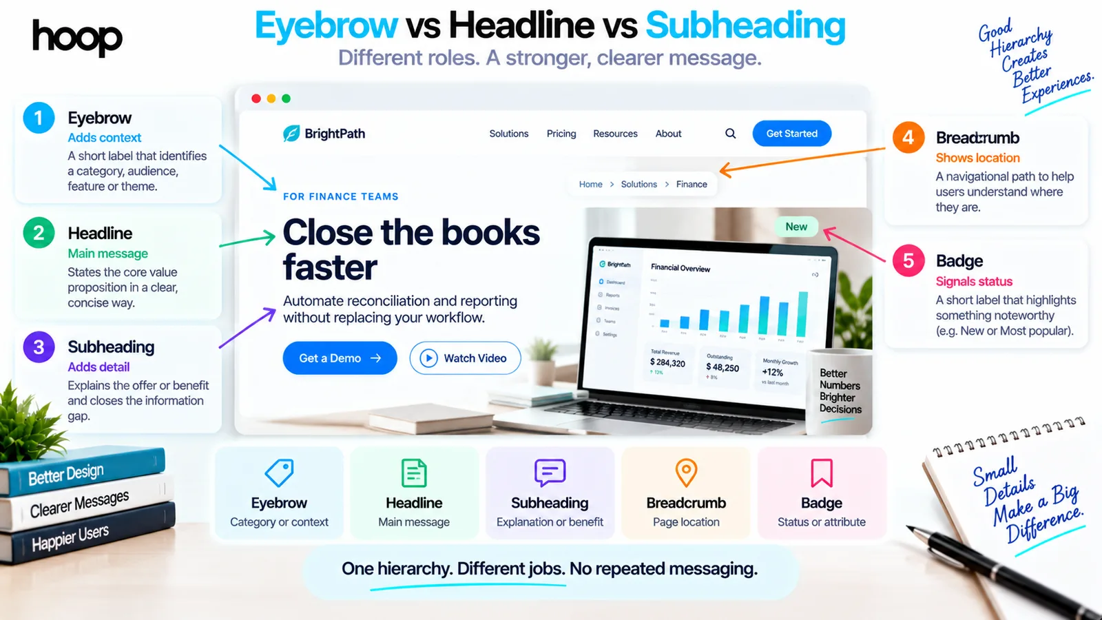
These elements sit close together, so their jobs can blur. A clear content hierarchy assigns one purpose to each element instead of asking three lines to say the same thing.
| Element | Primary job | Typical length | Example |
|---|---|---|---|
| Eyebrow | Adds category or context | Usually 1–6 words | FOR FINANCE TEAMS |
| Headline | States the main message | One concise phrase | Close the books faster |
| Subheading | Explains the offer or benefit | One or two sentences | Automate reconciliation and reporting without replacing your workflow. |
| Breadcrumb | Shows location in a site hierarchy | A navigational path | Home > Solutions > Finance |
| Badge | Signals status or a notable attribute | One short label | New or Most popular |
An eyebrow is not automatically a heading, and a badge is not automatically an eyebrow. Position and styling can look similar, but meaning and behavior matter. A linked category label is navigation. A “New” chip is status. A quiet line that frames the headline is eyebrow text.
Why Designers Use Eyebrow Text
It creates context before the headline
A headline often needs to be memorable, emotionally engaging, or benefit-led. That can leave little room for precise context. An eyebrow can identify the intended audience, product area, campaign, or subject without forcing the headline to become long and mechanical.
It supports scanning
People rarely read a web page from top to bottom on the first pass. They scan for signals that help them decide what deserves attention. Consistent, meaningful eyebrow labels can work like signposts, particularly on long pages and card-based layouts.
It separates repeated content modules
On a product page with several features, an eyebrow can identify each feature family while the headings remain benefit-focused. In an editorial layout, consistent category labels help readers distinguish news, guides, research, and opinion.
It can sharpen audience recognition
A visitor should quickly understand whether a page is relevant. An eyebrow such as “For multi-location retailers” or “For first-time founders” answers that question faster than a broad headline can. This is especially useful on targeted landing pages built for one campaign or customer segment.
When an Eyebrow Improves a Design
The strongest eyebrows supply information that is useful, specific, and missing from the headline. They earn their place rather than merely filling the space above an H1.
An eyebrow is likely to help when it does at least one of the following:
- Names a meaningful category users recognize.
- Identifies a specific audience or use case.
- Introduces a product feature while allowing the headline to describe the benefit.
- Provides a short proof point, such as an award or independently verified result.
- Creates a consistent orientation system across cards or long-form sections.
The practical test is simple: compare comprehension with and without the eyebrow. If the label helps users understand who the page is for, what the section covers, or why the message matters, it is doing real work. If nothing changes, the design probably does not need it.
When Eyebrow Text Becomes Clutter
An eyebrow can weaken a page when it competes with the headline or introduces another pause in the reading path. A common failure is duplication: “Our Services” above “Services Designed for Your Business.” The reader learns almost nothing from the first line.
Generic phrases such as “Welcome to the future,” “Discover more,” or “Built differently” often sound polished without adding meaning. They also make unrelated pages feel interchangeable. The problem becomes more obvious when every section uses the same formula: tiny uppercase label, oversized headline, paragraph, and button.
This repetition helps explain why some designers now associate eyebrows with AI-generated interfaces. The pattern itself is not an AI invention; it comes from long-standing editorial and advertising practice. What feels automated is indiscriminate use, especially when the label is vague, decorative, and repeated across the entire page.
If a website has accumulated these patterns over time, a focused UX audit can determine which labels clarify the experience and which create unnecessary friction.
How to Write Effective Eyebrow Copy
Say something the headline does not
Read the eyebrow and headline together. If they repeat the same noun or promise, rewrite one of them. “Email automation” above “Automate your email marketing” wastes valuable attention. “For lean marketing teams” above “Turn every follow-up into a timely conversation” creates a more useful relationship.
Keep it concise
Most eyebrows work best as a few words. Length is not governed by a universal number, but the label should be understood in a glance. If it needs a sentence to make sense, it may belong in the supporting copy.
Prefer concrete labels over slogans
“Security and compliance” provides orientation. “Confidence without compromise” sounds attractive but may not tell the visitor what the section contains. Save emotional language for the headline when a straightforward label gives the page better structure.
Use a consistent content system
If eyebrows act as categories, keep the category vocabulary stable. Do not alternate between “Insights,” “Ideas,” and “Resources” unless those labels represent genuinely different content. Consistency matters in a reusable UI and UX design system because the same component may appear across dozens of screens.
Do not hide essential meaning there
Eyebrows are intentionally less prominent than headlines, so some visitors will skip them. The headline and nearby copy should still communicate the essential proposition. Treat the eyebrow as useful framing, not the only place where a critical warning, qualification, or product identity appears.
How to Style Eyebrow Text
The eyebrow should be noticeable without becoming the first thing on the page. The exact treatment depends on the design system, but a few principles hold across most layouts.
Establish a clear size relationship
Use a smaller type size than the headline and enough vertical spacing to show that both elements belong together. If the gap above the headline is too large, the eyebrow can look like a detached label. If the gap is too tight, the two lines can feel cramped.
Maintain readable contrast
Muted does not mean faint. Eyebrow text still needs sufficient contrast against its background. Very light gray text, extremely small type, and thin all-caps lettering may look refined in a mockup but become difficult to read on mobile screens or in bright environments.
Use uppercase with care
Uppercase can distinguish the eyebrow from the headline, but it reduces familiar word shapes and can feel aggressive when the phrase is long. If uppercase is part of the visual language, keep the text short and use restrained letter spacing.
Treat pills as a different visual commitment
A pill-shaped container increases prominence and may imply that the label is clickable, selectable, or represents status. Do not put an eyebrow in a pill merely because it looks current. If it is plain contextual copy, unboxed text often communicates the hierarchy more honestly.
Check every breakpoint
A label that feels balanced on desktop can wrap awkwardly on a phone. Responsive typography, spacing, and line length should be reviewed as part of a broader responsive website development process rather than approved from a single design frame.
Accessibility and Semantic HTML
Visual styling and document structure are related, but they are not the same. HTML heading elements communicate the hierarchy of a page to browsers and assistive technologies. The W3C recommends nesting heading levels according to the relationships and importance of page sections, while MDN describes H1 through H6 as six levels of section headings.
An eyebrow should therefore not receive a heading tag simply because it sits above a headline. If it is only contextual text, a paragraph or span associated with the heading may be more appropriate. If the eyebrow genuinely names a section in the content outline, the team should determine its semantic role from the page structure — not its font size.
Do not use an H1 for the eyebrow and an H2 for the actual page title just to reproduce a visual layout. CSS can make any appropriate element look smaller or larger. Semantic HTML should reflect meaning, while CSS controls appearance.
Clear headings and labels help users understand how information is organized and find what they need. That is why accessible hierarchy should be built into professional web design services rather than treated as a correction after development.
Examples of Strong and Weak Eyebrows
| Assessment | Eyebrow and headline | Why it works or fails |
|---|---|---|
| Strong | FOR IN-HOUSE LEGAL TEAMS Review contracts without the bottleneck | The eyebrow identifies the audience; the headline states the benefit. |
| Strong | PAYMENT SECURITY Protect every transaction from checkout to settlement | The label names the topic while the headline explains the outcome. |
| Weak | OUR SERVICES Services that help your business grow | The two lines repeat each other and remain vague. |
| Weak | WELCOME TO THE FUTURE A smarter platform for modern teams | Neither line defines the product, audience, or concrete value. |
A Practical Decision Framework
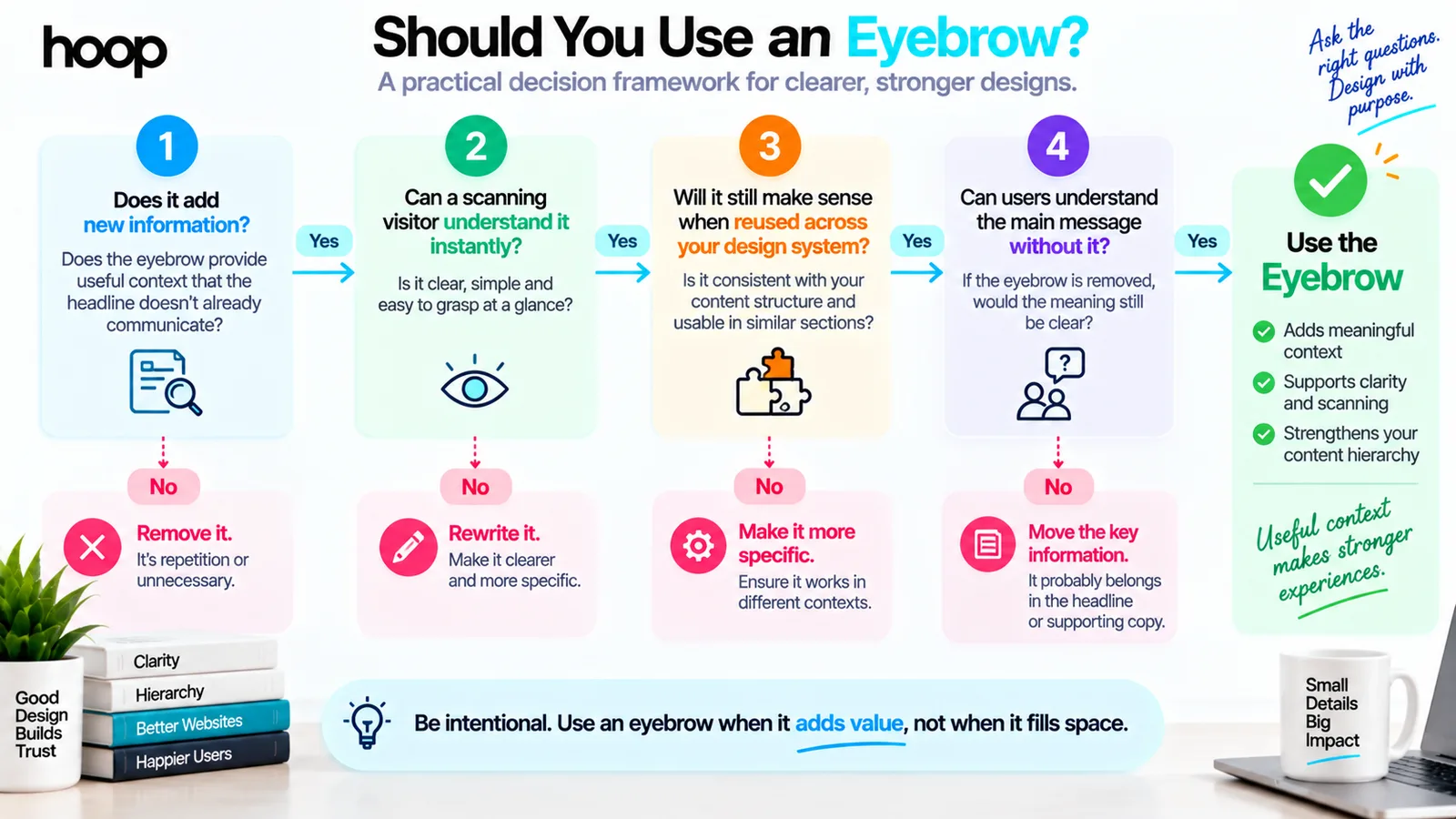
Before adding or approving an eyebrow, ask four questions. What new information does it provide? Will a scanning visitor understand it immediately? Does it remain useful when repeated across the design system? Can users still understand the essential message if they skip it?
Then test the real outcome. Show representative users two versions of the page and ask them, after a brief look, who the offer is for, what it does, and what they would do next. Watch whether the eyebrow improves comprehension or creates an extra stop before the headline. Analytics can measure downstream behavior, but short usability sessions often reveal why a label helps or fails.
The answer does not have to be universal. A category-driven publication may benefit from eyebrows throughout the site, while a focused service homepage may need only one — or none. Good design applies the pattern according to content, audience, and task.
Small Label, Real Effect on Hierarchy
An eyebrow in web design is a small label above a headline that adds context, establishes a category, or helps users scan the page. Its size is small, but its effect on hierarchy can be significant.
The best eyebrow text is concise, specific, visually subordinate, and semantically appropriate. It tells the reader something the headline does not. If it merely fills an empty space, repeats the same message, or follows a fashionable template without purpose, removing it will usually make the design clearer.
If you are refining a new website or untangling an interface that has become crowded, Hoop can help turn content hierarchy into a clear, responsive, conversion-focused experience. Explore Hoop’s website redesign services or start a conversation about your project.
“The pattern is not an AI invention. What feels automated is indiscriminate use.”
Key takeaways
- 01The eyebrow must say something the headline does not. Otherwise, delete it.
- 02Concrete labels beat slogans: “Security and compliance” orients; “Confidence without compromise” does not.
- 03Never give an eyebrow a heading tag just because it sits above the title — CSS handles size.
- 04Never put essential meaning there; many visitors skip it entirely.
Written by
Sahar
Content Writer
Frequently Asked
Questions
Everything you need to know before booking a strategy call. Can't find your answer? Contact us directly.
Eyebrow text is a short label placed above a headline. It introduces the category, audience, topic, or context before the main message.
The name describes its position: the small line sits above the larger headline in roughly the same relationship that an eyebrow sits above an eye. The pattern originated in editorial and print design.
No. An eyebrow usually appears above the headline and supplies brief context. A subheading appears below the headline and expands on the message with supporting detail.
Not automatically. Use heading elements according to the page’s semantic structure. If the eyebrow is only contextual text, a paragraph or span is often more appropriate, while the real page title remains the H1.
They can improve comprehension and relevance when they identify the audience, category, or proof point. They can also hurt clarity when they add vague or repetitive copy. Test the label against a version without it.
Keep it short enough to understand at a glance, commonly a few words. Specificity matters more than following a fixed word count.