
What Is a Modal in Web Design? A Practical UX Guide
A modal in web design is a focused dialog that appears above a webpage and temporarily blocks interaction with the background. Good modals support short, important tasks — confirmations, sign-ins, warnings, focused forms — without forcing users onto another page.
Sahar
Content Writer
What is a modal in web design? A modal is a dialog layer that appears above the current page and temporarily blocks background interaction. The user must complete, cancel, or dismiss the dialog before returning to the page underneath.
That blocking behavior separates a true modal from popups, banners, tooltips, and ordinary overlays.
How Does a Modal Differ From a Normal Popup?
A true modal changes how the interface behaves, not only how the interface looks. The background becomes inactive while the dialog holds the user’s attention.
A modal blocks the underlying page
The page can remain visible behind a modal. Users should not interact with background controls. Buttons, links, forms, and navigation behind the dialog become temporarily unavailable.
A dimmed backdrop often communicates that state visually. The backdrop supports the modal, but the backdrop is not the modal itself.
A modal contains the active task
A modal should contain one focused action, decision, or message. Good examples include confirming deletion, signing in, entering a short address, or reviewing a critical warning.
The dialog should explain the task, required action, and exit path. Extra navigation weakens that focus.
A modal controls keyboard focus
Keyboard focus should move into the modal when the dialog opens. Focus should remain inside the dialog until the user closes it.
The W3C modal dialog guidance describes this contained focus behavior and recommends returning focus after closing. That focus model is central to accessible modal behavior.
What Is the Difference Between a Modal, Popup, Dialog, Overlay, and Lightbox?
The terms often overlap in casual conversation, but each term describes a different part or behavior. Clear terminology helps designers and developers build the intended interaction.
Modal vs popup
A popup is a broad label for content that appears unexpectedly or above existing content. A popup can remain non-blocking and allow continued page interaction.
A modal specifically blocks normal interaction with the page until dismissal or completion. Every modal can feel popup-like, but not every popup behaves modally.
Modal vs dialog
A dialog is an interface window that asks for information, presents options, or communicates a message. A dialog can be modal or non-modal.
A modal dialog blocks the background. A non-modal dialog lets users continue working elsewhere in the interface without closing it.
Modal vs overlay and lightbox
An overlay usually describes the visual layer behind the dialog. It often covers or dims the page. Designers often call that layer a backdrop or scrim.
A lightbox usually displays media, including enlarged images, videos, galleries, or product previews. A lightbox can use modal behavior when background interaction becomes unavailable.
What Are the Main Parts of a Modal?
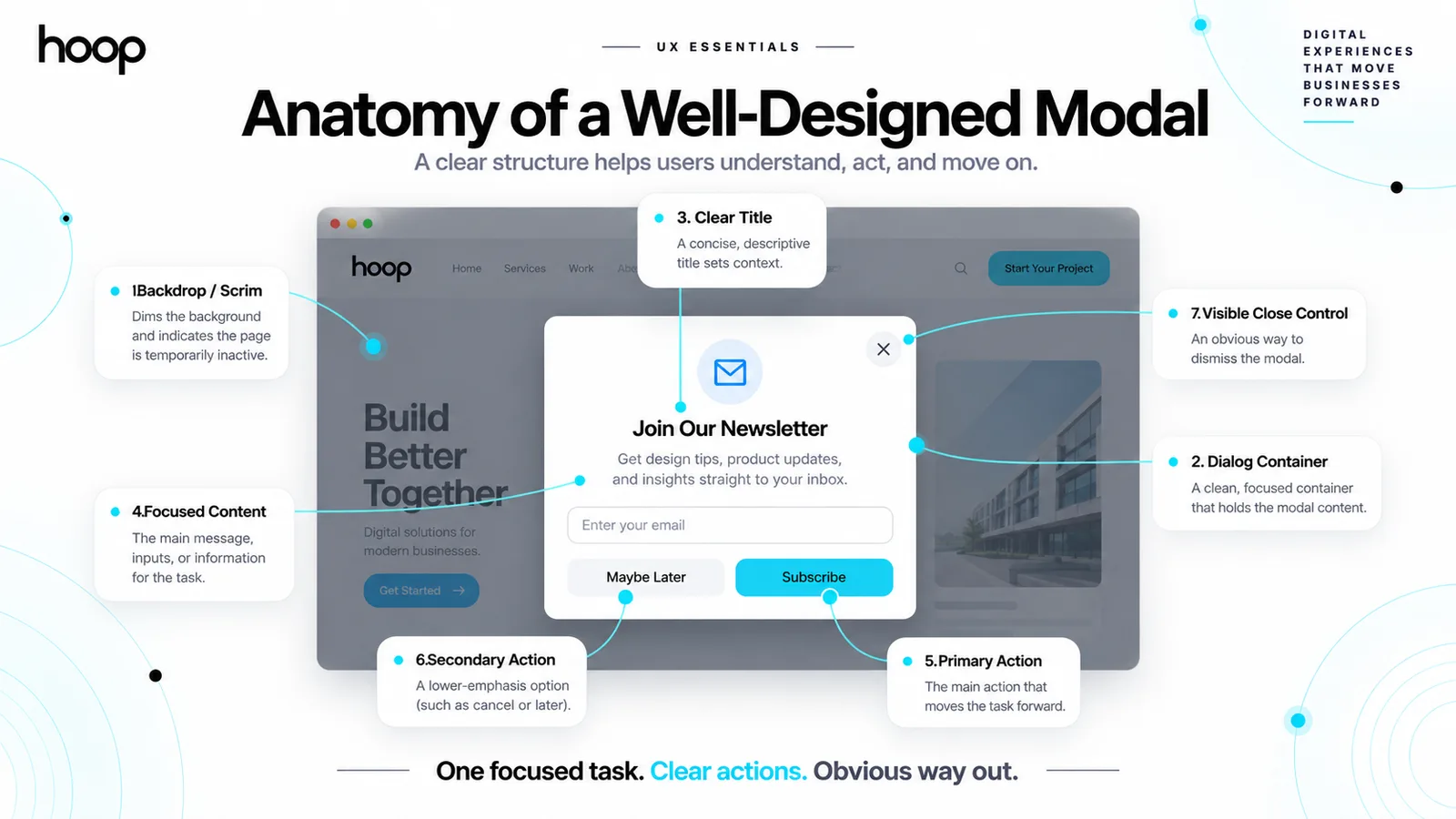
A usable modal combines structure, hierarchy, actions, and clear dismissal behavior. Most production modals contain 6 core parts.
1. Backdrop or scrim
The backdrop visually separates the active dialog from the page underneath. Designers usually reduce contrast or darken the background without hiding all context.
The backdrop can also capture pointer interaction when outside-click dismissal makes sense. Critical dialogs should not disappear from an accidental background click.
2. Dialog container and title
The container holds the modal content and establishes the visual boundary. The title should identify the task or decision immediately.
Useful titles include “Delete project?”, “Sign in”, “Add delivery address”, and “Save changes?”. Vague titles such as “Attention” force users to read more before understanding the task.
3. Content, actions, and close control
The body should contain only information needed for the current decision. Primary and secondary actions should use clear verbs, including “Delete”, “Save”, “Cancel”, or “Continue”.
Dismissible modals should include a visible close path. A close button matters because users should not depend only on clicking the backdrop.
What Is a Modal Used For?
Use a modal when the user needs to complete one focused task without losing the current page context. The interruption should protect or simplify the user’s workflow.
Use modals for important confirmations
Confirmation modals work well before actions that are difficult to reverse. Examples include deleting data, discarding unsaved changes, removing a payment method, or leaving a workflow.
The confirmation should describe the exact consequence. A destructive primary action should use a specific label such as “Delete account” instead of “Yes”.
Use modals for short, contained forms
Short forms can work well inside modals. Users benefit when the current page context still matters. Examples include sign-in, newsletter signup, address entry, and a brief contact request.
Long forms need more space, validation context, and navigation. A dedicated page often works better for complex applications, onboarding, or checkout processes.
Teams can connect modal decisions with broader UI/UX design services. Those services cover flows, prototypes, accessibility, and task completion.
Use modals for focused information
A modal can present information that requires acknowledgment before the user continues. Examples include session expiration, permission explanations, security alerts, or major account changes.
Routine information should not block the interface. Toasts, banners, inline messages, and notifications work better for low-priority updates.
When Should You Avoid Modals?
Avoid a modal when users need background context, lengthy content, deep navigation, or a shareable destination. A modal should not replace a proper page merely to reduce navigation.
Avoid modals for long reading
Articles, documentation, policies, detailed comparisons, and extensive help content belong on normal pages. Users need scrolling freedom, browser navigation, and direct links for these tasks.
Long content also increases focus-management complexity on smaller screens. The dialog can become harder to understand when important actions sit far below the opening content.
Avoid modals for complex workflows
Multi-step tasks often need visible progress, saved state, error recovery, and room for supporting information. A dedicated page gives those workflows more stable structure.
Web products with dashboards, onboarding, accounts, and multi-step interactions need a wider interaction architecture. Hoop’s web application development work covers those full application flows beyond individual dialogs.
Avoid interruption without user intent
Opening a modal immediately can interrupt reading before users understand the page. Marketing prompts, discounts, and email forms need careful timing and frequency.
A user-triggered modal usually feels more predictable. Examples include clicking “View details”, “Sign in”, “Delete”, or “Edit profile” before the dialog appears.
How Should a Modal Behave for Accessibility?
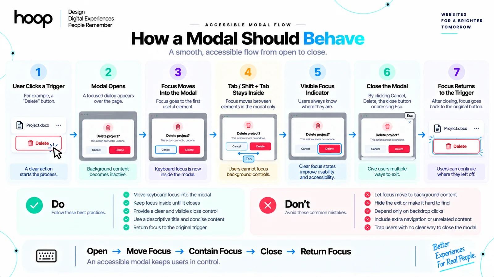
An accessible modal must work through keyboard input, visible focus, screen readers, and predictable dismissal behavior. Visual styling alone does not create accessibility.
Move focus into the dialog
When the modal opens, move focus to an appropriate element inside the dialog. The best element depends on the content and the task.
A simple form can focus its first input. A destructive confirmation can focus a safer action, such as “Cancel”, when accidental activation creates serious consequences.
Keep focus inside the modal
Tab and Shift+Tab should move through focusable controls inside the active modal. Keyboard users should not reach links or buttons hidden behind the dialog.
The dialog also needs a visible focus indicator. Users must always see which control will respond to the next keyboard action.
Return focus after closing
When the modal closes, focus should usually return to the button or link that opened it. That behavior preserves the user’s location and workflow.
Screen-reader labeling also matters. The dialog needs an accessible name, normally through a visible title associated with the dialog container.
Should Clicking Outside a Modal Close It?
Outside-click dismissal works for low-risk dialogs, but it should not become a universal rule. The consequence of accidental dismissal should guide the decision.
Allow easy dismissal for lightweight content
Image previews, optional explanations, and simple non-destructive dialogs can often close through the backdrop. Escape-key support should provide another fast exit.
Users still need a visible close control. A discoverable button communicates how to leave without requiring users to guess interaction rules.
Protect data-entry and destructive tasks
Do not close a form accidentally if dismissal would erase meaningful user input. Ask for confirmation when the form contains unsaved work that would be lost.
Destructive dialogs also deserve deliberate actions. An accidental backdrop click should not silently confirm deletion or submit a consequential choice.
How Should Modals Work on Mobile Screens?
Mobile modals need larger touch targets, careful keyboard handling, visible actions, and enough space for content. A desktop-sized dialog often becomes cramped on a phone.
Use available viewport space
A mobile modal can use most or all of the viewport. Larger tasks often need that extra room. Full-screen dialogs often work better for forms, filters, and detailed selections.
Designers should account for software keyboards, safe areas, and orientation changes. Fixed heights can hide actions when keyboards open.
Keep essential actions reachable
Primary actions should remain easy to reach without awkward scrolling. Sticky action areas can help when longer mobile content requires scrolling inside the dialog.
The interface should also prevent background scrolling when the modal is active. Competing scroll areas can make the page feel unstable or confusing.
Responsive dialog behavior belongs inside a wider responsive system. Hoop’s website redesign services include mobile layout, accessibility, and interaction review for existing websites.
What Is the HTML dialog Element?
The HTML <dialog> element gives developers a native structure for dialogs. JavaScript can call showModal() to open the element as a modal dialog.
Native dialog behavior reduces manual work
Browsers can handle key native dialog behavior. Examples include top-layer rendering and background inertness. Developers still need strong labeling, useful focus placement, and clear controls.
A simple structure looks like this:
<dialog id="deleteDialog">
  <h2>Delete project?</h2>
  <p>This action permanently removes the project.</p>
  <button value="cancel">Cancel</button>
  <button value="delete">Delete project</button>
</dialog>
JavaScript can open the dialog with deleteDialog.showModal(). The script can close the dialog after a user action.
ARIA does not create modal behavior by itself
Developers sometimes add role="dialog" and aria-modal="true" to custom components. Those attributes communicate semantics to assistive technology.
ARIA attributes do not automatically trap focus, disable background interaction, or create correct dismissal behavior. Developers must implement those behaviors when using custom dialogs.
Should Modals Be Built in HTML or Generated With JavaScript?
Use HTML for stable dialog structure and JavaScript for state, triggers, validation, dynamic content, and interaction. The implementation should match the product architecture.
Keep simple page-specific dialogs in the document
A unique confirmation dialog can remain in the page markup. The dialog stays closed until needed. JavaScript only needs to open, close, and process the selected action.
This approach keeps structure readable and easier to test.
Generate reusable application dialogs when needed
Component-based interfaces can render a shared modal component with changing titles, content, and actions. React, Vue, Angular, and other frameworks commonly use that pattern.
A reusable component still needs reliable accessibility behavior. Reuse should standardize focus, dismissal, sizing, and backdrop behavior.
Teams building component-driven interfaces can use broader software development services. Those services cover frontend architecture, testing, and product maintenance.
What Are the Most Common Modal Design Mistakes?
The biggest modal mistakes come from unnecessary interruption, weak focus handling, hidden exits, excessive content, and poor mobile behavior. Each mistake increases user effort.
Opening too many modals
Do not stack routine prompts across the same session. Newsletter forms, cookie choices, discount offers, and account prompts can overwhelm the interface when combined.
Nested modals create even greater complexity. Multiple dialog layers complicate focus restoration, Escape behavior, backdrop handling, and user orientation.
Writing vague actions
Buttons labeled “Yes”, “No”, “OK”, or “Submit” can hide consequences. Specific verbs make the result easier to predict before the user acts.
For a deletion flow, “Delete file” communicates more than “Confirm”. For saved changes, “Save changes” communicates more than “Continue”.
Ignoring keyboard and mobile testing
A modal that looks correct with a mouse can still fail for keyboard users. A dialog that works on desktop can still break under a mobile keyboard.
Test focus order, Escape behavior, touch targets, screen-reader labels, scrolling, orientation, and validation before release.
Modal Decision Quick Reference
| Task | Best timing | Recommended method | Difficulty |
|---|---|---|---|
| Delete confirmation | After user selects delete | Short modal with explicit actions | Low |
| Sign-in | After user requests account access | Modal or dedicated page | Medium |
| Newsletter signup | After meaningful engagement | Optional modal with easy dismissal | Low |
| Multi-step onboarding | After account creation | Dedicated page or full-screen flow | High |
| Image preview | After user selects media | Lightbox-style modal | Low |
| Complex checkout | After purchase intent begins | Dedicated checkout flow | High |
How Do You Decide Whether a Modal Is the Right Pattern?
Choose a modal only when blocking the background makes the current task clearer or safer. Start with the user’s task instead of the component.
Ask whether interruption is necessary
A modal should earn the interruption. Use one when the user must make a decision before continuing or needs temporary focus without losing context.
Use inline content when the user can continue normally. Use a toast for passive feedback, a tooltip for brief explanation, and a page for complex work.
Ask whether the user needs background context
A modal hides or disables the surrounding interface. That behavior becomes harmful when users need to compare the dialog with information behind it.
Move the task onto a page, drawer, or non-modal panel when users need simultaneous access to surrounding content.
Prototype before development
Designers can test triggers, copy, actions, dismissal, and mobile behavior before engineering begins. Prototypes expose friction early.
A Modal Is an Interaction Mode, Not a Box
A modal in web design is not simply a box floating above a page. A true modal temporarily changes the interface into one focused interaction mode.
Good modal design uses interruption carefully. The dialog provides clear purpose, predictable dismissal, keyboard focus, responsive behavior, and accessible labeling.
Choose another pattern when users need long content, background context, deep navigation, or a complex workflow. If your interface needs stronger modal behavior, explore Hoop’s professional web design services. The team designs interactions around real user tasks.
“A modal should earn the interruption.”
Key takeaways
- 01Blocking the background is what makes a dialog modal; a popup need not block anything.
- 02Focus moves in, stays in, and returns to the trigger on close.
- 03Protect data entry and destructive actions from accidental backdrop dismissal.
- 04Long reading, complex workflows, and shareable destinations belong on a page.
Written by
Sahar
Content Writer
Frequently Asked
Questions
Everything you need to know before booking a strategy call. Can't find your answer? Contact us directly.
No. A modal blocks interaction with the underlying page, while a popup can remain non-blocking or open separately.
Not always. A dialog can be modal or non-modal. A modal dialog specifically makes the background interface inactive until dismissal.
Yes, for dismissible modals. Users need a visible exit in addition to keyboard or backdrop dismissal where those methods apply.
Yes. Short, focused forms work well in modals. Long or multi-step forms usually work better on dedicated pages.
No. Modals help when the interruption protects a focused task. Overuse, weak accessibility, and poor timing create the negative experience.