
What Is Responsive Web Design? One Layout for Every Screen
Responsive web design lets one website adapt its layout, text, images, navigation, and controls to different viewport sizes — using flexible CSS layouts, content-driven breakpoints, responsive media, container queries, and real-device testing.
Sahar
Content Writer
Responsive web design is an approach that lets one website adapt to the space available on phones, tablets, laptops, and larger displays. The same page can rearrange columns, resize media, change navigation, and adjust typography without creating a separate mobile website.
Responsive web design uses HTML and CSS as its foundation. Modern implementations add Flexbox, CSS Grid, media queries, container queries, fluid sizing, responsive images, and accessibility testing.
How Does Responsive Web Design Work?
Responsive web design works by combining flexible dimensions with rules that change layout when available space changes. The browser evaluates the viewport, applies CSS, and recalculates the page as conditions change.
Flexible layouts use available space
Flexible layouts avoid rigid page widths that only work on one screen. Developers commonly use percentages, fr units, minmax(), Flexbox, and CSS Grid.
Hoop’s website development guide explains how responsive layouts fit into the wider frontend development stack.
Media queries apply conditional CSS
Media queries let CSS respond to conditions such as viewport width, height, orientation, pointer capability, or motion preference.
A simple breakpoint can move navigation links into a compact menu when horizontal space becomes limited. Another breakpoint can increase grid columns when more space becomes available.
The following CSS changes a layout after 48rem:
@media (min-width: 48rem) { .layout { grid-template-columns: 1fr 1fr; } }
Responsive web design uses breakpoints to protect usability, not to imitate a list of phone models.
Container queries make components responsive
Container queries let a component respond to its own available space instead of the entire viewport. Component-level responsiveness makes reusable design systems more flexible.
Container queries work especially well for cards, dashboards, sidebars, pricing modules, and reusable content blocks.
What Are the 5 Building Blocks of Responsive Web Design?
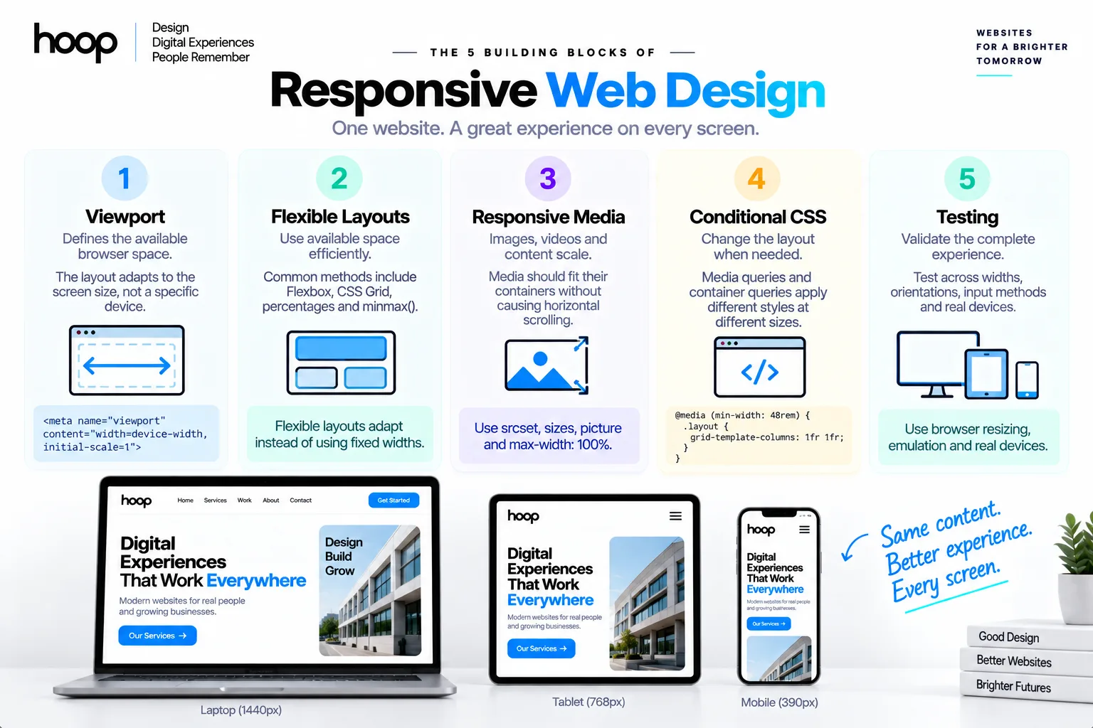
The 5 core building blocks are the viewport, flexible layouts, responsive media, conditional CSS, and testing. Each block solves a different layout problem.
| Task | Timing | Method | Difficulty |
|---|---|---|---|
| Configure the viewport | Project setup | Viewport meta tag | Easy |
| Build flexible layouts | Design and development | Flexbox, Grid, percentages, minmax() | Medium |
| Add responsive media | Development | srcset, sizes, picture, max-width | Medium |
| Add layout changes | Development | Media queries and container queries | Medium |
| Test real behavior | Before every release | Browser resizing, emulation, real devices | High |
The viewport defines available browser space
The viewport represents the page area available inside the browser. A physical screen and a browser viewport are not always the same size.
A desktop user can resize a browser window without changing the monitor. Responsive web design should react to available layout space rather than guessed hardware.
Flexible media prevents overflow
Images, videos, charts, and embedded content should fit their containers without creating horizontal scrolling. A common image rule uses max-width: 100% and automatic height.
Testing validates the complete system
Responsive behavior needs continuous testing across widths, orientations, zoom levels, and input methods. Preset device buttons cannot represent every real viewport.
The MDN responsive design guide provides a technical reference for modern layout techniques.
Responsive Website vs Separate Mobile Website: What Is the Difference?
A responsive website uses one page system that adapts, while a separate mobile website maintains another mobile-specific experience. Most modern projects prefer one responsive system because shared content and code simplify maintenance.
One responsive codebase reduces duplication
A responsive site can use one URL, one content structure, and one frontend codebase across supported devices. Teams can update content once. Responsive web design therefore reduces duplicated presentation work.
Separate mobile sites create more coordination. Teams must keep navigation, copy, features, analytics, accessibility, and fixes synchronized across versions.
Responsive layouts preserve content relationships
A good responsive system does not simply hide desktop content on smaller screens. Designers reprioritize layout while preserving the information users need.
A pricing comparison might become stacked cards on mobile. A desktop navigation bar might become a menu button while keeping the same destinations.
Hoop’s responsive website development guide covers how multi-device design connects with frontend implementation and performance.
How to Choose Breakpoints That Fit Your Content
To choose breakpoints that fit your content, resize the layout until the current structure becomes cramped, unclear, or unusable. Add a breakpoint where the content needs a different arrangement.
Start with the content, not device names
Do not begin with a fixed list labeled phone, tablet, and desktop. Device categories change, while layout failures remain visible.
Watch for 5 signals: text wrapping badly, controls colliding, columns becoming too narrow, media overflowing, or navigation losing clarity.
A breakpoint belongs where one of those failures appears.
Use fewer breakpoints when flexible CSS can solve the problem
Flexbox, Grid, minmax(), auto-fit, auto-fill, and clamp() can reduce unnecessary breakpoint rules. Fluid systems adapt between major layout changes.
A card grid can use repeat(auto-fit, minmax(...)) to add or remove columns automatically. That behavior often removes several fixed-width rules.
Test between your breakpoints
Do not test only at 375px, 768px, and 1440px. Resize continuously through the spaces between your planned widths.
A page can look correct at 768px and fail at 820px. Responsive web design should survive the full range, not only screenshot sizes.
Mobile-First vs Desktop-First: Which Approach Works Better?
Both approaches can create responsive websites, but mobile-first CSS often produces simpler progressive enhancement. Mobile-first development starts with narrow layouts and adds complexity as space increases.
Mobile-first starts with essential content
A mobile-first layout often begins with one-column content, simple navigation, and touch-friendly controls. Larger breakpoints then introduce additional columns or richer navigation.
This approach forces early prioritization because limited space exposes weak hierarchy quickly.
Desktop-first can fit established desktop products
Desktop-first design starts with the wide experience and adapts downward. Existing enterprise interfaces, dashboards, or data-heavy products can use this approach successfully.
Responsive design matters more than starting direction
Hoop’s UI UX design services connect responsive layouts with user flows, wireframes, design systems, and usability testing.
How Do Flexbox and CSS Grid Support Responsive Web Design?
Flexbox and CSS Grid provide flexible layout systems that reduce dependence on fixed coordinates. Developers often use both within the same page.
Flexbox manages flexible rows and columns
Flexbox works well when elements need alignment along one primary axis. Common examples include navigation bars, button groups, form actions, and card rows.
CSS Grid manages rows and columns together
CSS Grid works well for 2-dimensional structures. Examples include product galleries, feature sections, dashboard panels, and editorial layouts.
Layout tools should follow content structure
Do not choose Grid because a page looks complex. Do not choose Flexbox because a page looks simple.
Choose the tool that matches the relationship between elements. Many responsive pages use Grid for macro layout and Flexbox inside components.
How Do Responsive Images and Typography Work?
Responsive media and typography adapt visual content without sacrificing readability or loading unnecessary resources. Good responsive web design handles both layout and content presentation.
Responsive images match files to display needs
The srcset attribute lets developers offer multiple image widths. The sizes attribute describes how much layout space an image will occupy.
The <picture> element can also support art direction. Designers can provide different crops when a wide desktop image does not work on a narrow screen.
Fluid typography scales within limits
The CSS clamp() function lets typography grow between defined minimum and maximum values. Fluid type reduces abrupt jumps between breakpoints.
Aspect ratio protects media layout
The aspect-ratio property can reserve the correct media shape before content loads. Stable dimensions reduce unexpected shifts and preserve composition.
Designers can combine object-fit with a fixed aspect ratio when cards require consistent image areas.
Responsive vs Adaptive Web Design: What Changes?
Responsive design uses flexible layouts across available space, while adaptive design commonly switches between predefined layout states. Both approaches aim to serve different viewing conditions.
Responsive design flows continuously
Responsive layouts can grow, shrink, wrap, and reflow between breakpoints. Flexible dimensions handle much of the transition automatically.
Adaptive design targets defined states
Adaptive interfaces can provide distinct designs for specific ranges or contexts. Teams sometimes use adaptive decisions when interaction patterns differ substantially.
For example, a complex enterprise dashboard can show different control patterns on touch devices and pointer-based workstations.
Hybrid approaches are common
Modern websites often combine fluid responsive layout with adaptive component behavior. A page can scale continuously while navigation changes to a distinct mobile interaction.
How Does Responsive Navigation Change Across Screens?
Responsive navigation preserves access while changing presentation to fit available space. Navigation should become more compact without hiding essential destinations.
Wide screens can expose primary destinations
Desktop navigation can show high-priority links directly because horizontal space allows scanning. Secondary items can remain inside dropdown menus.
Narrow screens need touch-friendly patterns
Mobile navigation often uses a menu button, drawer, accordion, or bottom navigation. The right pattern depends on information architecture and task frequency.
Navigation changes should preserve orientation
Users should know where they are and how to move back. Breadcrumbs, active states, section labels, and predictable menus support orientation.
Responsive web design should not make important destinations disappear merely to create a cleaner mobile header.
How to Test Responsive Websites Properly
To test responsive websites properly, resize continuously, emulate device conditions, and test representative physical devices before release. Each method catches different failures.
Resize the browser continuously
Drag the browser width slowly from narrow to wide. Watch every section rather than checking only the hero area.
Look for horizontal overflow, clipped text, awkward wrapping, stretched images, crowded buttons, broken grids, and floating elements.
Use browser device emulation
Chrome, Firefox, and Safari provide responsive-development tools. Emulation helps test viewport dimensions, orientation, touch behavior, and device pixel ratios quickly.
Test real devices and user settings
Test representative phones, tablets, and laptops. Include iOS Safari and Android Chrome when your audience uses both platforms. Responsive web design needs real-browser validation.
Also test browser zoom, larger text, reduced motion, landscape orientation, slow connections, and keyboard navigation.
The modern web design guide explains how responsive behavior fits with broader interface and accessibility decisions.
How Does Responsive Web Design Support Accessibility?
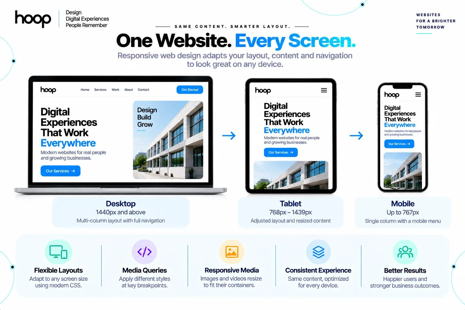
Responsive design supports accessibility when content remains readable, operable, and logically ordered under different display and user settings. Reflow should never remove essential functionality.
Content should survive zoom and larger text
Users can enlarge text or zoom the page. Fixed-height containers can clip enlarged content, while flexible containers can expand naturally.
Layouts should reflow rather than force horizontal scrolling for ordinary text content.
Touch and keyboard users need usable controls
Responsive interfaces should provide clear focus states, logical tab order, usable touch spacing, and visible labels.
A navigation drawer must work with keyboard input as well as touch. Modal interfaces must also manage focus correctly.
Reduced-motion preferences deserve responsive behavior
CSS can detect prefers-reduced-motion. Websites can reduce or remove nonessential movement for users who request less animation.
What Are the Most Common Responsive Design Mistakes?
The most common mistakes come from designing for screenshots instead of designing a flexible system. Responsive failures often appear between the widths teams remembered to test.
Hardcoded widths create fragile layouts
Fixed component widths can overflow narrow containers or leave excessive empty space on wide screens. Flexible constraints usually age better.
Too many breakpoints increase maintenance
Device-specific CSS can grow quickly. A new phone or browser width then exposes another gap between rules.
Content-driven breakpoints and intrinsic layouts reduce that maintenance burden.
Hiding content can damage the experience
Teams sometimes remove important text, filters, navigation, or actions from mobile layouts to make the page fit.
Oversized media can waste bandwidth
A visually responsive image can still download an unnecessarily large file. Use responsive sources and modern formats where suitable.
Does Responsive Web Design Require Bootstrap or Another Framework?
No. Modern HTML and CSS provide the core tools needed to build responsive websites without a framework. Frameworks can still accelerate consistent implementation.
Native CSS already provides strong responsive tools
Flexbox, Grid, media queries, container queries, clamp(), minmax(), and responsive media features cover most layout requirements.
Developers can build complete responsive systems without Bootstrap, Tailwind CSS, or another component framework.
Frameworks can standardize team workflows
Frameworks can provide spacing scales, breakpoints, components, utilities, and documentation. That consistency helps larger teams move faster.
Choose tools after defining the interface
Do not choose a framework before understanding the product. Start with page structure, components, user needs, and maintenance requirements.
What Should You Check Before Launching a Responsive Website?
Check layout stability, readable content, navigation, media, input behavior, accessibility, and real-device performance before launch. A responsive page should work across a range rather than pass 3 screenshots.
Check every core template
Test templates such as the homepage, service page, blog article, contact page, form, search page, and error page.
Check interactive states
Test menus, accordions, tabs, filters, forms, dropdowns, modals, carousels, and validation messages. Interactive states often expose responsive defects late.
Check content extremes
Use long headings, short labels, large images, empty states, error messages, and translated text where relevant.
Build a Responsive Website That Works Across Real Devices
Responsive web design succeeds when one interface remains clear, usable, fast, and accessible across changing viewport conditions. The strongest systems use flexible layouts first and add breakpoints only when content needs a structural change.
If your current website breaks between devices or needs a new responsive interface, explore Hoop Interactive’s responsive web design services to plan the UX, design system, frontend build, and device testing together.
“Responsive web design uses breakpoints to protect usability, not to imitate a list of phone models.”
Key takeaways
- 01The 5 building blocks are the viewport, flexible layouts, responsive media, conditional CSS, and testing.
- 02Add a breakpoint where your content stops working — not where a phone model sits in a spec sheet.
- 03Flexbox, Grid, clamp(), and container queries remove many fixed-width rules before you write a media query.
- 04Test continuously between widths, and check zoom, larger text, keyboard use, and reduced motion.
Written by
Sahar
Content Writer
Frequently Asked
Questions
Everything you need to know before booking a strategy call. Can't find your answer? Contact us directly.
No. Mobile-friendly describes a useful outcome, while responsive web design describes an approach that adapts one layout system across conditions.
Not always for every component. Flexbox, Grid, intrinsic sizing, and container queries can handle many changes without viewport media queries.
There is no universal best breakpoint. Choose breakpoints where your content or interaction pattern stops working well.
No. Mobile-first and desktop-first workflows can both produce responsive websites when teams test the complete viewport range.
Yes, in many cases. The required work depends on the existing CSS, templates, navigation, components, media, and frontend architecture.
Keep reading
All articles →
What Is Mobile First Web Design? A Responsive Guide
Sep 8, 2026 · 10 min read
Responsive Website Development Company Creating High-Performance Digital Platforms
Jul 15, 2026 · 6 min read