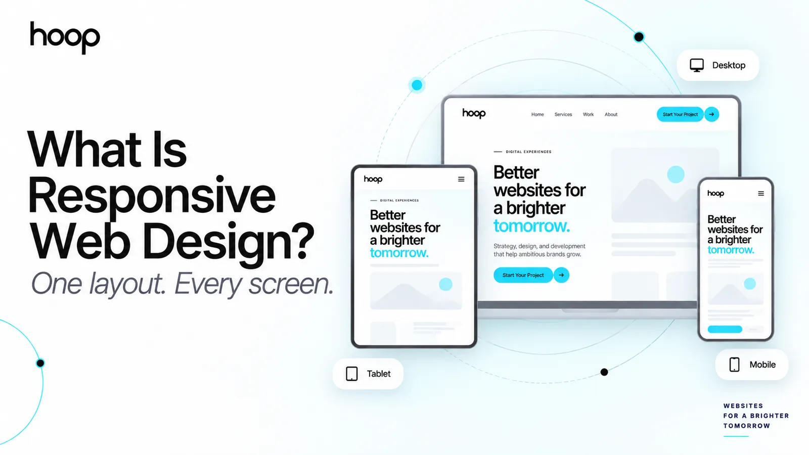

Responsive Website Development Company Creating High-Performance Digital Platforms
Responsive website development builds platforms that adapt seamlessly across devices while staying fast, usable, and search-visible — combining responsive design, adaptive UI/UX, mobile-first optimization, and scalable architecture.
Sahar
Content Writer
Businesses today operate in a digital ecosystem where customers access websites through multiple devices including smartphones, tablets, laptops, and desktop computers. Because of this shift, organizations require websites that adapt seamlessly across screens while maintaining speed, usability, and search visibility.
A professional Responsive Website Development Company helps businesses create mobile-friendly websites designed for performance, scalability, and user engagement. These platforms combine responsive web design, adaptive UI/UX design, mobile optimization, and scalable architecture implementation to deliver consistent digital experiences.
Modern responsive development goes far beyond visual layout adjustments. It integrates search engine optimization (SEO), analytics insights, conversion optimization strategies, and business system integrations. The result is a digital platform that supports marketing campaigns, customer engagement, and long-term business growth.
Companies that invest in responsive development build digital infrastructure capable of supporting evolving technologies, omnichannel customer journeys, and modern digital marketing strategies.
Need this done right?
Hoop builds the strategy, design and development behind sites like this one — talk to us about yours.
Responsive Web Design for Multi-Device Experiences
Responsive web design ensures that websites automatically adjust layout, content structure, and interactive elements according to screen size. Instead of building separate mobile and desktop websites, responsive development uses flexible design frameworks that adapt dynamically.
A modern web design agency focuses on building responsive environments that maintain usability across all devices. These systems rely on scalable grid structures, responsive images, and adaptive navigation components.
Responsive web design enables businesses to create mobile friendly websites that perform efficiently across platforms.
Key features of responsive design include:
- mobile responsive design
- adaptive website design
- cross-platform compatibility focus
- scalable web design frameworks
These technologies ensure that websites remain accessible, functional, and visually consistent regardless of device type.
Businesses benefit from responsive platforms because visitors experience fewer usability issues and more seamless interactions.
User Experience and Adaptive UI/UX Design

The success of a responsive website depends heavily on user experience (UX) and user interface (UI) design. Websites must guide users through content, services, and digital interactions smoothly.
Adaptive UI/UX design ensures that navigation structures and interface components adjust to different screen sizes while maintaining clarity and usability.
Human-centered design principles focus on understanding how visitors interact with digital platforms. Designers analyze user journeys, behavior patterns, and engagement metrics to optimize navigation systems.
Important UX design components include:
- user-centric navigation design
- micro-interaction design specialists for intuitive feedback
- accessible interface structures
- responsive content hierarchy
When these elements are implemented effectively, websites become user friendly websites that improve engagement and customer satisfaction.
Strong UX design also supports conversion optimization and marketing effectiveness.
Mobile-First Design Strategy and Mobile Optimization
Mobile traffic now dominates internet usage across most industries. For this reason, modern development teams implement a mobile-first design approach.
Mobile-first development begins by designing the interface for smaller screens and expanding it for larger displays. This ensures that the most important content remains visible and accessible on smartphones.
Mobile optimization includes:
- responsive navigation menus
- touch-friendly interface elements
- optimized mobile media assets
- simplified content presentation
Search engines also favor mobile optimized websites through mobile-first indexing, which prioritizes the mobile version of a website for ranking evaluation.
Businesses that follow mobile-first design strategies improve their search visibility and user engagement.
Website Speed Optimization and Performance Engineering

Website performance is one of the most important factors influencing user satisfaction and search engine rankings. Slow websites often result in higher bounce rates and reduced conversions.
A professional responsive website company focuses on performance-optimized code delivery to ensure that websites load quickly across devices.
Performance engineering involves optimizing both front-end and back-end development processes.
Key performance optimization strategies include:
- front-end development optimization
- efficient back-end development architecture
- optimized image and media delivery
- scalable system architecture
Fast loading websites improve both user experience and SEO performance. Businesses that prioritize website speed optimization achieve higher engagement and improved conversion rates.
Responsive Websites and Search Engine Optimization
Responsive development directly supports search engine optimization (SEO). Search engines prioritize websites that provide consistent user experiences across devices.
SEO friendly responsive websites maintain structured content hierarchies and optimized page performance.
Important SEO elements include:
- optimized heading structures
- responsive navigation systems
- structured metadata implementation
- mobile optimized content layout
Responsive websites also improve crawlability, allowing search engines to index pages more effectively.
Organizations that combine responsive web design with SEO strategies gain stronger visibility in organic search results.
Digital Marketing Integration and Conversion Optimization
Responsive websites play a critical role in digital marketing strategies. Marketing campaigns drive traffic from search engines, social platforms, and paid advertising.
If a website does not function properly on mobile devices, visitors quickly abandon the page. This reduces marketing performance and conversion potential.
Responsive websites improve marketing outcomes by ensuring consistent experiences across devices.
Marketing advantages include:
- optimized landing page performance
- improved user engagement
- higher conversion rate optimization
- stronger campaign results
When responsive development aligns with digital marketing strategies, websites become engines for growth that support revenue generation.
Data-Driven Optimization and Website Analytics
Understanding how users interact with digital platforms is essential for improving performance. Businesses rely on website analytics tools to analyze visitor behavior and engagement patterns.
Analytics platforms provide insights into:
- user navigation journeys
- engagement metrics
- traffic sources
- conversion activity
Responsive websites provide more accurate analytics because users experience consistent layouts across devices.
Data-driven optimization allows organizations to continuously refine their websites and improve user engagement.
Analytics insights also help businesses evaluate marketing performance and adjust strategies accordingly.
Custom Web Development and Business Software Integration
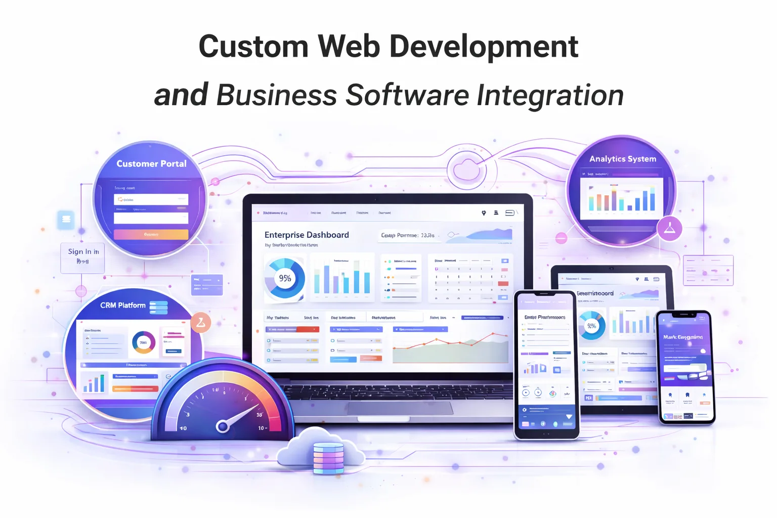
Many organizations require digital platforms with advanced functionality beyond basic informational websites.
Custom web development allows businesses to build specialized platforms tailored to operational needs.
These platforms often include:
- customer portals
- enterprise tools and dashboards
- digital service platforms
- integrated business systems
Custom development transforms websites into operational platforms that support internal workflows and customer interactions.
Responsive platforms can also integrate with enterprise software systems such as CRM platforms, marketing automation tools, and analytics systems.
These integrations improve operational efficiency and strengthen digital ecosystems.
Headless CMS Architecture and Content Management
Modern digital platforms often rely on content management system (CMS) technology to manage content efficiently.
A headless CMS architecture separates the content management layer from the presentation layer, allowing content to be delivered across multiple digital channels.
Benefits of headless CMS systems include:
- flexible content distribution
- faster development cycles
- scalable digital infrastructure
- multi-platform content delivery
This architecture allows businesses to maintain responsive websites while delivering personalized content experiences across devices.
Progressive Web Applications and Advanced Digital Platforms
Responsive development also supports progressive web applications (PWAs). PWAs combine the functionality of mobile applications with the accessibility of websites.
Progressive web apps offer:
- offline functionality
- fast loading performance
- push notification capabilities
- app-like user interactions
These features enable businesses to create bespoke digital experiences that improve engagement and retention.
PWAs represent the future of responsive digital platforms.
Responsive eCommerce Website Development
E-commerce continues to grow rapidly, and many customers now complete purchases through mobile devices.
Responsive e-commerce website development ensures that online stores function smoothly across devices.
Key responsive eCommerce features include:
- responsive product galleries
- optimized checkout systems
- secure payment processing
- fast loading product pages
These improvements enhance conversion rate optimization and increase customer trust.
Responsive eCommerce platforms support better shopping experiences and higher sales performance.
Website Maintenance and Long-Term Digital Reliability
Launching a responsive website is only the beginning of the digital journey. Continuous website maintenance ensures that platforms remain secure, efficient, and updated.
Maintenance services typically include:
- performance monitoring
- security updates
- CMS updates
- feature improvements
Regular maintenance helps businesses maintain long-term reliability and protect their digital platforms from technical issues.
Organizations that invest in maintenance services provide better digital experiences for customers.
Why Businesses Choose Hoop
Hoop focuses on building responsive digital platforms designed for modern business environments. By combining responsive web design, scalable development architecture, mobile optimization, and SEO strategies, Hoop helps businesses create high-performance websites.
The team emphasizes transparent communication, collaborative processes, and data-driven optimization to ensure measurable results.
Responsive platforms built by Hoop support digital marketing, customer engagement, and long-term business growth.
Conclusion
Responsive development has become essential for businesses operating in a multi-device digital environment. Organizations must deliver seamless experiences across smartphones, tablets, and desktop computers while maintaining speed, usability, and search visibility.
A professional Responsive Website Development Company helps businesses create scalable digital platforms that support marketing campaigns, customer engagement, and operational systems.
By combining responsive web design, mobile optimization, SEO strategies, analytics insights, and custom development frameworks, businesses can build websites that drive traffic, improve conversions, and support long-term growth.
Partner with Hoop to build responsive digital platforms designed for the future of digital business.
“Modern responsive development goes far beyond visual layout adjustments.”
Key takeaways
- 01Responsive design adapts one site across all devices
- 02Adaptive UI/UX keeps navigation clear on every screen
- 03Mobile-first optimization prioritizes the most-used screens
- 04Scalable architecture supports long-term business growth
Written by
Sahar
Content Writer
Frequently Asked
Questions
Everything you need to know before booking a strategy call. Can't find your answer? Contact us directly.
A responsive website development company builds websites that automatically adapt layouts and content to match different screen sizes and devices.
Responsive websites improve usability across devices, increase engagement, and support better search engine rankings.
Yes. Responsive websites improve landing page performance, increase engagement, and support higher conversion rates.
Development timelines vary depending on project complexity, features, and integration requirements.
Keep reading
All articles →
Website Development in 2025: Complete Guide to Modern Web Solutions
Aug 5, 2026 · 7 min read
What Is WordPress Web Design? How WordPress Websites Actually Work
Sep 26, 2026 · 10 min read