
What Is Mobile First Web Design? A Responsive Guide
Mobile-first web design starts with the essential experience for narrow screens, then adds layout space, features, and visual complexity as the viewport grows — combining content prioritization, responsive CSS, flexible layouts, and progressive enhancement.
Sahar
Content Writer
Mobile-first web design starts with the smallest practical viewport and the most important content, then enhances the experience as more space becomes available. Designers use mobile constraints to prioritize information, navigation, and actions. Developers commonly implement the approach with flexible CSS, Flexbox, Grid, and wider-screen media queries.
Mobile-first does not mean creating a separate mobile website. It also does not mean treating desktop as an afterthought. A strong process plans the complete experience, then uses the narrow layout as the baseline for responsive growth.
What Does Mobile-First Web Design Actually Mean?
The mobile-first approach makes the narrow layout the baseline. You decide what users need before extra desktop space can hide weak priorities.
Mobile-first is a design strategy
Designers begin with limited space, touch interaction, shorter visible areas, and smaller navigation regions. Those constraints force decisions about content order, calls to action, forms, menus, and visual hierarchy.
Mobile-first is also an implementation pattern
Developers can write narrow-screen styles first, then add layout changes as the viewport becomes wider. Media queries using minimum-width conditions are a common way to apply those enhancements.
How Does Mobile-First Web Design Work?
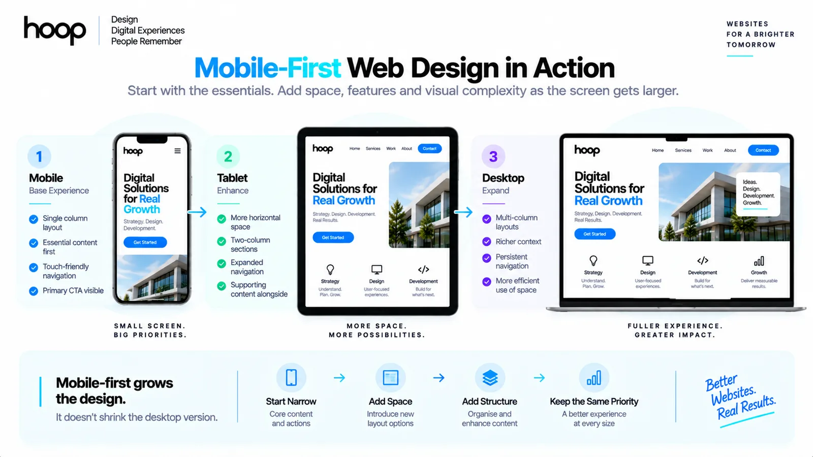
A mobile-first layout grows from a simple base instead of shrinking from a complex desktop page. The process usually follows 5 connected decisions.
Start by prioritizing essential content and actions for the narrowest useful layout. Build a flexible single-column or simple stacked structure, then widen the viewport until the content needs a different arrangement. Add a breakpoint only where that change improves the layout. Continue the same process while testing touch behavior, typography, images, navigation, and accessibility across widths.
A responsive website development approach supports this process by treating layout changes as part of one continuous system rather than separate phone, tablet, and desktop websites.
Mobile-First vs Responsive Web Design: What Is the Difference?
Responsive design describes the result; mobile-first describes the starting direction. A responsive site adapts across viewports, while a mobile-first workflow begins with the narrow experience and expands.
| Question | Mobile-First Design | Responsive Design |
|---|---|---|
| What does it define? | The order of design and enhancement | How layouts adapt across available space |
| Typical CSS direction | Base narrow styles, then wider enhancements | Can use mobile-first or desktop-first rules |
| Primary design pressure | Content and feature prioritization | Cross-device usability |
| Can one exist without the other? | Yes, but mobile-first normally targets a responsive result | Yes, responsive design can start desktop-first |
Mobile-First vs Desktop-First: Which Approach Is Better?
Neither approach wins every project. The better starting point depends on the product, audience, interface density, and team workflow.
Mobile-first fits many public websites
Consumer websites, ecommerce pages, local-service sites, content platforms, and lead-generation pages often receive substantial mobile use. Starting narrow helps teams solve essential tasks early.
Desktop-first can fit dense applications
Analytics dashboards, internal enterprise tools, data-heavy editors, and specialist workspaces can depend on large displays. Teams can still design responsive states while prioritizing the environment users actually need.
Hoop’s web design services treat mobile and desktop as connected states of one product, with responsive behavior planned before development begins.
Why Start With the Smallest Practical Screen?
Small screens expose weak priorities quickly. A desktop canvas can hide unnecessary content, oversized navigation, and competing actions inside extra space.
Mobile-first clarifies content hierarchy
You must decide which headline, action, proof, form field, or navigation choice appears first. That decision strengthens information architecture across every viewport.
Mobile-first reduces late layout compression
A complex 4-column desktop page rarely collapses cleanly by simply reducing widths. Starting narrow can prevent late redesign work around stacking, order, spacing, and hidden controls.
How Does Mobile-First CSS Work?
Mobile-first CSS keeps the simplest layout in the base rules and adds enhancements for wider viewports. Minimum-width media queries are a common implementation technique.
.feature-grid {
  display: grid;
  grid-template-columns: 1fr;
  gap: 1rem;
}

@media (width >= 48rem) {
  .feature-grid {
    grid-template-columns: repeat(2, 1fr);
  }
}

@media (width >= 72rem) {
  .feature-grid {
    grid-template-columns: repeat(3, 1fr);
  }
}
The CSS begins with one column. Wider conditions add 2 and then 3 columns only when the layout has enough room. MDN explains mobile-first media queries as a standard responsive-layout technique.
How Should Mobile-First Breakpoints Be Chosen?
Choose breakpoints when the content needs a different layout, not because a popular phone has a specific width. Content-driven breakpoints usually create a more maintainable responsive system.
Start with the narrow layout and increase the browser width continuously. Watch for cramped text, stretched cards, awkward whitespace, or navigation strain. Add a breakpoint only where a new arrangement clearly improves the experience, then continue widening until another meaningful layout change becomes necessary.
This content-driven method also keeps the design ready for future devices because the CSS responds to available space rather than specific hardware names.
How Do Flexbox and CSS Grid Support Mobile-First Layouts?
Flexbox and CSS Grid let layouts reorganize without creating separate markup for every viewport. Both tools work well with mobile-first enhancement.
Use Flexbox for flexible one-dimensional groups
Navigation rows, button groups, pricing actions, form controls, and stacked content sections often fit Flexbox because the relationship follows one main axis.
Use Grid for rows and columns
Card collections, galleries, feature comparisons, and page regions often fit CSS Grid. A single-column mobile grid can expand naturally as space increases.
How Does Mobile-First Design Change Content Hierarchy?
Mobile-first design forces teams to prioritize meaning before decoration. The first visible screen has limited room, so hierarchy becomes an explicit product decision.
Lead with the user’s primary task instead of a long corporate introduction, and keep the strongest action visible without crowding the interface. Order supporting information by decision value rather than internal company structure. Secondary detail can move lower on the page without disappearing, while headings and sections should remain easy to scan on narrow screens.
A good modern website design system preserves this hierarchy as components expand across larger layouts.
How Does Mobile-First Navigation Work?
Mobile navigation needs fewer visible choices, larger touch targets, and clearer priority. Desktop space can add convenience, but the underlying information architecture should stay understandable.
Do not hide essential paths
Collapsing a menu does not justify burying important destinations. The navigation still needs meaningful labels, predictable grouping, and an obvious way back.
Design for touch before hover
Phones do not provide persistent hover states. Important actions need visible labels, usable tap targets, and feedback that does not depend on a mouse pointer.
Does Mobile-First Web Design Improve Performance?
Mobile-first can encourage simpler initial layouts, but the approach does not guarantee fast pages. Performance still depends on assets, JavaScript, fonts, images, network behavior, and rendering decisions.
A narrow layout can reduce visual complexity, yet a page can remain slow if it downloads oversized video, unoptimized images, large JavaScript bundles, or unnecessary third-party scripts.
Performance-aware software development services should connect responsive design decisions with front-end implementation, image handling, testing, and deployment.
How Does Mobile-First Design Support Accessibility?
Mobile-first design can support accessibility when small-screen constraints lead to clearer content and larger interactive targets. Accessibility still requires deliberate testing and semantic implementation.
Keep text readable without horizontal scrolling and preserve a logical source order when visual layouts change. Interactive elements need visible focus indicators and touch controls large enough to operate reliably. Important content should remain available on narrow screens, and the layout should survive browser zoom, text enlargement, orientation changes, and reflow.
How Should Images and Media Work in Mobile-First Design?
Mobile-first media should fit narrow layouts without forcing oversized downloads or horizontal scrolling. The visual asset should scale with the layout and remain useful at every viewport.
Choose responsive image behavior early
Use flexible image dimensions so media can shrink inside its container. Responsive image techniques can also let the browser select an appropriate source for the available display conditions.
Avoid desktop-first media assumptions
A wide banner, comparison chart, or autoplay video can dominate a phone screen. Mobile-first design asks whether the same asset needs cropping, a different aspect ratio, a lighter source, or a more compact presentation.
How Should Forms and Touch Controls Be Designed Mobile-First?
Mobile-first forms reduce friction before extra desktop space creates the illusion that every field belongs. Each control should remain readable, tappable, and easy to complete with a virtual keyboard.
Use visible labels instead of placeholder-only instructions, and keep primary actions easy to reach without accidental taps. Choose input types that trigger useful mobile keyboards where appropriate. Keep forms single-column until wider layouts genuinely improve comprehension, place validation messages beside the field that needs attention, and test fixed controls while the virtual keyboard is open.
How Does Mobile-First Typography Work?
Mobile-first typography begins with readable text on a narrow viewport and scales only when larger space improves hierarchy. The goal is not to make every heading dramatically larger on desktop.
Use line lengths that remain comfortable, avoid tiny body text, and keep heading relationships obvious. Fluid functions such as clamp() can help type scale between sensible minimum and maximum values without forcing abrupt jumps at every breakpoint.
Typography should also survive browser zoom and user text enlargement. A mobile-first layout that breaks when text grows is not truly responsive.
What Is a Practical Mobile-First Design Process?
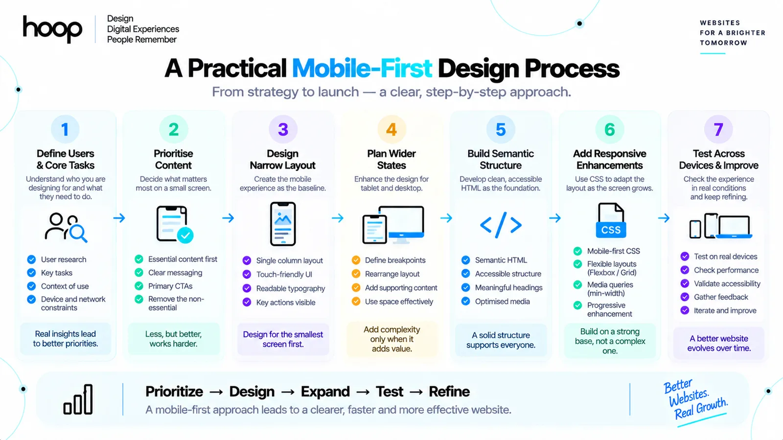
A practical process plans the content and both viewport extremes before production CSS begins. Implementation can still proceed from narrow to wide while the team understands the complete system.
Begin by defining the audience, primary tasks, and required content before drawing screens. Sketch the narrow layout first, then sketch at least one wide layout so desktop does not become a stretched phone design. Identify shared components, navigation states, and content order across both layouts. Build semantic HTML that supports those states without duplicated content, apply base styles for the narrow experience, and then add wider enhancements while testing continuously between breakpoints.
What Is Progressive Enhancement in Mobile-First Design?
Progressive enhancement starts with a functional baseline and adds richer presentation or behavior when the environment supports it. Mobile-first often follows the same direction.
The smallest layout should still let users read content, navigate, submit essential forms, and complete core tasks. Wider screens can add multi-column layouts, persistent sidebars, richer previews, or additional context without breaking the baseline experience.
When Does Desktop-First Make More Sense?
Desktop-first can be reasonable when the primary product depends on large-screen workflows. The choice should follow real usage instead of fashion.
Desktop-first can make sense for dense analytical dashboards used mainly on large monitors, professional editing tools with wide canvases and many controls, or internal systems where organization policy requires desktop hardware. Even then, define narrow states whenever users can access the product outside the primary environment.
The key principle is not “mobile at all costs.” The key principle is to understand where users perform their important work and design every required state intentionally.
What Are the Most Common Mobile-First Design Mistakes?
Most mobile-first mistakes come from treating the method as a rigid rule instead of a responsive design strategy. The following problems create weak results.
- Designing only the mobile mockup: a stretched mobile layout can waste desktop space and produce weak information density.
- Removing useful content: narrow screens require prioritization, not automatic information loss.
- Using device-specific breakpoints: phone-model widths create brittle CSS and unnecessary maintenance.
- Hiding functionality without alternatives: users still need access to important actions on small screens.
- Assuming mobile-first guarantees speed: heavy media and JavaScript can erase any initial simplicity.
- Ignoring orientation and viewport height: landscape phones, browser chrome, and virtual keyboards can change available space.
- Treating hamburger menus as automatic: a collapsed menu still needs clear labels, hierarchy, and accessibility.
Mobile-First Web Design Quick-Reference Workflow
Use this workflow to keep mobile-first decisions connected to actual content and viewport behavior. The difficulty rises when layouts become denser or interactions become more specialized.
| Task | Timing | Method | Difficulty |
|---|---|---|---|
| Prioritize content | Before wireframes | Rank tasks, actions, and supporting information | Medium |
| Design narrow layout | Wireframe stage | Use one clear hierarchy and touch-friendly controls | Medium |
| Plan wider states | Before development | Define tablet and desktop structure alongside mobile | Medium |
| Choose breakpoints | During front-end build | Widen viewport until content needs a layout change | Medium |
| Build responsive CSS | Development | Use flexible units, Flexbox, Grid, and wider-screen queries | Medium |
| Test devices | QA | Resize continuously, emulate devices, and test real hardware | High |
| Review accessibility | QA and launch | Test zoom, focus, touch, reflow, and source order | High |
How Should You Test a Mobile-First Website?
Test the layout continuously across widths instead of checking only 3 preset devices. A strong QA process combines browser tools with real hardware.
Resize the browser slowly from narrow to wide and watch every layout transition. Then test representative phones, tablets, laptops, and large desktop widths. Rotate mobile devices, open and close the virtual keyboard around forms, and verify touch targets, sticky navigation, modals, menus, and carousels. Increase browser zoom and text size to confirm reflow, and finish on a real lower-powered phone instead of relying only on a fast desktop emulator.
Build Mobile-First Around Real User Needs
Mobile-first web design works best when it creates clearer priorities, flexible layouts, and stronger cross-device usability. The method should guide responsive decisions rather than become a rule that ignores the product or audience.
Plan the mobile and desktop experience together, use narrow layouts to expose priorities, enhance the interface as space grows, and test continuously across real conditions. For projects where mobile visitors need a direct path to action, Hoop also applies mobile-first principles to contractor website design and other conversion-focused web builds.
“Small screens expose weak priorities quickly. A desktop canvas can hide them inside extra space.”
Key takeaways
- 01Mobile-first is a starting direction; responsive is the result.
- 02Add a breakpoint where the content breaks, never at a phone model’s width.
- 03Sketch at least one wide layout too, or desktop becomes a stretched phone page.
- 04Mobile-first does not guarantee speed — media and JavaScript still decide that.
Written by
Sahar
Content Writer
Frequently Asked
Questions
Everything you need to know before booking a strategy call. Can't find your answer? Contact us directly.
No. Responsive design describes a website that adapts across viewports. Mobile-first describes a process that starts with the narrow layout and enhances it as space increases.
No. Mobile-first prioritizes essential tasks and presentation. Important functionality should remain available unless product requirements justify a different experience.
No. Minimum-width queries are common, but modern CSS can also create responsive behavior through flexible Grid, Flexbox, intrinsic sizing, and container-based techniques.
No. Mobile-first fits many public websites, while desktop-first can suit dense applications used mainly on large screens. Product context should decide the approach.
No. Mobile-first works with standard HTML and CSS. Frameworks can provide useful breakpoint systems, but the strategy does not depend on a framework.
Keep reading
All articles →
What Is Responsive Web Design? One Layout for Every Screen
Sep 3, 2026 · 10 min read
Responsive Website Development Company Creating High-Performance Digital Platforms
Jul 15, 2026 · 6 min read