What Is Accessibility in Web Design? A WCAG Guide
Accessibility in web design means building websites that people with different visual, hearing, motor, and cognitive access needs can use effectively — combining inclusive UI decisions with semantic HTML, keyboard navigation, screen-reader support, clear forms, strong contrast, and real testing.
Sahar
Content Writer
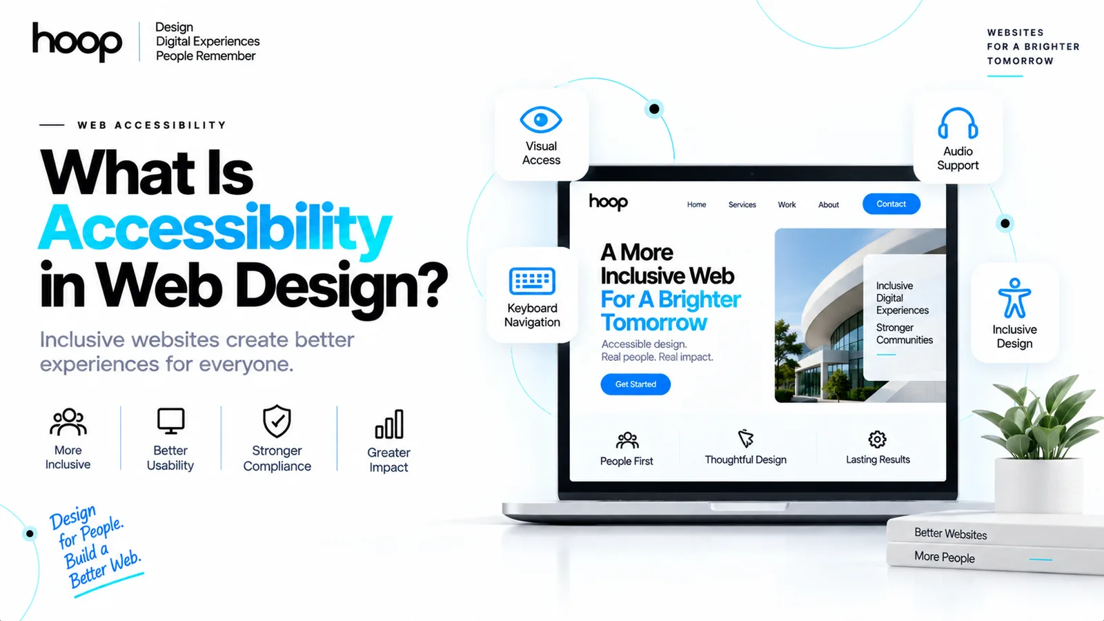
Accessibility in web design means creating websites that people with different visual, hearing, motor, cognitive, and other access needs can perceive, understand, navigate, and use. Accessible websites combine visual design with semantic HTML, keyboard support, screen-reader compatibility, meaningful text alternatives, predictable interactions, and tested focus behavior.
Accessibility is not a visual style. A website can look bold, minimal, editorial, or highly branded and still be accessible. The real test is whether users can complete essential tasks through different ways of seeing, hearing, moving, reading, and interacting.
Web Accessibility Means People Can Use the Website
Web accessibility removes barriers that stop people from completing real tasks. Those tasks can include reading an article, submitting a form, purchasing a product, booking an appointment, or navigating an account dashboard.
A website becomes inaccessible when design or code creates unnecessary dependence on one ability. A menu that only works with a mouse excludes keyboard users. Low-contrast text can block people with low vision. An unlabeled form field can leave a screen-reader user without enough information to complete checkout.
Accessibility is broader than compliance
Compliance checks technical requirements. Accessibility asks whether people can actually use the experience. A technically valid page can still fail through vague labels, poor reading order, unclear errors, or unpredictable navigation.
Accessibility and usability overlap
Accessible design often improves usability for a wider audience. Clear headings support screen-reader navigation and visual scanning. Captions help deaf users and people watching video without sound.
Hoop builds these considerations into its accessible web design process instead of treating accessibility as a final repair task.
Who Benefits From Accessible Web Design?
Accessible websites support permanent disabilities, temporary limitations, and situational constraints. The same interface decision can help users in very different circumstances.
People can use assistive technologies such as screen readers, screen magnifiers, switch controls, voice control, alternative keyboards, and refreshable braille displays. Other users simply need larger text, reduced motion, captions, or predictable navigation.
Permanent access needs
Permanent access needs can include blindness, low vision, deafness, hearing loss, limited mobility, color-vision differences, dyslexia, and cognitive disabilities.
The website should not assume every user can see color, hear audio, make precise pointer movements, or process dense instructions quickly.
Temporary and situational needs
A broken wrist can make mouse control difficult. Bright sunlight can reduce visibility. A noisy train can make audio unusable. Accessible interaction patterns handle these situations without requiring a special version of the website.
What Does WCAG Mean for Web Design?
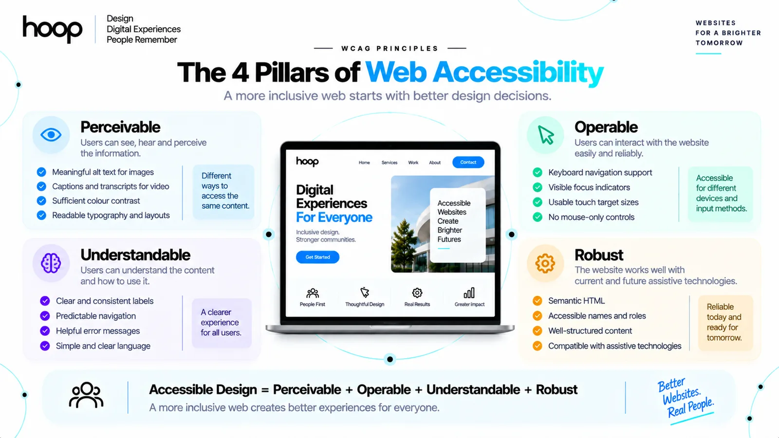
The Web Content Accessibility Guidelines (WCAG) provide testable recommendations for making digital content more accessible. The current W3C recommendation is WCAG 2.2, which covers accessibility across desktop, mobile, kiosk, and other web experiences.
WCAG groups accessibility around 4 principles: perceivable, operable, understandable, and robust, often shortened to POUR.
Perceivable
Users need a way to perceive the information. Examples include text alternatives for meaningful images, captions for prerecorded video, sufficient contrast, and layouts that remain readable when text grows.
Operable
Users need to operate controls through supported input methods. Keyboard access, visible focus, usable target sizes, and controls that do not depend on precise pointer movement all support operability.
Understandable and robust
Users need predictable navigation, labels, understandable errors, and consistent behavior. Developers also need semantic code that assistive technologies can interpret. WCAG defines conformance levels A, AA, and AAA; many organizations target Level AA.
Quick Reference: Common Accessibility Barriers
| Barrier | Example | Better design response | Users affected |
|---|---|---|---|
| Low contrast | Light gray text on white | Increase text and control contrast | Low vision, glare situations |
| Mouse-only control | Dropdown opens only on hover | Support keyboard and pointer interaction | Keyboard, motor-impaired users |
| Missing label | Form shows placeholder only | Add a persistent programmatic label | Screen-reader, cognitive users |
| Hidden focus | Outline removed from buttons | Provide a clear visible focus state | Keyboard users |
| Color-only meaning | Errors shown only in red | Add text, icons, and clear messages | Color-vision, low-vision users |
| Uncaptioned video | Speech exists only in audio | Add synchronized captions | Deaf, hard-of-hearing users |
What Does Accessible Visual Design Look Like?
Accessible visual design creates strong hierarchy without making information depend on perfect vision. Contrast, typography, spacing, motion, and state design all influence whether users can understand the interface.
Color contrast and meaning
Text and interface controls need enough contrast against their backgrounds. WCAG 2.2 generally requires a 4.5:1 contrast ratio for normal text and 3:1 for large text at Level AA, with defined exceptions.
Color should not carry meaning alone. A form error can use red, but the interface should also provide an icon or written error message.
Typography, zoom, and reflow
Readable typography uses clear sizing, adequate line height, sensible line length, and sufficient spacing. Enlarged text should not hide important controls or force unnecessary horizontal scrolling.
Responsive layouts support accessibility because content can reflow when users zoom or use smaller viewports. Hoop’s guide to responsive website development explains how flexible layouts adapt across screen conditions.
Motion and animation
Motion can communicate state, hierarchy, or progress, but unnecessary animation can distract users or trigger vestibular discomfort. Interfaces should respect reduced-motion preferences when animation is not essential to the task.
How Does Keyboard Accessibility Work?
Keyboard accessibility means users can reach, understand, and operate interactive elements without a mouse or touch screen. A keyboard user should be able to move through the page in a logical order and see where focus currently sits.
Focus order should follow the task
Pressing Tab should move through links, buttons, fields, menus, and controls in an order that matches the visual and logical flow. The document structure should create a sensible default order.
Visible focus is essential
Removing the browser focus outline without providing a replacement makes keyboard navigation difficult. Buttons, links, tabs, menu items, and form fields need a visible focus state.
Skip links save repeated work
A skip link lets keyboard users bypass repeated navigation and move directly to primary content. Skip links are especially useful on large websites with complex headers.
Interactive patterns such as menus, tabs, accordions, and dialogs require intentional keyboard behavior. Hoop’s UI UX design services incorporate those states during component design rather than leaving them undefined for development.
How Do Screen Readers Understand a Website?
Screen readers rely on meaningful structure and accessible names, not visual appearance alone. Semantic HTML gives browsers and assistive technologies information about headings, navigation, forms, buttons, lists, tables, and page regions.
Semantic HTML creates structure
Use native elements for their intended purpose. A real <button> carries keyboard and accessibility behavior that a styled <div> lacks by default. Headings should describe hierarchy, while landmarks such as <nav> and <main> help users move between major regions.
Accessible names explain controls
A screen reader needs to know what a control is and what it does. Icon-only buttons need accessible names such as “Close dialog” or “Search.” Link text should also communicate destination or purpose.
ARIA should support native HTML
Accessible Rich Internet Applications (ARIA) attributes can describe complex widgets and states, but ARIA should supplement semantic HTML rather than replace it. Native controls usually provide stronger default accessibility behavior.
What Is Good Alt Text?
Good alternative text communicates the purpose of an informative image in context. Alt text should not describe every pixel, and not every image needs a spoken description.
Informative images need useful alternatives
A product image might need the product name and meaningful visual detail. A chart may require a concise summary plus access to the underlying data. The right description depends on why the image appears.
Decorative images should stay quiet
Decorative images that add no information should usually use empty alternative text so screen readers can skip them. Repeating filenames, “image of,” or keyword-filled descriptions creates noise instead of accessibility.
Video needs more than alt text
Video accessibility can require captions, transcripts, audio description, and accessible player controls. Captions also help users in quiet or noisy environments.
What Makes Forms Accessible?
Accessible forms clearly explain what information users need, how to enter it, and how to recover from errors. Forms become difficult when instructions disappear, labels are missing, or validation only uses color.
Every input needs a clear label
Placeholder text should not replace a persistent label. Placeholders disappear during typing and often provide weak support for assistive technologies.
Labels should stay connected programmatically to their controls so a screen reader can announce each field correctly.
Errors need specific guidance
“Something went wrong” gives users little help. An accessible error identifies the problem and explains how to correct it.
For example, “Enter an email address in name@example.com format” is more useful than a red border alone.
Focus should move intentionally
After a failed submission, users need a clear path to errors. The interface can provide an error summary, move focus when appropriate, and connect each message to the related field.
Complex forms and authenticated workflows often need engineering support as well as visual design. Hoop’s custom web application development work combines frontend accessibility with application logic, validation, and secure interactions.
How Does Responsive Design Support Accessibility?
Responsive design supports accessibility when content remains usable under zoom, text enlargement, narrow viewports, and different input methods. Accessibility testing should not stop at 1 desktop screen and 1 phone preset.
Content should reflow
Users who zoom should not lose important information off-screen. Text and controls should adapt instead of creating unnecessary two-dimensional scrolling for ordinary page content.
Touch targets need space
WCAG 2.2 introduces a Level AA minimum target-size criterion of 24 by 24 CSS pixels, with specific exceptions. Many design systems use larger targets to improve comfort on touch devices.
Orientation should not break the task
A mobile interface should not require one device orientation unless the orientation is essential. Forms, menus, and dialogs should remain usable when available space changes.
Can Automated Accessibility Tools Test Everything?
No. Automated tools find detectable accessibility problems, but automated scans cannot prove that a website is fully accessible. Tools can flag certain contrast failures, missing labels, invalid ARIA, empty links, and structural problems.
Automated testing cannot reliably judge whether instructions are understandable, focus order is logical, alt text has the right meaning, or a workflow makes sense with a screen reader.
Use automated checks early
Tools such as axe, Lighthouse, and Accessibility Insights can catch repeatable problems during development. Automated checks work best inside continuous testing rather than as one final audit.
Test with a keyboard
Navigate the entire core journey without a mouse. Check menus, forms, dialogs, carousels, tabs, filters, and error recovery.
Test with assistive technology
Screen-reader testing with NVDA or VoiceOver reveals problems that visual inspection cannot. Teams should also test zoom, reflow, reduced motion, and real devices. Human testing adds insight that automated scores cannot replace.
How Do Design Systems Improve Accessibility?
Design systems can make accessible behavior reusable instead of rebuilding accessibility on every page. A well-designed component library defines both visual states and interaction rules.
Build accessible components once
Buttons, inputs, modals, alerts, tabs, navigation, and tooltips should include accessibility requirements from the start. Component specifications can define keyboard behavior, focus states, labels, errors, contrast, and motion alongside visual styling.
Document behavior for developers
Figma files should not show only static screens. Design handoff should communicate hover, focus, error, disabled, loading, expanded, and selected states.
A shared design system gives designers and developers one source of truth. Hoop’s broader software development services use reusable architecture and QA so interface requirements survive the move from design to production.
What Are Common Accessibility Mistakes?
The most common accessibility mistakes come from relying on appearance without defining behavior. Small shortcuts can create major barriers.
Common mistakes include:
- Removing visible focus styles
- Using low-contrast text
- Creating buttons from non-interactive elements
- Skipping form labels
- Using color as the only error signal
- Writing vague link text
- Breaking heading hierarchy
- Adding inaccessible custom dropdowns
- Auto-playing motion without control
- Using ARIA where native HTML would work better
- Hiding content when users zoom
- Publishing videos without captions
Accessibility reviews should prioritize task completion over score chasing.
Does Accessibility Limit Creative Web Design?
No. Accessibility limits barriers, not creativity. Designers can use strong branding, animation, unusual typography, and rich interactions when contrast, motion, semantics, and keyboard behavior remain usable.
Is web accessibility a legal requirement?
Accessibility obligations depend on jurisdiction, organization type, service, and applicable law. WCAG provides technical guidance, but WCAG itself is not a universal law. Businesses should confirm legal obligations with qualified counsel when compliance risk matters.
How to Make a Website More Accessible
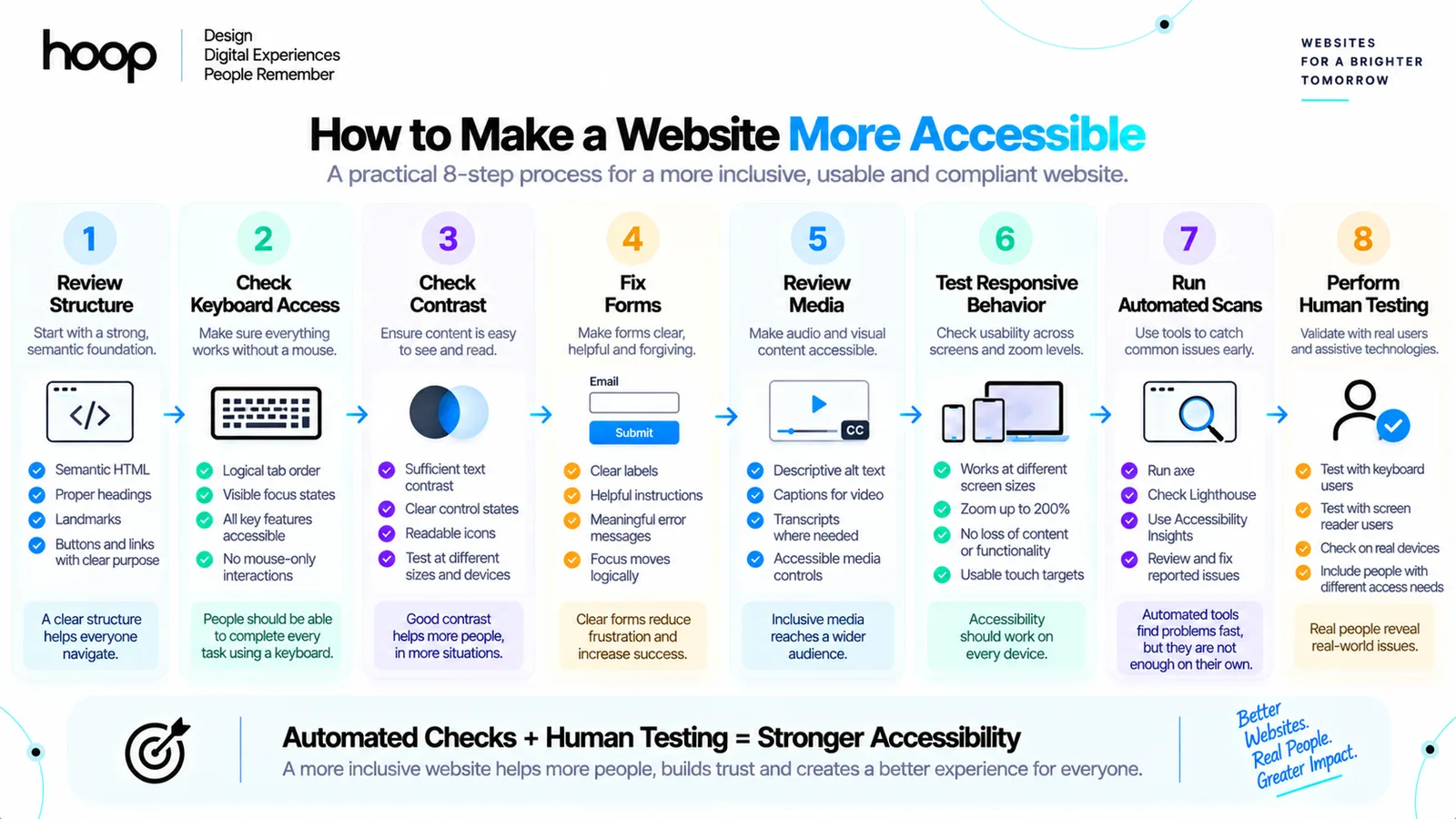
To make a website more accessible, start with core user journeys and remove the barriers that prevent completion. The following 8-step sequence gives teams a practical starting point.
- Review structure. Use semantic headings, landmarks, lists, buttons, and links correctly.
- Check keyboard access. Complete core tasks without a mouse and verify visible focus.
- Check contrast. Test text, icons, borders, focus states, and interactive controls.
- Fix forms. Add persistent labels, specific errors, instructions, and logical focus behavior.
- Review media. Add meaningful alt text, captions, transcripts, and accessible controls where needed.
- Test responsive behavior. Check zoom, reflow, orientation, touch targets, and text enlargement.
- Run automated scans. Use automated tools to catch repeatable technical issues early.
- Perform human testing. Test with keyboards, screen readers, real devices, and users with relevant access needs.
Accessibility works best as a continuous design and engineering practice.
Accessible Web Design Works Better When Accessibility Starts Early
Accessibility in web design means giving more people a reliable way to perceive information, operate controls, understand content, and complete important tasks. WCAG, semantic HTML, keyboard support, screen-reader structure, strong contrast, responsive layouts, accessible forms, and human testing work together rather than as isolated fixes.
Teams get stronger results when accessibility starts in research, wireframes, design systems, component specifications, and development. If your website needs a redesign or accessibility-first build, Hoop can help you plan and ship an interface where accessibility is part of the product from the beginning.
“Accessibility limits barriers, not creativity.”
Key takeaways
- 01WCAG groups requirements as perceivable, operable, understandable, robust — POUR.
- 02Colour must never be the only way meaning is conveyed.
- 03Automated scans catch repeatable failures; they cannot prove a site is accessible.
- 04Accessible components built once in a design system beat page-by-page retrofitting.
Written by
Sahar
Content Writer
Frequently Asked
Questions
Everything you need to know before booking a strategy call. Can't find your answer? Contact us directly.
No. Accessibility primarily removes barriers for people with disabilities, but clear structure, captions, keyboard support, and readable interfaces help many users in temporary or situational conditions.
No. WCAG AA provides an important technical baseline, but conformance cannot guarantee that every workflow is understandable or usable for every person.
No. Automated tools identify some technical failures, but manual keyboard testing, assistive-technology testing, and human judgment remain necessary.
No. Informative images need meaningful alternatives. Purely decorative images should usually use empty alternative text so assistive technologies can ignore them.
No. Accessibility works better when teams define contrast, semantics, focus, keyboard behavior, form states, and component rules during design and development.