What Is a Storyboard in Web Design? A UX Planning Guide
A storyboard in web design is a sequence of frames showing how a user experiences a website or digital task over time — the situation, goal, actions, website interactions, and outcome, captured before detailed interface design begins.
Sahar
Content Writer
A storyboard helps you understand why a user reaches a screen, what happens before the interaction, and what should happen next. A wireframe shows page structure, while a storyboard shows the experience surrounding that structure.
Design teams use storyboards when context matters. A booking journey, support request, checkout flow, onboarding process, or multi-device task often becomes easier to evaluate when the team can see the user’s situation in sequence.
What Does a Storyboard Show in Web Design?
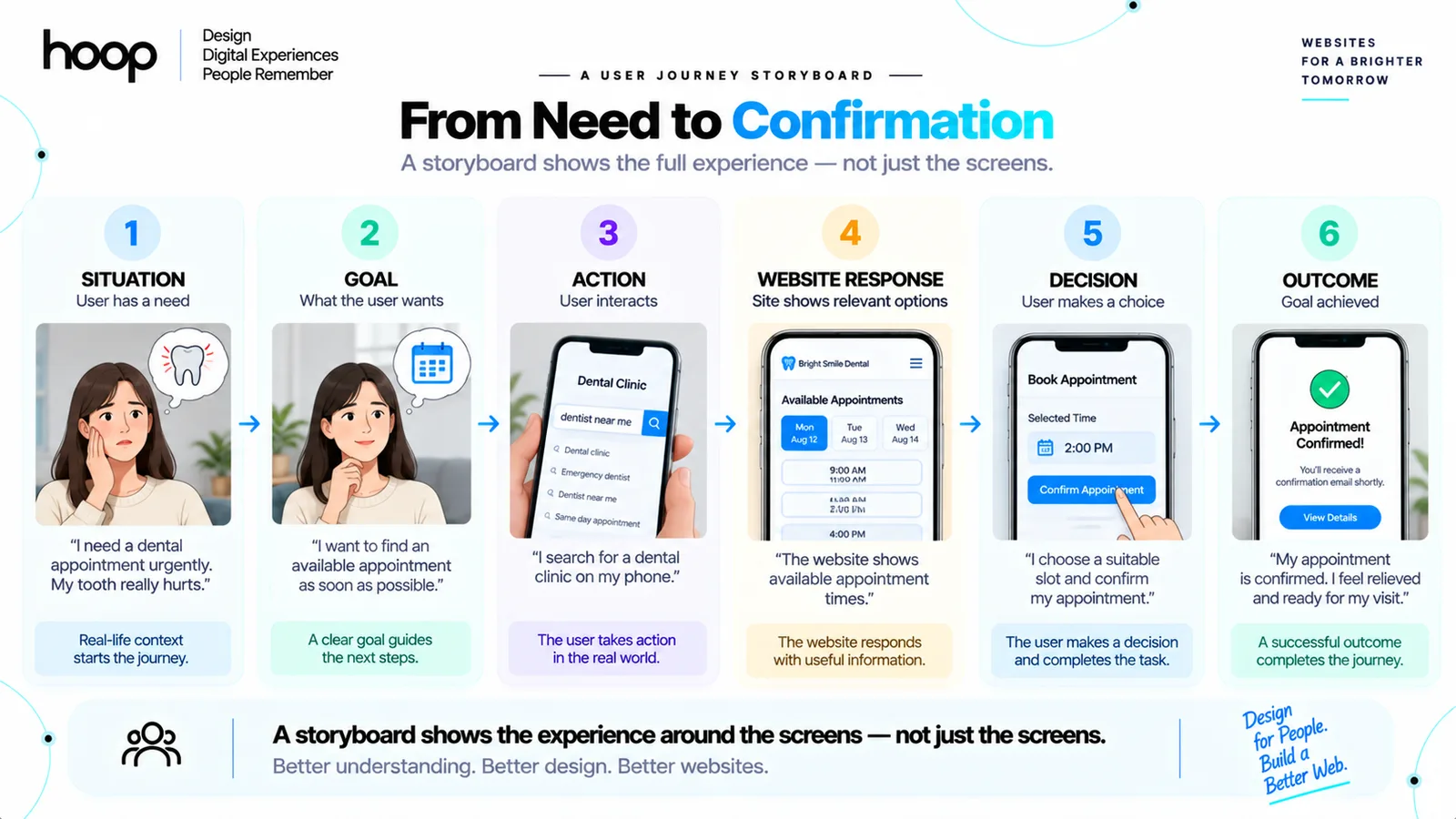
A storyboard shows a user moving through a specific scenario from a starting problem to an outcome. Each frame captures one meaningful moment rather than every possible click.
A useful sequence can follow this structure:
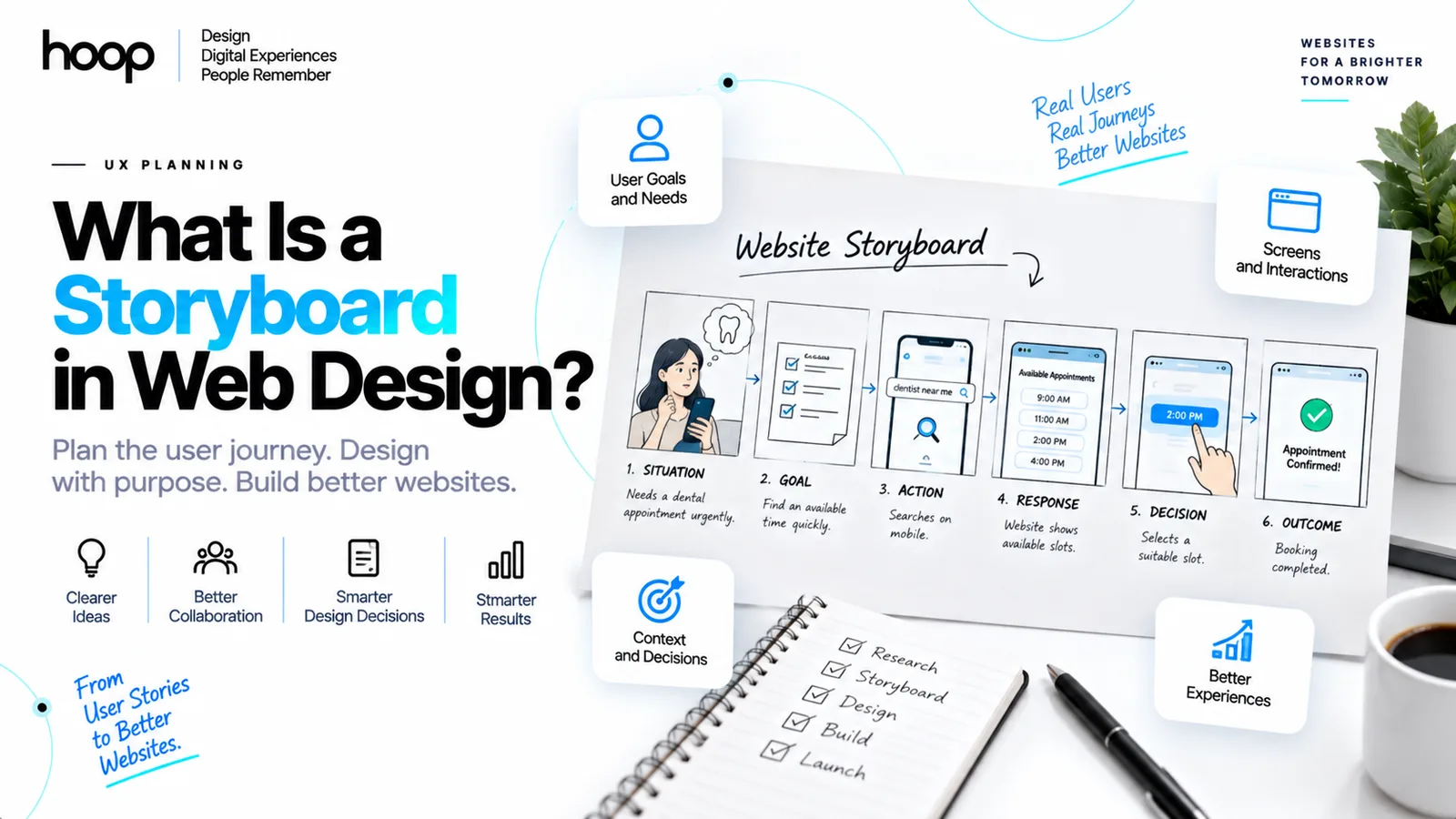
Situation → Goal → Action → Website Response → Decision → Outcome
For example, a patient needs an urgent dental appointment. The patient searches from a phone, opens a clinic website, checks available times, selects a slot, and receives confirmation. The storyboard shows the context around those interactions, not only the website screens.
A storyboard starts with one user and one scenario
A strong storyboard focuses on one situation: who the user is, what the user needs, and what triggers the journey.
A vague scenario such as “someone visits a website” gives the design team little useful information. A specific scenario such as “a parent books a same-day pediatric appointment during a lunch break” exposes time pressure, mobile use, trust needs, and likely interruptions.
Each frame captures a meaningful moment
Each frame should show a change in context, action, decision, or system response. You do not need a frame for every button press.
Useful frames can show discovery, comparison, friction, form completion, and confirmation without forcing viewers to infer missing steps.
Captions explain actions and reactions
Short captions can identify what the user does, sees, expects, or feels. Captions also help stakeholders understand rough drawings without requiring polished illustration.
A caption might say, “Maya cannot find an appointment after work.” Another frame might say, “Maya filters appointments by evening availability.” Those captions connect the user’s need with the interface decision.
Storyboard vs Wireframe: What Is the Difference?
A storyboard explains the user’s experience over time, while a wireframe defines the structure of a page or screen. Both tools can appear in the same project, but each answers a different design question.
| Design artifact | Main question | What it shows | Best use |
|---|---|---|---|
| Storyboard | What is the user experiencing? | Context, actions, reactions, outcomes | Early scenario exploration |
| Wireframe | How should this screen be organized? | Layout, content blocks, controls | Page and screen structure |
| User flow | Where can the user go next? | Steps, decisions, navigation paths | Interaction logic |
| Journey map | What happens across the wider journey? | Stages, touchpoints, pain points | End-to-end experience analysis |
| Prototype | How will the interface behave? | Clickable or interactive screens | Interaction testing |
A storyboard can explain why a shopper abandons checkout after receiving a delivery call. A wireframe can show where the checkout fields and payment controls sit.
If your project needs deeper interface planning, Hoop’s UI UX design services cover research, wireframes, prototypes, and design systems within one workflow.
Storyboard vs User Flow: Which One Should You Use?
Use a storyboard to explain context and use a user flow to explain navigation logic. A complex project often benefits from both.
A user flow might show:
Homepage → Product → Cart → Checkout → Payment → Confirmation
A storyboard adds the surrounding behavior. The shopper discovers the product while commuting, adds the item, gets interrupted, returns later, and completes payment at home.
User flows focus on system decisions
A user flow maps screens, actions, branches, and decision points. Designers use flows to validate navigation and determine which screens the product requires.
A checkout flow can show what happens after a payment fails, a coupon expires, or a user chooses guest checkout. The flow stays focused on product logic.
Storyboards focus on human context
A storyboard includes factors that exist outside the interface. Location, urgency, interruptions, emotions, other people, and device changes can all affect the experience.
That wider context can reveal requirements a screen-only flow misses. A field technician working outdoors needs different interaction decisions from an office worker using the same service.
Storyboard vs Journey Map: How Do They Differ?
A storyboard visualizes one scenario through sequential frames, while a journey map organizes a broader experience into structured stages. Journey maps often cover more touchpoints and a longer period.
A journey map can span awareness through renewal. A storyboard can isolate one moment, such as resolving a failed onboarding payment.
Journey maps organize the wider experience
Journey maps commonly include stages, user goals, touchpoints, frustrations, emotions, and improvement opportunities. Teams use them to identify problems across channels.
A travel journey map can include search, booking, mobile check-in, airport signage, and support across different systems.
Storyboards make one moment concrete
A storyboard turns one part of that journey into visible scenes. Designers can examine where the user is, what happens around the user, and how the website supports the task.
That precision makes storyboards useful when a team needs to communicate a scenario quickly to stakeholders who do not work directly in UX.
Storyboard vs Prototype: Why Are Both Useful?
A storyboard explains the experience before detailed interaction design, while a prototype lets users test the planned interface. The tools belong at different levels of fidelity.
A storyboard can show a traveler losing a booking email at an airport. A prototype can then let the traveler test a booking-recovery flow on a simulated website.
Storyboards test the scenario
A storyboard helps you challenge assumptions before you invest heavily in screen design. The team can ask whether the scenario feels realistic and whether the proposed solution addresses the real problem.
Teams can revise a short sequence quickly while product direction remains uncertain.
Prototypes test the interaction
A prototype lets users click, tap, scroll, enter information, or move between screens. Designers use prototypes to assess interface behavior and usability.
Storyboard vs Mood Board: What Changes?
A mood board defines visual direction, while a storyboard defines a sequence of user events. The 2 artifacts solve different problems.
A mood board contains visual references such as colors, typography, imagery, and textures. A storyboard contains user-experience scenes.
Ask 2 different questions:
- Use a mood board to decide what the website should feel like.
- Use a storyboard to decide what the user should experience.
When Should You Use a Storyboard in Web Design?
Use a storyboard when user context changes the design problem. Storyboarding adds the most value when screens alone cannot explain the full experience.
Strong use cases include appointment booking, ecommerce checkout, account recovery, onboarding, customer support, event registration, location-based services, and multi-device workflows.
Use storyboards for cross-channel experiences
A website journey can extend beyond the browser through QR codes, email, support calls, device changes, or physical locations.
A storyboard lets you show those transitions clearly. The design team can then determine what information each touchpoint must preserve.
Use storyboards for new or unfamiliar products
Storyboards help stakeholders understand unfamiliar product behavior by showing the user, setting, action, interface, and result together.
For browser-based products with deeper account logic, Hoop’s web application development process starts with discovery and UX before architecture and engineering.
Use storyboards to expose hidden assumptions
A storyboard forces the team to show what happens between major steps. Missing scenes often reveal assumptions about connectivity, permissions, authentication, user knowledge, or device availability.
When Do You Not Need a Storyboard?
Skip a storyboard when the user context is simple and another artifact answers the design question faster. Storyboarding should solve a communication problem, not become mandatory paperwork.
A basic five-page brochure site rarely needs detailed storyboards. A sitemap and wireframes can handle simple navigation and content planning.
Skip storyboards for pure layout questions
Use a wireframe when you only need to decide content order, column structure, navigation placement, or component hierarchy.
A storyboard adds unnecessary work if the user scenario has no meaningful context beyond viewing the page.
Skip storyboards when the flow is already clear
Use a user flow when the team already understands the user context and only needs to map decisions or navigation branches.
What Should Each Storyboard Frame Contain?
Each frame should communicate 5 elements: context, goal, action, touchpoint, and outcome. Those elements keep the storyboard focused on the user rather than decorative illustrations.
1. Context
Show where the user is and what circumstances matter. The setting can reveal device constraints, distractions, privacy concerns, or urgency.
2. Goal
State what the user wants at that moment. A clear goal connects each scene to the design problem.
3. Action
Show what the user does. Actions can include searching, scanning, comparing, entering information, contacting support, or switching devices.
4. Touchpoint
Identify the website, mobile screen, email, kiosk, form, or other interface involved. The touchpoint tells the team where design work must support the user.
5. Outcome
Show what changes after the interaction. The outcome can represent success, failure, confusion, delay, or another decision.
How to Create a Storyboard for a Website
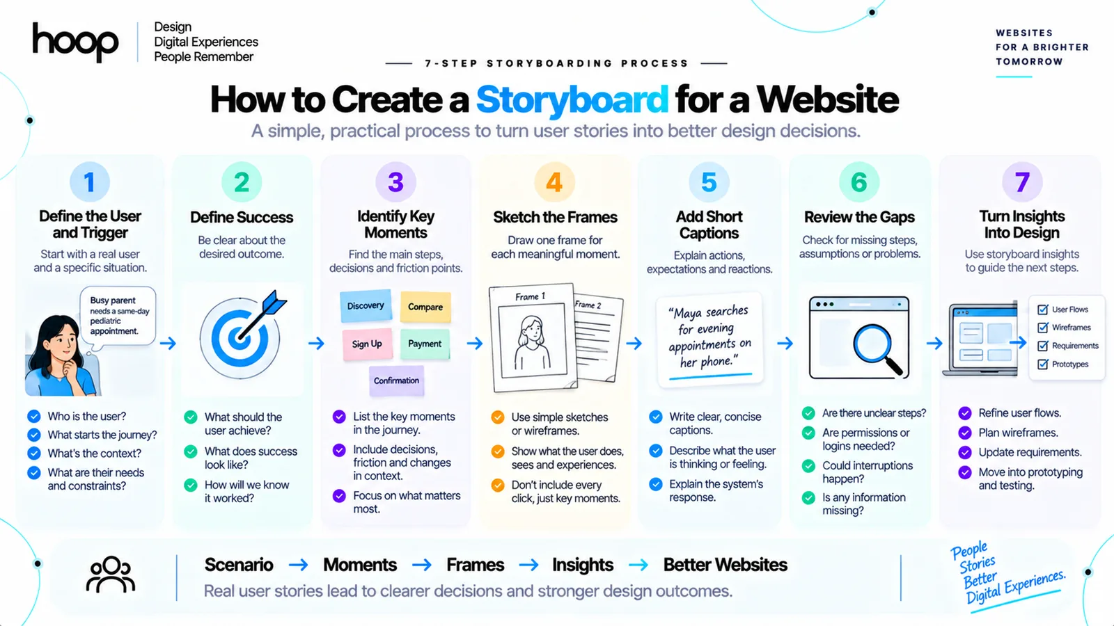
To create a storyboard for a website, define one user scenario, identify the important moments, draw each moment, and validate the sequence. You can start with rough sketches before creating polished visuals.
Step 1: Define the user and trigger
Choose one user and one triggering event. Write the user’s goal in a single sentence.
Example: “Jordan needs to reschedule a delivery while traveling to work.”
Step 2: Define the successful outcome
Decide what success looks like before drawing frames. A clear ending prevents the storyboard from becoming a loose collection of scenes.
Step 3: Identify the key moments
List the moments where context, behavior, or system state changes. Keep the sequence focused on decisions that affect design.
Step 4: Draw one frame per moment
Use stick figures, boxes, screenshots, icons, or simple shapes. Illustration quality matters less than clear communication.
Figma’s UX storyboard guide describes storyboards as early visualizations of a user’s journey through a specific flow.
Step 5: Add short captions
Add one or two short notes explaining the action, environment, expectation, or reaction. Avoid paragraphs inside each frame.
Step 6: Review the gaps
Ask what the storyboard assumes. Check connectivity, device use, permissions, account state, interruptions, and error conditions.
Step 7: Convert findings into design work
Turn the validated scenario into user flows, requirements, wireframes, prototypes, or development tasks. Hoop’s broader software development services connect discovery work with design, engineering, quality assurance, and delivery.
Quick-Reference Storyboarding Workflow
| Task | Timing | Method | Difficulty |
|---|---|---|---|
| Define user and scenario | 10–20 minutes | Write one trigger, goal, and outcome | Easy |
| Map key moments | 15–30 minutes | List context and decision changes | Easy |
| Sketch frames | 30–60 minutes | Use paper, FigJam, or Figma | Medium |
| Add captions | 10–20 minutes | Explain action and reaction | Easy |
| Review assumptions | 20–40 minutes | Walk through the sequence with the team | Medium |
| Convert to UX artifacts | 30–90 minutes | Create flows, wireframes, or requirements | Medium |
What Tools Can You Use for Website Storyboarding?
You can create useful storyboards with simple drawing tools or collaborative UX platforms.
Common options include Figma, FigJam, Miro, PowerPoint, Canva, whiteboards, tablets, and paper.
Figma and FigJam support design collaboration
Figma suits storyboards that include interface references. FigJam suits workshops, rough sequences, comments, and collaborative mapping.
Miro works well for workshop-based storyboards
Miro lets distributed teams combine research notes, journeys, flows, and storyboard frames on one collaborative canvas.
Paper works well for early exploration
Paper keeps early ideas flexible and easy to redraw during workshops.
How Does Storyboarding Fit Into the Web Design Process?
Storyboarding usually fits after user research and before detailed wireframes or prototypes.
A practical sequence is:
Research → User Problem → Storyboard → User Flow → Wireframe → UI Design → Prototype → Development
Research gives the storyboard evidence
Interviews, support logs, usability tests, and stakeholder input can reveal which real or plausible situations deserve visualization.
Storyboards inform interface requirements
A frame showing a user switching from desktop to phone creates a continuity requirement. A frame showing poor connectivity creates an error-handling or persistence requirement.
Design systems follow later
Storyboards should not lock teams into colors, component styles, or final spacing. Detailed visual systems belong later, after the team understands the interaction problem.
Hoop’s guide to modern website design explains how research, interface systems, accessibility, and testing work together after early planning.
What Are Common Storyboarding Mistakes?
The biggest mistakes come from treating the storyboard as either a page map or a polished illustration project. A good storyboard exists to expose user context and design assumptions.
Mistake 1: Drawing screens without the user
A row of website screenshots shows screens, not necessarily a user experience. Include the user situation when the context changes the design problem.
Mistake 2: Showing every click
Too many frames hide the moments that matter. Focus on context changes, decisions, friction, and outcomes.
Mistake 3: Designing the final UI too early
Detailed styling can distract from the scenario. Keep early frames simple enough to invite change.
Mistake 4: Ignoring failure states
Perfect journeys hide requirements. Include failures, poor connectivity, interruptions, and permission denial when those events affect the product.
Mistake 5: Using storyboards on every project
A storyboard should earn its place. Use a wireframe, user flow, journey map, or prototype when one of those tools answers the question more directly.
Can AI Help Create UX Storyboards?
Yes. AI can speed up storyboard illustration, but designers still need to define the scenario and validate the experience.
AI can generate rough environments, characters, alternate scenes, and visual variations for designers to refine.
See the Situation Before You Commit to Screens
A storyboard helps you see the user’s situation before you commit to screens. The strongest storyboards expose context, decisions, friction, and outcomes that wireframes alone cannot show.
Use storyboarding when the surrounding experience changes the design problem. Skip it when a simpler artifact answers the question faster. If you need a team to turn complex user journeys into clear digital experiences, explore Hoop’s web design services.
“A row of website screenshots shows screens, not necessarily a user experience.”
Key takeaways
- 01One user, one scenario, one triggering event — vague scenarios teach a team nothing.
- 02Each frame marks a change in context, decision, or system response, not every click.
- 03Storyboards explain context; user flows explain navigation logic. Complex projects use both.
- 04Skip the storyboard when a sitemap, wireframe, or flow answers the question faster.
Written by
Sahar
Content Writer
Frequently Asked
Questions
Everything you need to know before booking a strategy call. Can't find your answer? Contact us directly.
No. A storyboard shows the user’s experience across time. A wireframe shows the structure and content of a specific page or screen.
No. Simple websites can use sitemaps and wireframes. Storyboards add more value when user context, multiple touchpoints, or unfamiliar behavior matters.
Use enough frames to show every meaningful change in context, action, or outcome. A focused scenario often works well with 5–8 frames.
Yes. Figma and FigJam support sketches, screenshots, captions, components, comments, and collaborative storyboard reviews.
No. Early storyboards should prioritize user context and sequence. Final visual design belongs in later UI mockups and prototypes.