
What Is Good Web Design? Usability That Wins More Leads
Good web design combines clear purpose, useful content, intuitive navigation, responsive layouts, accessibility, speed, trust, and measurable results — judged by how confidently people can understand and use the site, not by how many effects it has.
Sahar
Content Writer
Good web design makes a website easy to understand, easy to use, and effective at achieving its purpose. It combines useful content, clear structure, accessible interactions, responsive layouts, reliable performance, and a visual style that supports the brand. A beautiful page may attract attention, but a well-designed website also helps visitors know where they are, what the business offers, and what to do next.
This distinction matters because people do not visit most business websites to admire the interface. They arrive with a goal. They may want to compare a service, check a price, read proof, make a purchase, book a call, or solve a problem. Good website design reduces the effort between that goal and a successful outcome.
Good Web Design Begins With Purpose
Before choosing colours, fonts, images, or animations, a design team should define the website’s purpose. A portfolio must showcase work. An online shop must help customers find and buy products. A SaaS website must explain the product, demonstrate value, and move qualified visitors toward a trial or demo. A service-business website must turn a visitor’s uncertainty into enough confidence to enquire.
The same layout cannot serve every business equally well. A design is effective only when it fits the audience, the offer, the buying journey, and the desired action. This is why professional web design starts with research and planning rather than decoration.
A useful design brief answers four questions:
- Who will use the website?
- What information or task matters most to those users?
- What action should the website make easier?
- How will the business know that the design is working?
These answers create a decision filter. A visual element, page section, or feature belongs only if it helps the user or supports the website’s goal.
The 12 Principles of Good Web Design
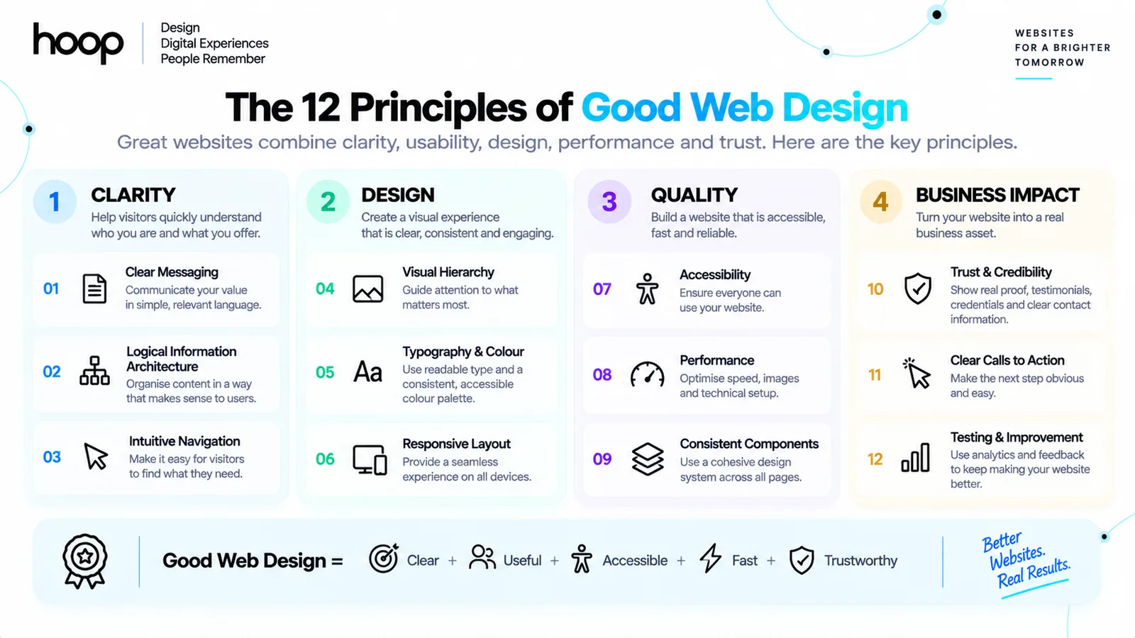
1. Clear messaging
Visitors should quickly understand what the website is about and why it is relevant to them. The headline should communicate the main value, while the supporting copy should explain who the offer is for and what problem it solves. Vague slogans force users to interpret the business for themselves. Clear language reduces that uncertainty.
Each page also needs its own purpose. Someone arriving from a search engine may never see the homepage, so a service page or article should provide enough context to stand on its own. Clear headings, concise introductions, descriptive links, and logical next steps help new visitors orient themselves.
2. Logical information architecture
Information architecture determines how pages and content relate to one another. A well-organised site groups related information, uses familiar labels, and creates predictable paths. Users should not need to guess whether pricing sits under “Solutions,” “Resources,” or “Company.” Labels should reflect the words customers understand.
A simple sitemap often reveals problems before visual design begins. It can show duplicate pages, missing information, overly deep navigation, and unclear relationships between services. Good structure also supports search visibility because important pages receive clear internal links and topical context.
3. Intuitive navigation
Navigation should answer three questions: Where am I? What can I find here? Where can I go next? Consistent menus, descriptive link text, breadcrumbs where appropriate, and a visible route back to key pages all help. The best navigation feels unsurprising because it follows users’ expectations.
More menu choices do not automatically create more freedom. Too many options increase decision effort and can hide the pages that matter. Prioritise the most important destinations, group secondary links logically, and make the mobile menu comfortable to operate. Clear website navigation is a functional requirement, not a finishing touch.
4. Strong visual hierarchy
Visual hierarchy tells users what to notice first, second, and third. Designers create it through scale, contrast, alignment, spacing, placement, and repetition. A clear page usually has one dominant heading, supporting information, distinct section titles, readable body copy, and an obvious primary action.
When every element is large, bright, animated, or bold, nothing feels important. Good hierarchy uses emphasis selectively. White space separates ideas, consistent alignment creates order, and restrained styling makes important content easier to scan.
5. Readable typography and purposeful colour
Typography must support reading before it expresses personality. Body text needs a comfortable size, sufficient line spacing, sensible line length, and clear contrast with the background. A limited type system — often one family or a carefully paired combination — creates greater consistency than several decorative fonts.
Colour should guide attention and reinforce meaning. A small, controlled palette usually works better than many competing colours. Buttons, links, warnings, and status messages should remain recognisable, and colour should not be the only way information is communicated. Brand expression matters, but readability and comprehension come first.
6. Responsive, mobile-friendly design
A responsive website adapts to different screen sizes and input methods. It does more than shrink a desktop page. Content may need to reflow, navigation may need a different pattern, touch targets need adequate space, and images must scale without causing horizontal scrolling.
A strong mobile-friendly design preserves the page’s priorities. The core message, primary action, and essential information should remain easy to find on a small screen. Testing should cover common viewport sizes as well as zoom, text enlargement, keyboard use, portrait and landscape orientation, and real content lengths.
7. Accessibility from the beginning
Accessible design allows more people to perceive, understand, navigate, and interact with a website. It should be part of planning, design, development, content, and testing — not a correction added just before launch.
Important practices include sufficient colour contrast, visible keyboard focus, descriptive headings, labelled form fields, meaningful link text, text alternatives for informative images, captions where needed, and controls that work without a mouse. The W3C Web Accessibility Initiative also recommends consistent navigation, clear feedback, logical grouping, and layouts designed for different viewport sizes.
Accessibility improves the experience for people with disabilities, but its benefits extend further. Captions help users in noisy environments. Strong contrast helps on bright screens. Clear labels reduce mistakes. Keyboard support assists users with temporary injuries as well as those who rely on assistive technology.
8. Fast and stable performance
A design is not successful if it looks polished but feels slow. Large images, excessive scripts, heavy video backgrounds, complex animations, and poorly loaded fonts can delay content and make interactions frustrating. Performance must influence design decisions from the start.
Good website performance means that meaningful content appears promptly, controls respond quickly, and the layout does not jump unexpectedly while loading. Designers and developers should work together to optimise media, reserve space for visual elements, reduce unnecessary code, and test on realistic devices and connections. The same principle applies to web applications, where responsiveness affects both usability and perceived product quality.
9. Consistent components and interaction patterns
Buttons, forms, cards, icons, headings, spacing, and feedback states should follow a coherent system. If the same visual treatment means “primary action” on one page and “secondary option” on another, users must relearn the interface. Consistency makes a website feel easier because previous interactions help people predict new ones.
A design system documents these choices so teams can build new pages without creating visual drift. It also speeds development and makes responsive behaviour, accessibility, and brand standards easier to maintain. Consistency should not create monotony; it creates a dependable foundation for purposeful variation.
10. Trust and credibility
Visitors look for signals that a business is real, capable, and safe to engage with. Clear contact details, accurate service information, genuine work samples, relevant testimonials, transparent policies, secure forms, and professional writing all contribute to trust. Broken links, vague claims, stock-like testimonials, and inconsistent branding weaken it.
Trust elements should appear where doubt is likely to arise. A case study can support a service claim. Delivery information belongs near a purchase decision. Security and privacy explanations belong near forms that request personal data. In ecommerce development, product clarity, checkout usability, payment confidence, and transparent fulfilment information are all part of the design experience.
11. Clear calls to action
A call to action tells a visitor what they can do next. Its wording should describe the action, and its visual treatment should make its importance clear. “Book a consultation,” “View pricing,” and “Start a free trial” are usually more informative than a generic “Learn more.”
Not every visitor is ready for the same commitment. A good page may provide one primary action and one lower-friction alternative, such as viewing a case study or reading implementation details. Conversion-focused web design guides decisions without turning every section into a sales pitch.
12. Testing and continuous improvement
Design teams cannot reliably predict every user response. Testing reveals whether people understand labels, notice key information, complete tasks, and recover from errors. Useful methods include moderated usability sessions, prototype testing, accessibility checks, analytics review, form analysis, performance monitoring, and controlled experiments.
Feedback should lead to focused changes rather than constant cosmetic redesign. If users abandon a form, investigate its questions, error messages, mobile layout, and technical reliability. If a service page attracts visitors but few enquiries, examine message clarity, proof, intent alignment, and the next step. Good design becomes stronger through evidence.
What Good Web Design Is Not
Several common shortcuts confuse appearance with quality. Trends can provide inspiration, but they are not universal solutions. A design may look modern in a gallery and still fail on a working business website.
| Common assumption | Why it fails | Better principle |
|---|---|---|
| More animation means better design | Motion can distract, delay content, and create accessibility problems. | Use motion only when it explains change, supports feedback, or guides attention. |
| Everything important must sit above the fold | Crowding the first screen weakens hierarchy and makes the message harder to scan. | Lead with the essential value and create a clear reason to continue. |
| Minimal design means very little content | Removing necessary explanation leaves visitors with unanswered questions. | Remove clutter while preserving the information needed for a decision. |
| Following trends makes a site modern | Trends may not fit the audience, brand, content, or technical constraints. | Choose patterns according to user needs and business purpose. |
| A finished mock-up proves the design works | Static screens cannot reveal every interaction, device, content, or accessibility issue. | Prototype, build, test, measure, and improve. |
A Practical Good Web Design Process
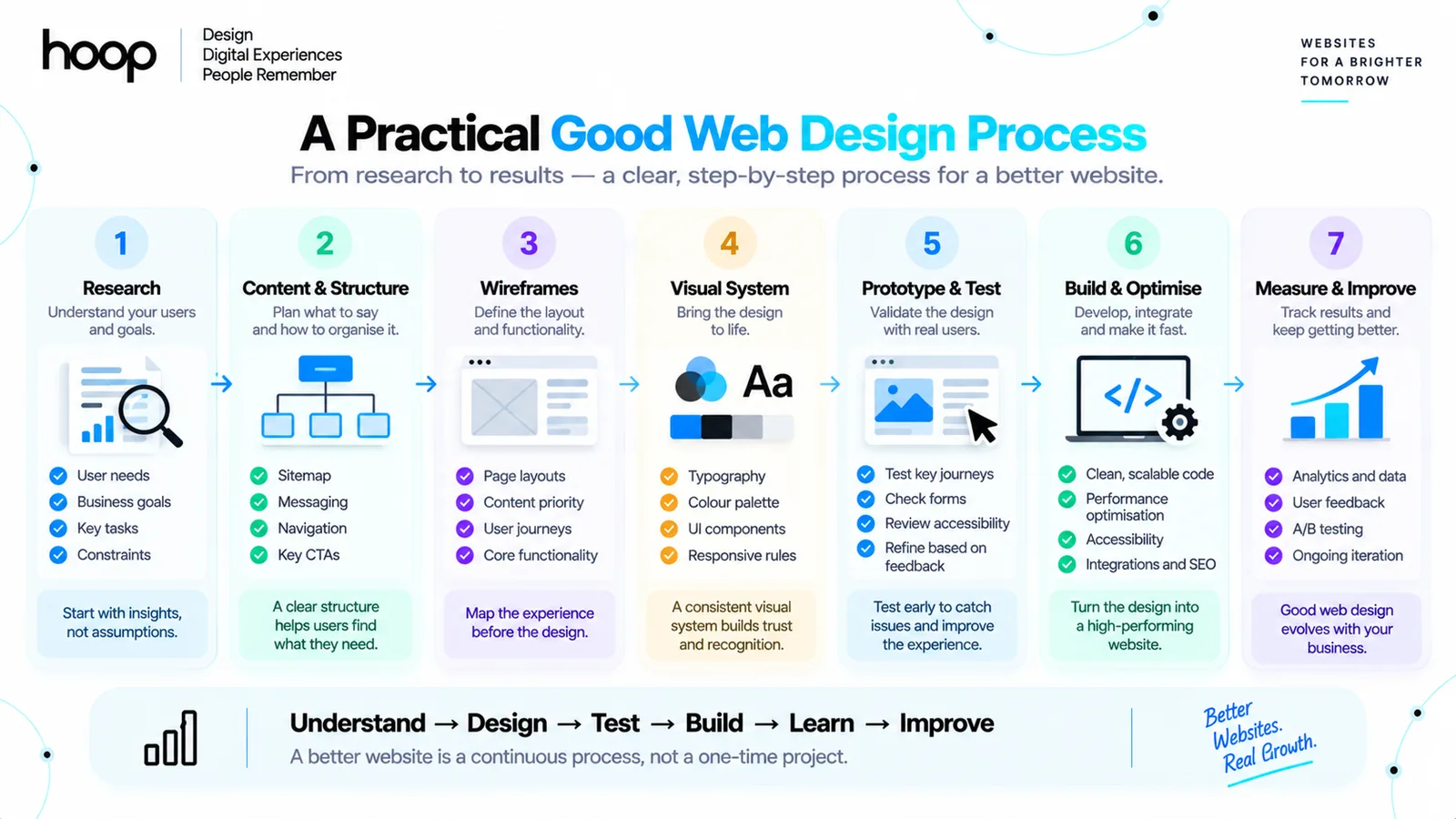
Good results are easier to repeat when the team follows a clear process. The exact activities vary by project, but the sequence should move from understanding the problem to validating the solution.
| Stage | Main purpose |
|---|---|
| 1. Research | Define business goals, user groups, common tasks, content needs, constraints, competitors, and current performance. |
| 2. Content and structure | Plan the sitemap, page purpose, key messages, proof, navigation, and calls to action. |
| 3. Wireframes | Arrange content and functionality in low-detail layouts before committing to visual styling. |
| 4. Visual system | Set typography, colour, spacing, components, imagery, interaction states, and responsive rules. |
| 5. Prototype and test | Test priority journeys, labels, forms, content order, keyboard access, and different screen sizes. |
| 6. Build and optimise | Translate the approved design into maintainable code, optimise performance, and preserve accessibility. |
| 7. Measure and improve | Review behaviour and outcomes after launch, then prioritise changes based on evidence. |
For complex products, this process should align with the broader software development lifecycle. Design decisions affect architecture, content management, analytics, integrations, quality assurance, maintenance, and the cost of future change.
How to Tell Whether a Website Design Is Good
A design should be judged against its purpose rather than personal taste alone. Start with task-based questions: Can a new visitor explain what the organisation offers? Can a user find the right service? Can a customer complete the main action on mobile? Can a keyboard user reach and operate every control?
Then review measurable outcomes. Depending on the website, relevant indicators may include qualified enquiries, completed purchases, trial registrations, task success, form completion, search usage, repeat visits, performance data, error rates, and customer support questions. A single metric rarely tells the full story, so combine behavioural data with user feedback and technical checks.
Use this short evaluation checklist:
- The website has a clearly defined audience and purpose.
- Each important page communicates its topic and next step quickly.
- Navigation labels are familiar, descriptive, and consistent.
- Headings, spacing, colour, and typography create a clear hierarchy.
- The design works across mobile, tablet, desktop, zoom, and text enlargement.
- Content and controls meet accessibility requirements.
- Pages load promptly, respond quickly, and remain visually stable.
- The interface uses consistent components and feedback states.
- Claims are supported by credible, relevant trust signals.
- Primary user journeys are tested and measured after launch.
Good Web Design Versus Great Web Design
Good design removes friction and helps users complete their goals. Great design does that while expressing a distinctive brand, adapting intelligently to context, and supporting the business as it grows. It balances familiarity with character. Users can recognise common patterns, yet the experience still feels specific to the organisation.
Great design also accounts for the whole system. The public-facing page, content workflow, data, integrations, analytics, and ongoing maintenance work together. This broader view is central to custom software development, where the interface is one part of a dependable digital product.
Build a Website That Works for Users and Business
So, what is good web design? It is the disciplined combination of user needs, business purpose, clear content, accessible interaction, responsive behaviour, reliable performance, and thoughtful visual communication. Its value is not measured by how many effects appear on the page. It is measured by how confidently people can understand, trust, and use the website.
Hoop Interactive designs digital experiences around real goals, from research and UX planning to responsive design, development, performance, and conversion. Explore our complete digital services or speak with our team about creating a website that supports your users and drives meaningful business results.
“People do not visit most business websites to admire the interface. They arrive with a goal.”
Key takeaways
- 01Purpose comes before palette: a brief that answers who, what, which action, and how you will know.
- 02Visual hierarchy fails when everything is emphasised.
- 03Accessibility and performance are design decisions, not post-launch corrections.
- 04A finished mock-up proves nothing — prototype, build, test, measure, improve.
Written by
Sahar
Content Writer
Frequently Asked
Questions
Everything you need to know before booking a strategy call. Can't find your answer? Contact us directly.
Good web design creates a website that is clear, useful, attractive, accessible, fast, and easy to use. It helps visitors find information and complete important actions without confusion.
The most important elements are clear purpose, relevant content, logical structure, intuitive navigation, strong visual hierarchy, responsive layouts, accessibility, fast performance, consistency, trust, and clear calls to action.
It needs to feel clear, but it does not have to look plain. A visually rich website can still be easy to use when its content, interactions, and priorities remain understandable. Simplicity means removing unnecessary complexity, not removing personality.
Design affects whether visitors understand the offer, trust the business, notice the next step, and complete it without friction. Clear messaging, relevant proof, usable forms, and visible calls to action can support more qualified enquiries or sales.
A website cannot be considered well designed if people cannot perceive its content or operate its controls. Accessibility expands usable access and often improves clarity, navigation, readability, and error prevention for everyone.
Update the website when user needs, business goals, content, technology, brand requirements, or evidence show that change is necessary. Continuous improvement is usually more useful than redesigning on a fixed schedule simply to follow visual trends.
Keep reading
All articles →
What Is a Hero in Web Design? Create Clearer Pages
Sep 11, 2026 · 9 min read
What Is an Eyebrow in Web Design? Stronger Hierarchy
Sep 11, 2026 · 9 min read