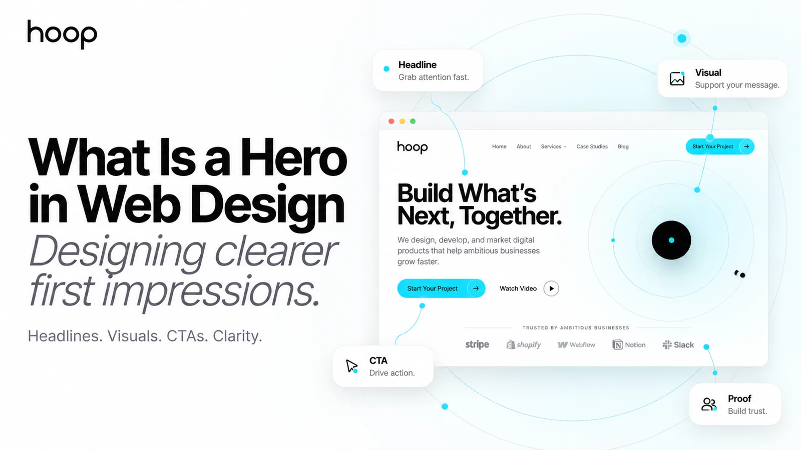
What Is a Hero in Web Design? Create Clearer Pages
A hero is the prominent opening section of a webpage. It introduces the main value through a headline, supporting copy, a call to action, and a visual — and it should be judged on clarity, accessibility, and speed rather than size.
Sahar
Content Writer
A hero in web design is the prominent opening section near the top of a webpage. It usually combines a headline, supporting message, call to action, and visual element to explain what the page offers and guide visitors toward the next step.
The hero is often the first substantial content a visitor sees after the site navigation. That makes it important, but not magical. A strong hero can establish relevance and direction within seconds. It cannot rescue weak positioning, confusing pricing, thin proof, or a frustrating experience farther down the page.
The best hero sections are not necessarily the largest or most dramatic. They are the ones that help the right visitor understand where they have arrived, what value is available, and what to do next.
What Is a Hero Section on a Website?
A hero section is a high-priority content area placed at or near the beginning of a homepage, landing page, product page, or campaign page. It may fill the screen, occupy a shallow horizontal band, or use a split layout with text on one side and an image on the other.
The word “hero” developed from the idea of a hero image or hero shot: the dominant visual given the most attention in advertising and editorial design. Modern web heroes do not always contain a photograph. The “hero” can be a product interface, illustration, animation, video, typography-led composition, or even a simple text block.
What defines it is not one particular layout. It is the section’s role as the page’s main introduction and visual focal point.
Hero Section vs Header vs Banner
These terms are often used interchangeably, but they describe different parts of a page.
| Element | Main purpose | Typical content | Common behavior |
|---|---|---|---|
| Header | Site-wide navigation | Logo, menu, search, account access | Usually repeats across pages |
| Hero | Introduces the page’s main value | Headline, copy, CTA, visual or proof | Changes according to page purpose |
| Banner | Announces a focused message | Promotion, alert, deadline, or update | Often temporary or dismissible |
| Above the fold | Describes a viewport area | Whatever appears before scrolling | Varies by screen size and device |
| Carousel | Rotates multiple panels | Several messages, offers, or images | Changes automatically or through controls |
What Should a Hero Section Accomplish?
A hero should answer three questions quickly: What is this? Why should I care? What can I do next? The exact language depends on how much a visitor already knows. Someone arriving from a branded search may need confirmation. Someone arriving from an advertisement needs continuity with the promise that earned the click. A visitor discovering an unfamiliar product needs more explanation.
A hero commonly supports one of two useful paths. The first is immediate action: a confident visitor clicks, books, buys, starts, or signs up. The second is informed exploration: the visitor understands enough to keep scrolling and evaluate the offer. Both are legitimate outcomes. Expecting every visitor to convert from the opening screen ignores how considered decisions are made.
The Essential Elements of a Good Website Hero
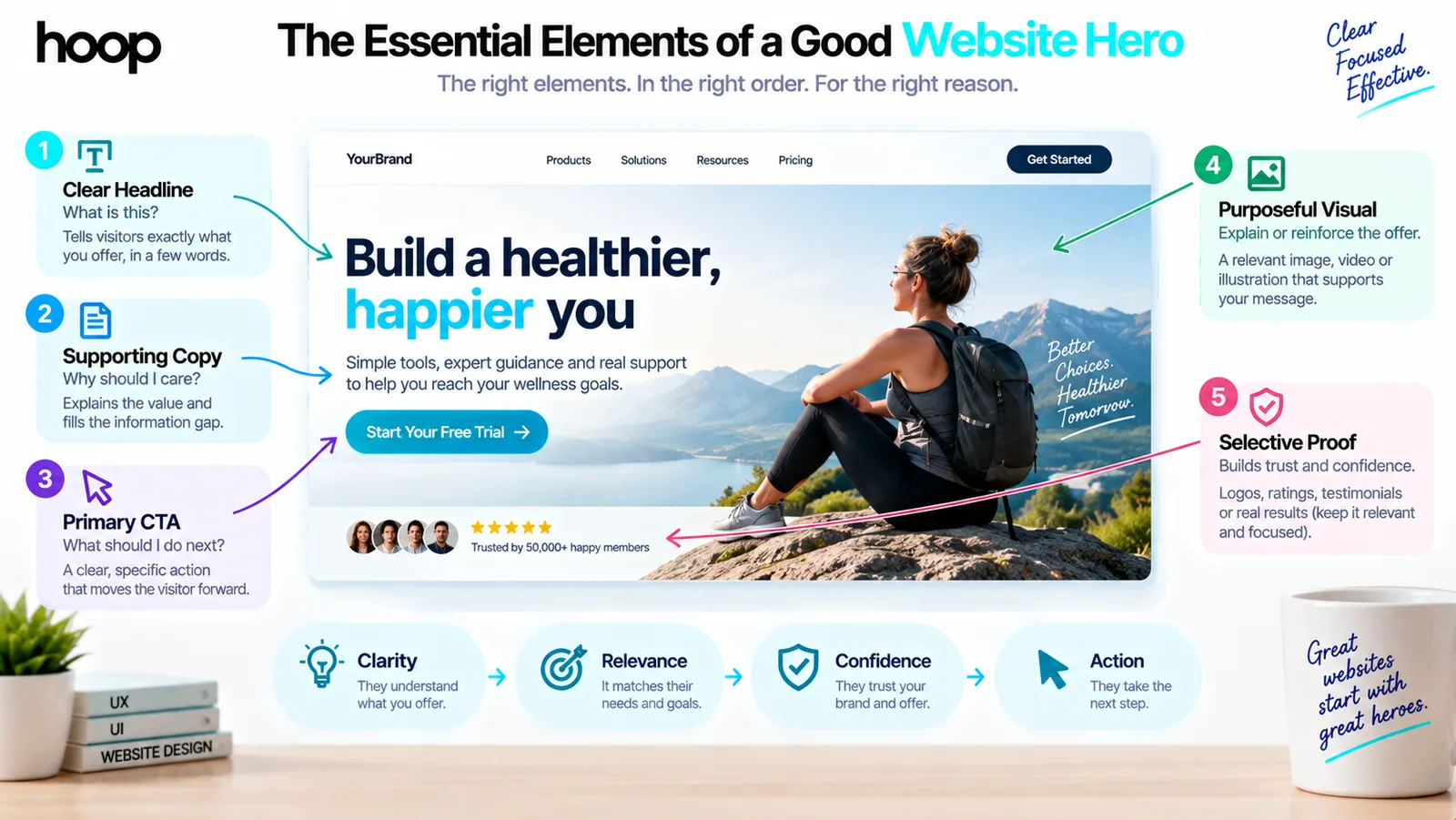
A clear, specific headline
The headline carries the core proposition. It should tell visitors what the company, product, or page makes possible without forcing them to decode a slogan. “Move work forward” may sound polished, but it does not identify the product or outcome. “Plan construction projects without losing track of costs” gives the visitor something concrete.
Clarity does not require dull copy. A strong headline can still have personality, but the meaning should survive without the visitor reading every supporting line.
Supporting copy that closes the information gap
The subheading explains the headline with enough detail to establish fit. It may identify the audience, method, product category, or differentiator. Avoid repeating the headline in longer words. Use this space to answer the most immediate question the headline creates.
One primary call to action
The main button should describe a meaningful next step, such as “Book a strategy call,” “Start free,” or “View the platform.” Generic labels such as “Submit” or “Click here” provide less confidence. A secondary action can help visitors who are not ready for the primary commitment, but both buttons should not compete with equal weight.
This hierarchy is particularly important in conversion-focused landing page design, where every element should support the same campaign goal.
A visual that explains or reinforces the offer
The visual should help visitors understand, desire, or trust the offer. A product screenshot can reveal how software works. A well-directed photograph can show the service in context. An illustration can simplify an abstract process. If the visual is generic decoration that could belong to any competitor, it is occupying premium space without contributing much.
Selective proof
A short customer quote, recognized client logos, a rating, or a verifiable performance fact can reduce uncertainty. Proof is not mandatory in every hero. Add it when trust is a major barrier and the evidence remains readable. Dense logo walls, several statistics, review badges, and multiple claims can make the opening feel crowded.
Popular Types of Hero Sections
Hero sections are often named by their layout or dominant medium rather than by a strict industry taxonomy. A split hero places copy and CTA beside a visual. A centered hero stacks content around a central axis and works well for a concise message. A full-screen hero fills most or all of the initial viewport, often for campaigns where atmosphere matters.
A product-led hero makes the interface, dashboard, or device mockup the primary visual. A video hero uses motion to demonstrate an experience, while a typography-led hero relies on message and type scale rather than imagery. Ecommerce sites may use a promotional hero featuring a collection or seasonal campaign.
No format is universally superior. The correct type depends on the content, visitor intent, available assets, and the action the page must support. A robust UI and UX design process selects the layout after clarifying those factors.
How Important Is the Hero Section for Conversions?
The hero matters because it is highly visible and shapes the visitor’s first interpretation. A confusing opening can create a poor scent trail: users may not know whether the page matches what they searched for or clicked. A clear hero reduces that uncertainty.
However, the claim that a hero alone can transform conversion performance should be treated carefully. Visitors may hesitate at pricing, abandon a form, distrust unsupported claims, or discover that the product does not meet their needs. Improving the hero while ignoring these problems can produce little change.
The right approach is to evaluate the complete journey. Use analytics to see where visitors leave, session recordings to observe behavior, and usability tests to learn what people misunderstand. A professional UX audit can separate an opening-message problem from friction elsewhere in the funnel.
Common Hero-Section Mistakes
Trying to say everything at once
Several headlines, long paragraphs, multiple badges, five buttons, and a complex illustration force visitors to make too many decisions. The hero should introduce the value and route the next step, not reproduce the entire page.
Using a vague slogan as the main message
Language such as “The future starts here” or “Innovation reimagined” can apply to almost any brand. If the visitor cannot tell what is offered, cleverness has displaced communication.
Making the hero unnecessarily tall
A full-screen hero can be effective when immersion is part of the experience. Used by default, it may hide useful proof and product information below the fold. The goal is not to force a scroll; it is to create a clear path through the page.
Relying on a rotating carousel
Carousels ask several messages to share the same priority. Visitors may miss later slides, controls can be inaccessible, and automatic movement can distract from reading. If several offers are equally important, the information architecture may need work rather than another slide.
Choosing imagery before defining the message
Starting with an attractive stock image often leads to copy being squeezed around a visual that has no strategic role. Establish the proposition, hierarchy, and action first. Then choose an image that strengthens them.
Designing only for the desktop mockup
A dramatic composition may collapse on a narrow screen. Headlines wrap, people in photographs are cropped, buttons move below the fold, and text overlays lose contrast. Responsive behavior should be designed intentionally, not left to development. Hoop’s guide to responsive website development explains how layouts must adapt across devices.
Hero Images, Performance, and Core Web Vitals
A large hero image is frequently the largest visible element in the initial viewport, which means it can become the page’s Largest Contentful Paint element. LCP measures when the largest visible image or text block renders. A beautiful but heavy hero can therefore make the page feel slow.
Serve appropriately sized responsive images, use efficient formats, declare image dimensions to reduce layout shift, and avoid downloading desktop-sized assets on mobile. Critical hero images should be discoverable early; they generally should not be delayed through below-the-fold lazy-loading behavior. Decorative animations and background videos need especially careful testing on slower devices and connections.
Performance should be considered during web design and development, because late optimization often forces compromises after the layout has already been approved.
Accessibility Considerations for Hero Sections
Text over photography must remain readable across the entire responsive crop. WCAG guidance sets a minimum contrast ratio of 4.5:1 for normal text, with specific exceptions, but a transparent overlay does not automatically guarantee that ratio. Test the actual combinations used at each breakpoint.
Informative hero images need text alternatives that communicate their relevant purpose. Purely decorative images should not create redundant announcements for screen-reader users; W3C guidance explains how decorative images can use an empty alternative or, where appropriate, be implemented through CSS.
Keep the main headline as real text rather than baking it into an image. Provide visible keyboard focus for calls to action, maintain a logical heading structure, avoid uncontrolled motion, and make video controls usable. If background video carries meaningful information, users need an accessible equivalent. Our guide to accessibility in web design covers these requirements in more depth.
How to Test Whether Your Hero Is Working
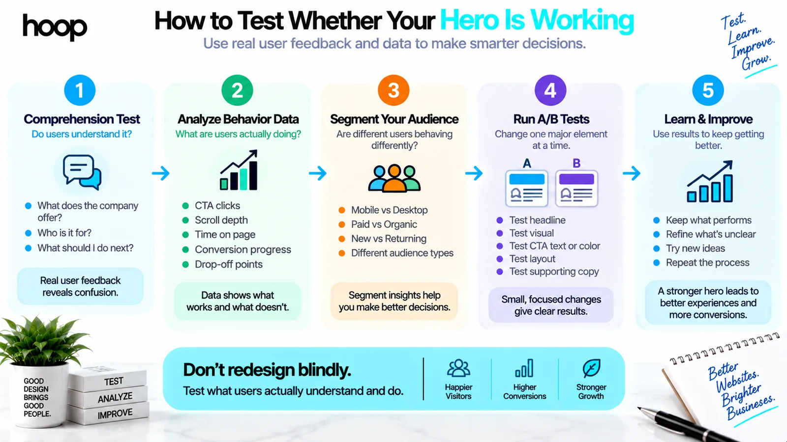
Begin with comprehension, not preference. Show the page to representative users for several seconds, then ask what the company offers, who it appears to serve, and what action they would take next. If answers vary widely, the message or hierarchy is unclear.
Use analytics to compare CTA clicks, scroll depth, and progress toward the page’s real conversion. Segment results by device and traffic source because a mobile social visitor may behave differently from a desktop visitor arriving through branded search. A/B tests can compare a meaningful hypothesis, such as a product-specific headline against a broad brand message.
Do not change the headline, image, CTA, proof, and layout at the same time if you need to understand what caused the result. Testing should reduce uncertainty, not simply crown whichever design received slightly more clicks during a short run.
A Practical Hero-Section Checklist
- The headline explains the central value in language the audience understands.
- Supporting copy adds information instead of repeating the headline.
- The primary CTA states a clear, relevant next step.
- The visual reinforces the offer and adapts properly on mobile.
- Text remains readable and interactive elements remain accessible.
- The hero loads quickly without delaying critical content.
- The next section naturally continues the story and provides proof.
A Confident Beginning, Not the Whole Argument
A hero in web design is the leading content section that introduces a page’s primary message and directs the visitor toward action or further exploration. It often contains a headline, supporting copy, CTA, and visual, but none of those elements should be added automatically.
An effective hero makes the page easier to understand. It is specific, focused, responsive, accessible, and fast. It creates a confident beginning while allowing the rest of the page to do the deeper work of explaining, proving, and converting.
If your current hero looks impressive but leaves visitors uncertain, Hoop can help align the message, interface, and journey. Explore our website redesign services to build a clearer opening and a stronger experience beyond it.
“A strong hero can establish relevance within seconds. It cannot rescue weak positioning, confusing pricing, or thin proof.”
Key takeaways
- 01A hero answers three questions fast: what is this, why care, what next.
- 02A vague slogan in the headline is the most common and most expensive mistake.
- 03The hero image is often the LCP element — size it, format it, and do not lazy-load it.
- 04Test comprehension before preference; change one element at a time.
Written by
Sahar
Content Writer
Frequently Asked
Questions
Everything you need to know before booking a strategy call. Can't find your answer? Contact us directly.
A hero is the prominent opening section of a webpage. It introduces the main value through a headline, supporting text, CTA, visual, or a purposeful combination of these elements.
The term comes from the “hero image” or dominant visual given primary attention in advertising and editorial layouts. In web design, it now refers to the leading section even when no photograph is used.
No. Every page needs a clear introduction, but it does not need an oversized visual treatment. Utility pages, dashboards, directories, and content-heavy sites may benefit from a compact page header instead.
Most heroes need a clear headline and logical next step. Supporting copy, imagery, proof, and secondary actions should be included only when they improve understanding or confidence.
There is no universal height. It should create adequate emphasis without unnecessarily hiding the next useful content. Test it across real mobile and desktop viewports.
Often, a single focused message performs better because rotating sliders divide attention and later slides may be missed. A carousel should have a strong content reason, accessible controls, and user-friendly motion behavior.
A hero image that becomes the LCP element is usually critical to the initial view and should be discovered early. Lazy loading is more appropriate for offscreen images, while implementation should be validated with performance testing.