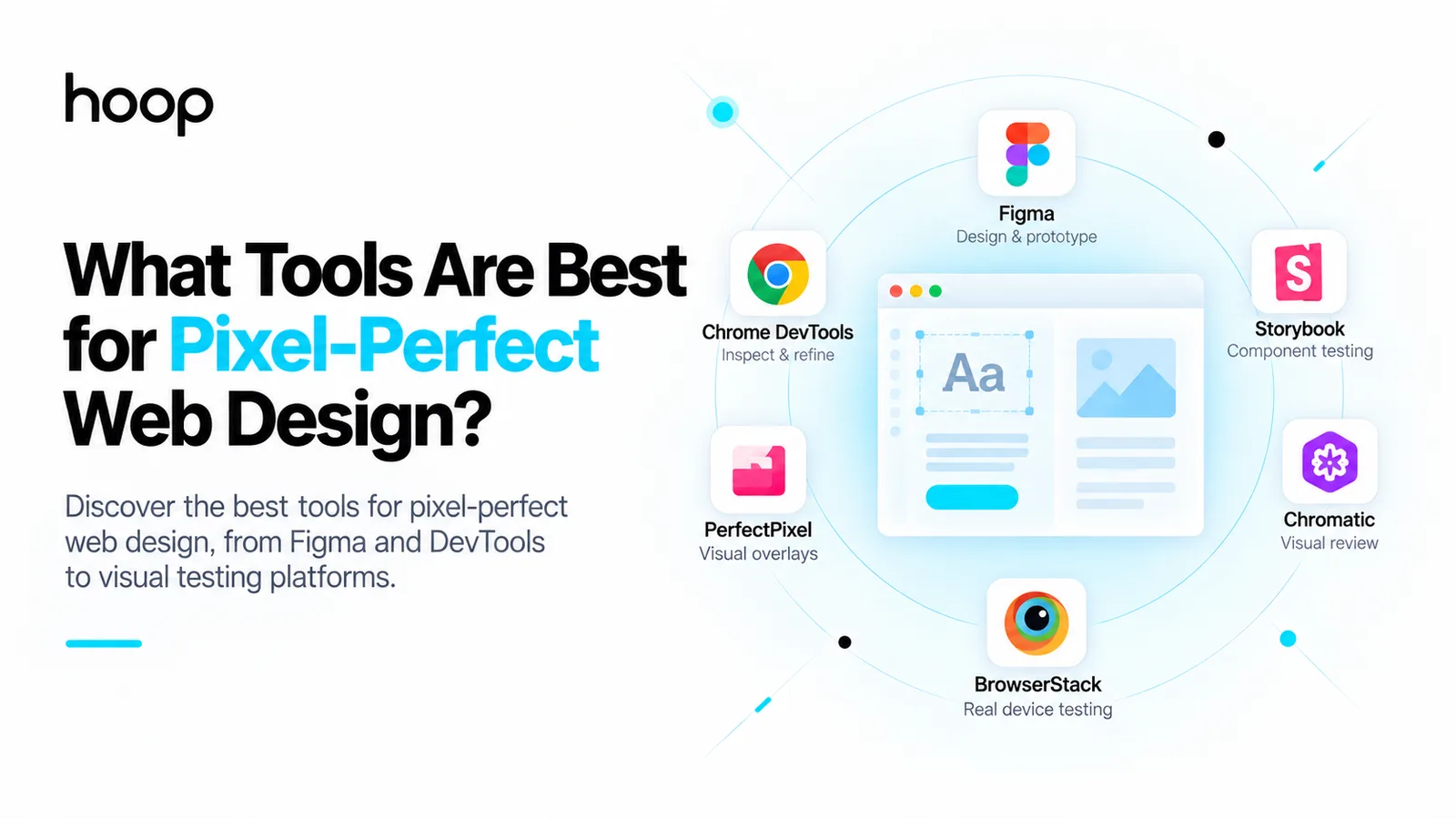
What Tools Are Best for Pixel-Perfect Web Design?
No single platform delivers pixel-perfect web design. Figma carries design intent, DevTools refines the implementation, overlays expose drift, and Playwright, Storybook, Chromatic, BackstopJS, Percy, and BrowserStack make visual quality repeatable.
Sahar
Content Writer
The best tools for pixel-perfect web design are not found in one all-purpose platform. Figma helps teams understand the source design. Chrome DevTools helps developers refine the implementation. Overlay tools reveal visible differences, while Playwright, Storybook, Chromatic, BackstopJS, Percy, and cross-browser services make visual quality repeatable. Used together, these tools produce a website that feels faithful to the design and remains reliable on real devices.
That last point matters because a website is not a static poster. A mockup may represent one viewport, one font environment, and one content state. The live page must also handle narrower screens, longer headings, browser differences, zoom, dynamic content, keyboard navigation, and user accessibility settings. The practical goal is therefore not mathematical sameness everywhere. It is consistent design intent: accurate typography, spacing, hierarchy, alignment, colour, imagery, interaction, and responsive behaviour.
For businesses investing in a new site, the quality of the workflow matters as much as the software. A strong web team knows what to inspect, what to automate, and when a one-pixel difference is harmless compared with a broken mobile layout or inaccessible control. This guide explains which tools deserve a place in that workflow and what each one is best at.
What Does Pixel Perfect Mean in Modern Web Design?
Pixel-perfect web design traditionally meant matching a finished interface to a reference image down to exact measurements. That definition works at a specified viewport, but it becomes incomplete as soon as the page responds to a different screen. Font rendering can vary by operating system and browser. Text wraps differently as available width changes. Images crop, navigation collapses, and content entered through a CMS may be longer than the placeholder copy used in the design.
A more useful standard is visual fidelity within a responsive system. At defined reference breakpoints, the implementation should closely match the approved design. Between those breakpoints, it should adapt predictably without losing the intended proportions, hierarchy, or usability. This approach protects the brand while respecting how the web actually works.
If your project is still at the design stage, Hoop’s UI and UX design service can establish clear components, states, spacing rules, and responsive behaviour before development begins. Better specifications reduce guesswork later and make every comparison tool more valuable.
The Best Tools for Pixel-Perfect Web Design at a Glance
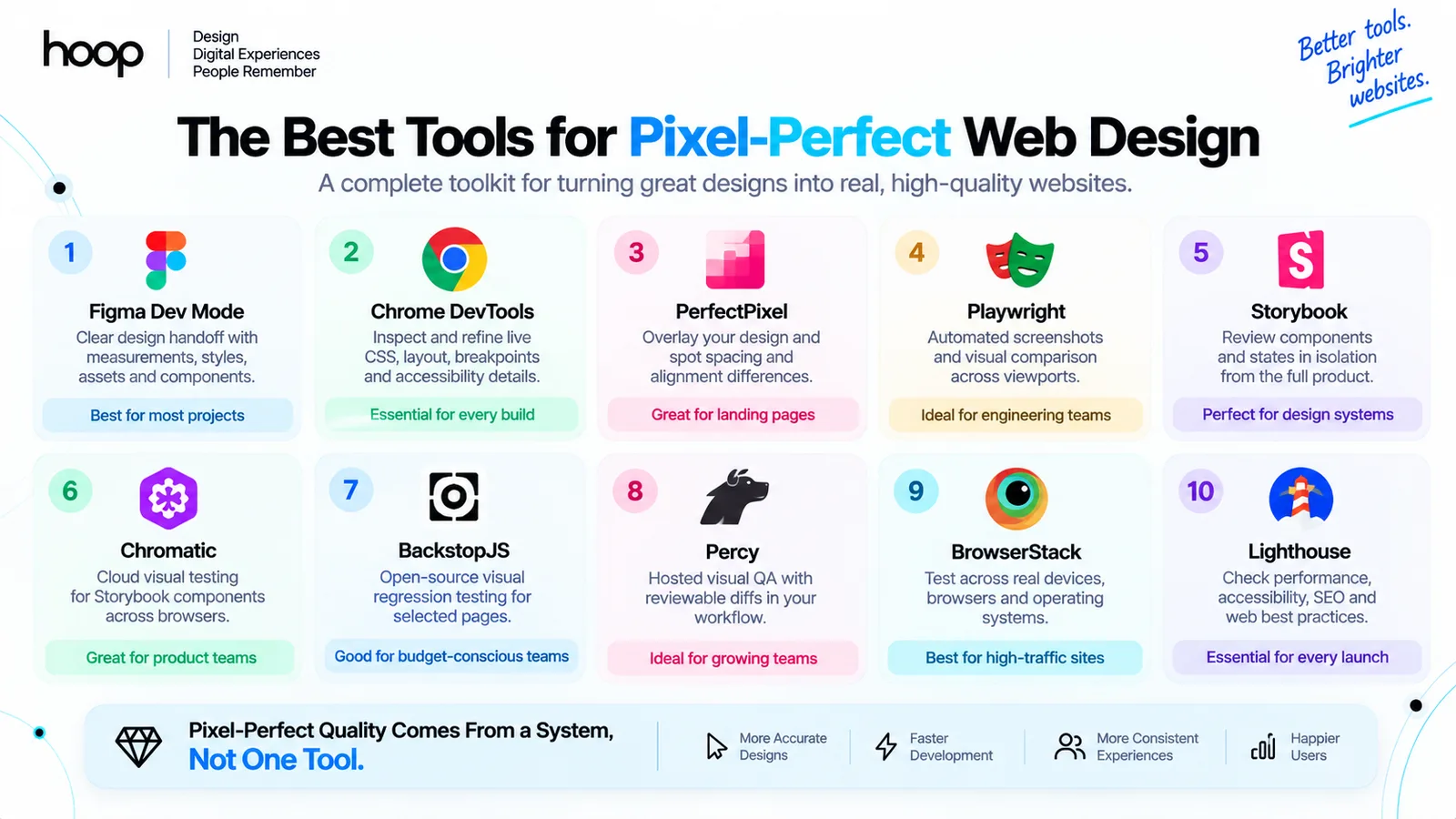
| Tool | Best for | Why it helps | Best fit |
|---|---|---|---|
| Figma Dev Mode | Design handoff | Exposes measurements, styles, assets, variables, and component details | Most projects |
| Chrome DevTools | Live CSS debugging | Shows computed styles, layout behaviour, breakpoints, and accessibility details | Every build |
| PerfectPixel | Manual overlays | Places a reference over the page so spacing and alignment drift becomes visible | Landing pages |
| Playwright | Automated screenshots | Captures pages at controlled viewports and compares them with approved baselines | Engineering teams |
| Storybook | Component isolation | Reviews components and states without navigating the entire product | Design systems |
| Chromatic | Cloud visual tests | Compares Storybook components across managed browser environments | Product teams |
| BackstopJS | Open-source regression | Runs screenshot comparisons for selected pages and scenarios | Budget-conscious teams |
| Percy | Hosted visual QA | Adds reviewable visual diffs to development and CI workflows | Growing teams |
| BrowserStack | Device coverage | Checks implementation across browsers, operating systems, and real devices | High-traffic sites |
| Lighthouse | Quality guardrails | Audits performance, accessibility, SEO, and web best practices | Every launch |
1. Figma and Dev Mode for Accurate Design Handoff
Figma is usually the starting point because it preserves far more information than a screenshot. Developers can inspect dimensions, padding, gaps, colours, type settings, border radii, effects, exported assets, component variants, and variables. Dev Mode also provides code-oriented inspection, making it easier to translate a design system into the conventions used by the project.
The real advantage is not copied CSS. Generated snippets can be helpful, but production code still needs sensible structure, semantic HTML, reusable components, and responsive rules. Figma is most valuable as a shared source of truth. Designers should define auto layout, reusable components, named styles, tokens, content states, and mobile behaviour. Developers can then reproduce the underlying system instead of manually approximating isolated screens.
Figma’s official inspection guidance explains that selected objects can expose layout and style properties, measurements, variables, and code details. Review Figma’s guide to inspecting designs for the current handoff capabilities and access options.
2. Chrome DevTools for Live CSS Precision
Chrome DevTools is the most important day-to-day implementation tool because it connects the visual result to the code producing it. The Elements and Styles panels let developers inspect the cascade, identify overridden rules, adjust values in real time, and understand the computed box model. Grid and flex overlays expose alignment and gap behaviour that can be difficult to diagnose by eye.
Device Mode is useful for quickly checking common viewport sizes, orientation changes, device pixel ratio, and responsive transitions. It does not replace testing on physical devices, but it reveals where a layout begins to feel cramped or where a breakpoint has been chosen to match a device label rather than the content. DevTools also helps trace font loading, image sizing, network delays, and layout shifts that can make an otherwise accurate page feel unstable.
3. Overlay and Side-by-Side Comparison Tools
Overlay extensions such as PerfectPixel are excellent for the final manual refinement of a fixed reference viewport. The developer places the approved design over the browser output, aligns the canvases, and changes the overlay opacity. Double edges immediately reveal differences in position, width, spacing, image crop, or type alignment.
An overlay is especially effective for high-value landing pages, campaign pages, and branded sections where visual detail directly affects credibility. It is less useful when the reference is incomplete or when the live content is materially different. Before comparing, confirm the viewport dimensions, browser zoom, page scale, fonts, scrollbar behaviour, and image assets. Otherwise the team may spend time correcting differences caused by an inconsistent test setup.
4. Playwright for Repeatable Screenshot Testing
Playwright turns visual checking into an automated engineering practice. Teams can open a page, set a viewport, wait for stable content, and capture either the full page or a specific component. Playwright Test can compare the result with an approved screenshot and report the pixels that changed. This is valuable after a shared CSS rule, component, browser dependency, or content template is updated.
The tool is particularly strong when the same critical pages must be checked repeatedly. A test suite can cover desktop and mobile home pages, navigation states, forms, pricing cards, dashboards, and error messages. Thresholds can accommodate tiny rendering noise while still catching genuine layout movement. Baselines should be created and compared in a consistent environment because operating systems, browser versions, hardware, and fonts can affect rendering.
5. Storybook and Chromatic for Component Quality
Storybook is a strong choice for websites and applications built from reusable components. Buttons, cards, navigation patterns, modals, form fields, and loading states can be developed and reviewed in isolation. Teams can create stories for different sizes, themes, content lengths, disabled states, errors, and other conditions that may not be easy to reach in the main application.
Chromatic adds hosted visual testing to that component workflow. It captures stories, compares them with approved baselines, and gives reviewers a focused way to accept or reject changes. This is more scalable than repeatedly checking an entire site to see whether one button or card has drifted. It also strengthens collaboration because designers can review the rendered component rather than only the static source file.
For a custom interface or digital product, Hoop’s web application development service combines reusable UI architecture with the functional requirements behind each screen. That connection matters: a component is only successful when it looks right in every state and behaves correctly in the product.
6. BackstopJS and Percy for Visual Regression Testing
BackstopJS is a practical open-source option for screenshot-based regression testing. Teams define URLs, viewports, selectors, interaction scenarios, and acceptable mismatch thresholds. It can then compare new captures with reference images and generate a report. The setup requires engineering ownership, but it offers control and can fit teams that prefer a self-managed workflow.
Whichever option you select, focus the first tests on high-risk surfaces. Global headers, navigation, form controls, templates, checkout steps, and reusable cards can affect many pages at once. A small, stable suite that protects critical UI is more valuable than hundreds of noisy screenshots no one reviews.
7. BrowserStack for Cross-Browser and Real-Device Checks
A page that matches the design in one desktop browser is not finished. BrowserStack and similar testing platforms provide access to combinations of browsers, operating systems, screen sizes, and real devices that a team may not own. This helps uncover differences in font rendering, form controls, viewport behaviour, touch interaction, sticky elements, and browser-specific CSS support.
8. Lighthouse and Accessibility Testing Tools
Visual fidelity should never be achieved by sacrificing performance or accessibility. Lighthouse helps teams identify performance, accessibility, SEO, and best-practice issues. Axe and browser accessibility inspectors can detect problems such as missing labels, insufficient colour contrast, invalid roles, and keyboard barriers. Automated results must still be paired with manual keyboard testing, zoom testing, and screen-reader review where appropriate.
This is where the idea of pixel perfection needs restraint. A user may enlarge text, apply a preferred font, enable reduced motion, or navigate without a mouse. The design must tolerate those choices. If a fixed-height card clips enlarged text, matching the original card height is not quality; it is a defect. Hoop’s guide to accessible web design can help frame visual decisions around a site that works for more users.
9. Tailwind CSS and Modern CSS for Consistent Implementation
Tailwind CSS can speed up accurate implementation when the project uses a deliberate configuration for colours, type scales, spacing, shadows, radii, and breakpoints. Its constraints encourage developers to reuse a system rather than introduce slightly different values throughout the codebase. Plain CSS, CSS Modules, Sass, and CSS-in-JS can produce equally precise results when supported by consistent tokens and component rules.
If an existing site has accumulated visual inconsistencies or brittle styles, a professional website redesign can address the design system and front-end structure together instead of layering more patches over old problems.
10. AI Design-to-Code Tools
AI-assisted tools can generate a useful first pass from a design or screenshot, especially for common page structures. They may accelerate scaffolding, suggest CSS, produce components, or help identify visible differences. However, generated output should be treated as an implementation draft rather than proof of production quality.
A tool may match one screenshot by using excessive absolute positioning, unnecessary wrappers, repeated values, or code that is difficult to maintain. It may miss interaction states, semantic structure, accessibility, data behaviour, content extremes, and responsive intent that were not visible in the prompt. AI is most helpful when a developer can inspect both the visual output and the code, correct the system, and verify the result through repeatable tests.
A Practical Pixel-Perfect Web Design Workflow
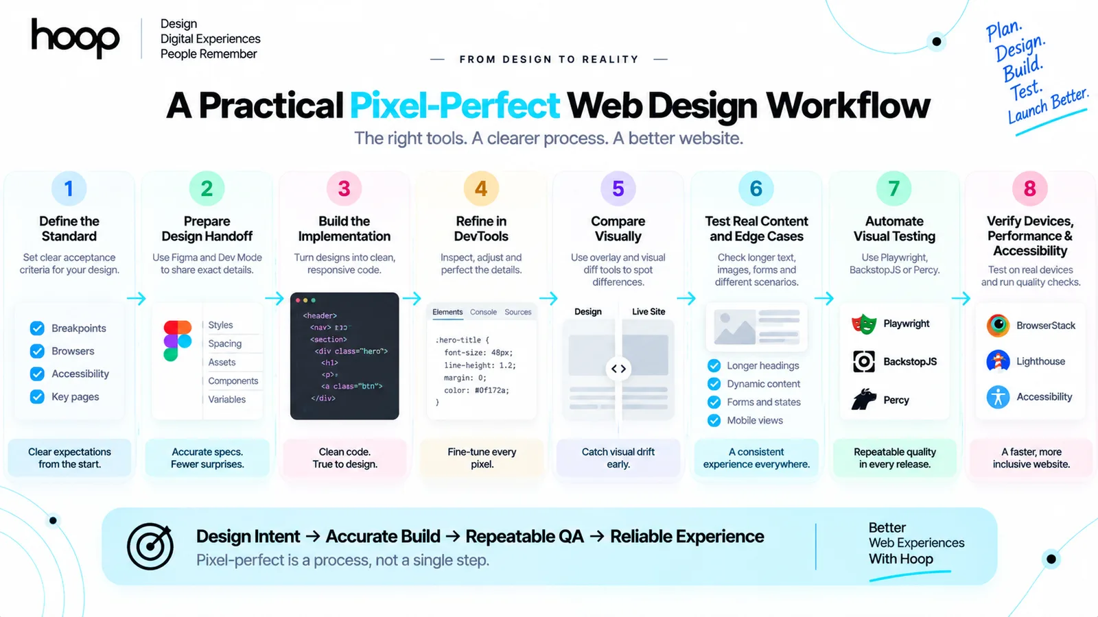
The strongest workflow combines human judgment with progressively more precise tools. It starts by agreeing on what fidelity means for the project and ends with checks that remain useful after launch.
- Define the acceptance standard. Identify approved reference breakpoints, supported browsers, accessibility requirements, and the pages or components where exact visual fidelity matters most.
- Prepare the design for handoff. Confirm fonts, assets, component states, tokens, grids, spacing rules, responsive examples, and realistic content before development begins.
- Build the underlying system. Create semantic structure, shared components, reusable tokens, and responsive layout rules before polishing individual pixels.
- Inspect and refine in DevTools. Correct the source of spacing, typography, alignment, and overflow differences rather than adding isolated visual nudges.
- Compare at controlled viewports. Use side-by-side review or an overlay at the exact dimensions of the approved references.
- Test transitions and content extremes. Resize continuously and try longer labels, validation errors, missing images, dynamic CMS entries, zoom, and keyboard navigation.
- Automate stable visual checks. Add Playwright, Storybook, Chromatic, BackstopJS, or Percy where repeated changes create regression risk.
- Verify browsers, devices, performance, and accessibility. Complete real-device checks and quality audits before approval.
For businesses without an internal design and engineering team, Hoop’s broader software development services can connect strategy, interface design, implementation, testing, and ongoing improvement in one delivery process.
How to Choose the Right Tool Stack
A freelancer building a small marketing site does not need the same stack as a product team maintaining hundreds of components. Choose tools according to repetition, risk, collaboration needs, and the cost of a visual defect.
For small marketing websites
Start with Figma, Chrome DevTools, an overlay extension, responsive browser checks, Lighthouse, and a short real-device checklist. This lightweight stack provides close visual alignment without creating more testing infrastructure than the project can maintain.
For growing products and design systems
Add Playwright for important page journeys and Storybook for reusable component states. As the team grows, connect visual checks to continuous integration and assign clear ownership for reviewing changes.
Common Mistakes to Avoid
Tools improve visibility, but they cannot compensate for a weak process. Several mistakes repeatedly create wasted effort and fragile interfaces:
- Comparing against a screenshot without matching its viewport, fonts, zoom, or content.
- Fixing every difference with absolute positioning, negative margins, or one-off overrides.
- Approving only desktop and assuming the mobile layout will resolve itself.
- Testing the ideal state while ignoring long content, empty states, errors, and loading behaviour.
- Accepting every screenshot difference automatically or allowing noisy tests to be ignored.
- Treating generated design-to-code output as production-ready without reviewing structure and accessibility.
- Prioritising a decorative one-pixel difference over usability, speed, maintainability, or conversion-critical behaviour.
Build a Website That Looks Right and Works Everywhere
The best tools for pixel-perfect web design form a quality system rather than a shopping list. Figma clarifies intent. DevTools helps developers implement it accurately. Overlays expose visual drift. Automated screenshot tests prevent regressions. Cross-browser, performance, and accessibility checks make sure the result survives beyond the reference canvas.
The right standard is a website that feels meticulously designed at every important breakpoint and remains fast, accessible, responsive, and maintainable. If you need a team that can carry a design from strategy and interface planning through development and quality assurance, explore Hoop’s web design and development services and start a conversation about your project.
“If a fixed-height card clips enlarged text, matching the original card height is not quality; it is a defect.”
Key takeaways
- 01The goal is faithful design intent within a responsive system, not identical output everywhere.
- 02Fix the source of a difference in the system, not with one-off absolute positioning.
- 03Automate visual checks on high-risk shared surfaces first — headers, forms, templates.
- 04A card that clips enlarged text is a defect, however well it matches the mockup.
Written by
Sahar
Content Writer
Frequently Asked
Questions
Everything you need to know before booking a strategy call. Can't find your answer? Contact us directly.
No. A website can match approved designs very closely at specified viewports, but browsers, fonts, screens, zoom settings, content, and accessibility preferences change the rendered result. Aim for faithful, responsive design intent rather than identical output everywhere.
Chrome DevTools is the most broadly useful free tool for implementation and debugging. Figma inspection is valuable for handoff, while Playwright and BackstopJS provide free, code-based options for repeatable screenshot comparisons.
Figma provides the design specifications, but it does not validate the finished website across browsers and devices. Developers still need browser inspection, responsive testing, accessibility checks, and visual QA.
They are accurate when the reference and browser are aligned at the same viewport, zoom, fonts, assets, and content. They reveal visible differences but do not assess code quality, responsiveness, performance, or accessibility.
Playwright is strong for teams that want browser automation and screenshot assertions in one engineering tool. Chromatic suits Storybook-centred component teams, while BackstopJS offers an open-source visual regression workflow and Percy provides hosted review.
AI can accelerate the first draft, but the output needs professional review. The team must verify semantic HTML, component structure, responsive behaviour, accessibility, performance, content states, and long-term maintainability.
The build should closely match the approved typography, grid, spacing, hierarchy, components, imagery, and interactions at the supplied breakpoints. Between those points, responsive behaviour and usability should guide the layout.