What Are the Trends in Modern Web Design? What Works Now
Modern web design trends center on strong typography, responsive layouts, modular design systems, purposeful motion, accessibility, and speed. Decorative effects — heavy scroll animation, generic AI styling, glass on every surface — lose appeal the moment they reduce clarity.
Sahar
Content Writer
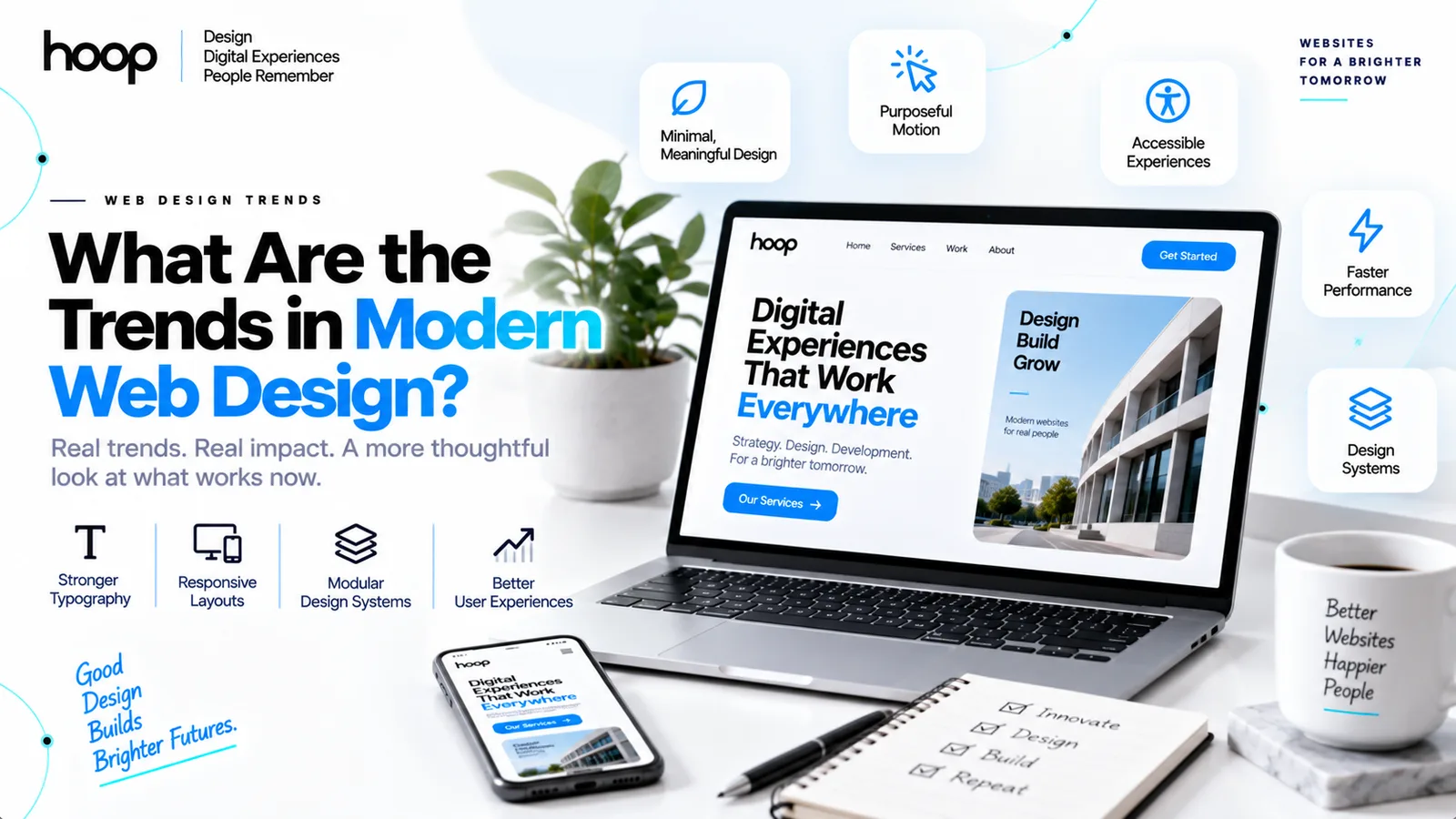
Modern web design favors clear hierarchy, strong typography, responsive layouts, modular systems, purposeful motion, accessible interaction, and better performance. The strongest trends make websites easier to understand while giving brands a distinct visual identity.
The more interesting shift is what designers are rejecting. Excessive scroll effects, generic AI-looking gradients, endless card grids, vague oversized hero text, and decorative animation now make many sites feel less modern rather than more.
What Actually Makes a Website Feel Modern?
A modern website feels intentional before it feels fashionable. Consistent spacing, readable type, clear navigation, responsive behavior, and disciplined visual hierarchy create a current look across industries.
Consistency matters more than novelty
Modern interfaces repeat spacing rules, component behavior, border radii, type scales, and interaction patterns. A coherent system makes a website feel designed rather than assembled.
Clarity now carries more visual weight
Users notice whether they can understand a page quickly. Clear headings, obvious actions, balanced whitespace, and predictable navigation often feel more current than decorative effects.
Businesses planning a new site can use professional web design services when visual direction must connect with UX, responsive behavior, and production constraints.
1. Typography-First Layouts Are Replacing Effect-First Design
Typography has become one of the strongest tools in modern web design. Designers use type scale, weight, spacing, and contrast to create hierarchy before adding complex graphics.
Large type works when the message has substance
Oversized headings can create a strong visual anchor. The design fails when a huge headline occupies most of the screen but communicates almost nothing.
Variable fonts support richer systems
Variable fonts let designers control weight, width, slant, and optical size inside one font file. The flexibility supports responsive typography without loading many separate font files.
The durable trend is not “make text enormous.” The durable trend is using typography as the primary structure of the interface.
2. Purposeful Minimalism Is Replacing Empty Minimalism
Minimalism still shapes modern interfaces, but extreme reduction has lost appeal. Users still need visible buttons, clear form fields, recognizable navigation, and enough contrast to understand what is interactive.
Useful minimalism removes friction
Good minimalism removes decorative noise while preserving information and controls. Users should see what matters without hunting for hidden actions.
Bad minimalism removes guidance
Invisible borders, ambiguous icons, low-contrast labels, and hidden navigation create confusion. A sparse interface is not automatically a usable interface.
Teams refining complicated journeys often benefit from UI UX design services that test structure before visual polish becomes expensive to change.
3. Modular Design Systems Are Becoming the Default
Modern websites increasingly rely on reusable components instead of designing every page from scratch. Design systems define typography, color, spacing, buttons, cards, forms, navigation, and states.
Design tokens create consistency
Tokens store decisions such as colors, spacing values, type sizes, and border radii. Designers and developers can update one rule instead of editing dozens of screens.
Components make redesigns safer
Reusable components reduce visual drift across large websites. Teams can improve one component and apply the change across every page using that component.
The trend matters because websites now behave more like evolving products. A modular system supports frequent updates without turning every change into a redesign project.
4. Responsive Design Is Becoming More Adaptive
Responsive design no longer means shrinking a desktop page into a phone layout. Modern interfaces change content priority, component behavior, navigation, spacing, and interaction based on available space.
Layouts respond to components, not only screens
Modern frontends increasingly use component-level responsiveness so cards, panels, and navigation patterns adapt inside different containers. The approach supports more flexible page systems.
Mobile design starts with task priority
A mobile layout should surface the action users need first. Designers often simplify navigation, reduce competing elements, and increase touch-target clarity on smaller screens.
Responsive thinking also influences redesign work. Website redesign services can help rebuild outdated layouts around current device behavior without treating mobile as an afterthought.
5. Motion Design Is Becoming More Selective
Animation remains part of modern web design, but constant movement is losing favor. The strongest motion explains state, confirms an action, guides attention, or improves continuity between interface changes.
Micro-interactions still add value
Useful examples include button feedback, form validation, loading transitions, expanding menus, drag states, and subtle hover responses. Each movement tells the user what changed.
Scroll spectacle has a higher burden of proof
Parallax, scroll hijacking, delayed text entrances, and full-screen storytelling can slow comprehension. The technique fits editorial stories and showcases better than documentation or task-heavy pages.
A modern interface should never make users wait for animation before reading information they already requested.
6. AI-Assisted Design Is Growing While Generic AI Aesthetics Fade
Artificial intelligence now helps designers generate concepts, rewrite interface copy, explore layouts, create imagery, and speed up repetitive production tasks. The workflow shift is real even when the final interface does not look “AI-generated.”
AI works best as an accelerator
Designers can use AI for exploration, variant generation, content scaffolding, asset preparation, and early prototypes. Human judgment still decides hierarchy, accessibility, brand fit, and interaction logic.
The recognizable AI look is becoming a liability
Purple gradients, neon glows, oversized rounded cards, floating metric panels, generic SaaS headlines, and synthetic stock imagery now appear across thousands of sites.
The modern response is stronger art direction. AI can accelerate production, but brands still need a visual system that does not look generated from the same prompt.
7. Glass, Gradients, and Soft Depth Are Becoming Accent Tools
Glassmorphism, blur, mesh gradients, translucent panels, and soft shadows still appear in current interfaces. Designers increasingly use these effects selectively rather than covering every surface with them.
Glass works best around layered information
A translucent navigation panel or floating control can create depth without reducing readability. Heavy blur across large areas can hurt contrast and device performance.
Gradients need brand logic
A gradient feels current when the color system belongs to the brand. Generic blue-purple gradients no longer create distinctiveness by themselves.
The broader trend is restraint: decorative depth supports hierarchy instead of becoming the hierarchy.
8. Maximalism, Retro Design, and Neo-Brutalism Are Becoming Brand Choices
Not every modern website is becoming cleaner. Tactile maximalism, retro interfaces, bold color, rough textures, heavy borders, and neo-brutalist layouts are growing as deliberate alternatives to polished SaaS sameness.
Maximalism works when the brand can carry it
Fashion, music, culture, entertainment, portfolios, and creative campaigns can support denser visual expression. The style becomes risky when users need fast comparison or detailed instructions.
Retro works through recognition
Pixel graphics, early-web references, terminal interfaces, and print-inspired layouts can create personality. The design still needs modern accessibility, responsive behavior, and clear interaction states.
The point is not to make every website look old. The point is to use cultural references intentionally instead of following one universal corporate style.
9. 3D and Immersive Experiences Are Getting More Practical
WebGL, interactive 3D scenes, product models, spatial motion, and layered storytelling can now appear in more mainstream websites. Better browsers and tooling have lowered the barrier to building immersive experiences.
3D works best when interaction adds information
A product viewer, architectural model, configurator, or portfolio scene can reveal information that a static image cannot show as clearly.
Performance still decides whether immersion succeeds
Large models, continuous animation, and background effects can drain battery, delay rendering, and perform poorly on lower-end devices. Progressive enhancement keeps the core page usable without the full effect.
Interactive products often need deeper engineering than marketing sites. Web application development becomes relevant when visual experiences depend on data, state, authentication, or complex user actions.
10. Accessibility Is Shaping Mainstream Visual Decisions
Accessibility is not a visual trend, but accessibility increasingly shapes what modern design looks like. Better contrast, visible focus states, larger targets, reduced motion, predictable navigation, and clear error messages improve interfaces for more users.
Reduced motion is now part of responsible motion design
Designers should respect reduced-motion preferences and avoid forcing large animations on users who disable them. Motion can degrade gracefully without removing core information.
Target size and focus visibility affect appearance
Accessible buttons, links, form controls, and keyboard states need enough size and contrast to remain usable. The official WCAG 2.2 guidance formalizes current accessibility expectations for web content.
Accessible design often looks more modern because the interface becomes clearer, more predictable, and easier to operate.
11. Performance-Aware Design Is Becoming a Visual Discipline
Modern web design increasingly accounts for the cost of imagery, video, animation, fonts, effects, and third-party scripts before development begins. Performance problems often start as design decisions.
Media needs an explicit purpose
A full-screen video should earn the bandwidth it consumes. Decorative video can add weight without improving comprehension, while a focused product demonstration can justify the cost.
Designers now think about rendering cost
Backdrop blur, giant shadows, complex masks, 3D scenes, and layered animation can stress devices. A polished desktop demo can still fail on an average phone.
Performance-aware design does not mean visually boring design. The goal is spending complexity where users actually notice value.
12. Every Important Page Is Being Designed as an Entry Point
Modern users often enter websites through service pages, articles, product pages, campaigns, or shared links instead of starting on the homepage. Important pages therefore need enough context to orient a first-time visitor.
Pages need local context
A strong page explains what the visitor reached, why the information matters, who provides it, and what action comes next without assuming homepage knowledge.
Calls to action need to match page intent
A visitor reading a detailed guide needs a different next step from a visitor arriving on a campaign page. Landing page design works best when one page supports one clear conversion path.
The broader trend is toward independent page usefulness. Site architecture still matters, but each important page must work on its own.
13. Editorial Density and Bento Layouts Are Challenging Empty Space
Modern web design is also moving beyond the idea that every page needs enormous empty sections. Editorial layouts, modular grids, and bento-style compositions can place more useful information above the fold without creating chaos.
Bento layouts organize density
Bento grids divide content into clear visual modules with different sizes and priorities. The layout works well for product features, dashboards, portfolios, and service overviews when every module has a distinct purpose.
Density needs a strong reading order
A dense page still needs clear hierarchy. Designers use scale, alignment, contrast, spacing, and grouping so users know where to look first and what information belongs together.
The trend is valuable because modern users often scan before reading. Dense layouts can reveal more options quickly without forcing long scroll journeys.
14. Adaptive Interfaces Are Becoming More Context-Aware
Modern websites increasingly adapt beyond screen size. Interfaces can change content, controls, recommendations, and navigation based on user state, account status, location, device capability, or previous actions.
Personalization should reduce work
Useful personalization remembers preferences, surfaces relevant shortcuts, or restores progress. Decorative personalization adds complexity without helping users complete a task.
Adaptive design needs stable structure
Users still need predictable navigation and consistent controls even when content changes. A strong design system provides stable interaction patterns while allowing selected modules to adapt.
This trend matters most in products with accounts, dashboards, marketplaces, and recurring workflows. Static brochure sites usually need less personalization.
Modern Web Design Trends: Quick Reference
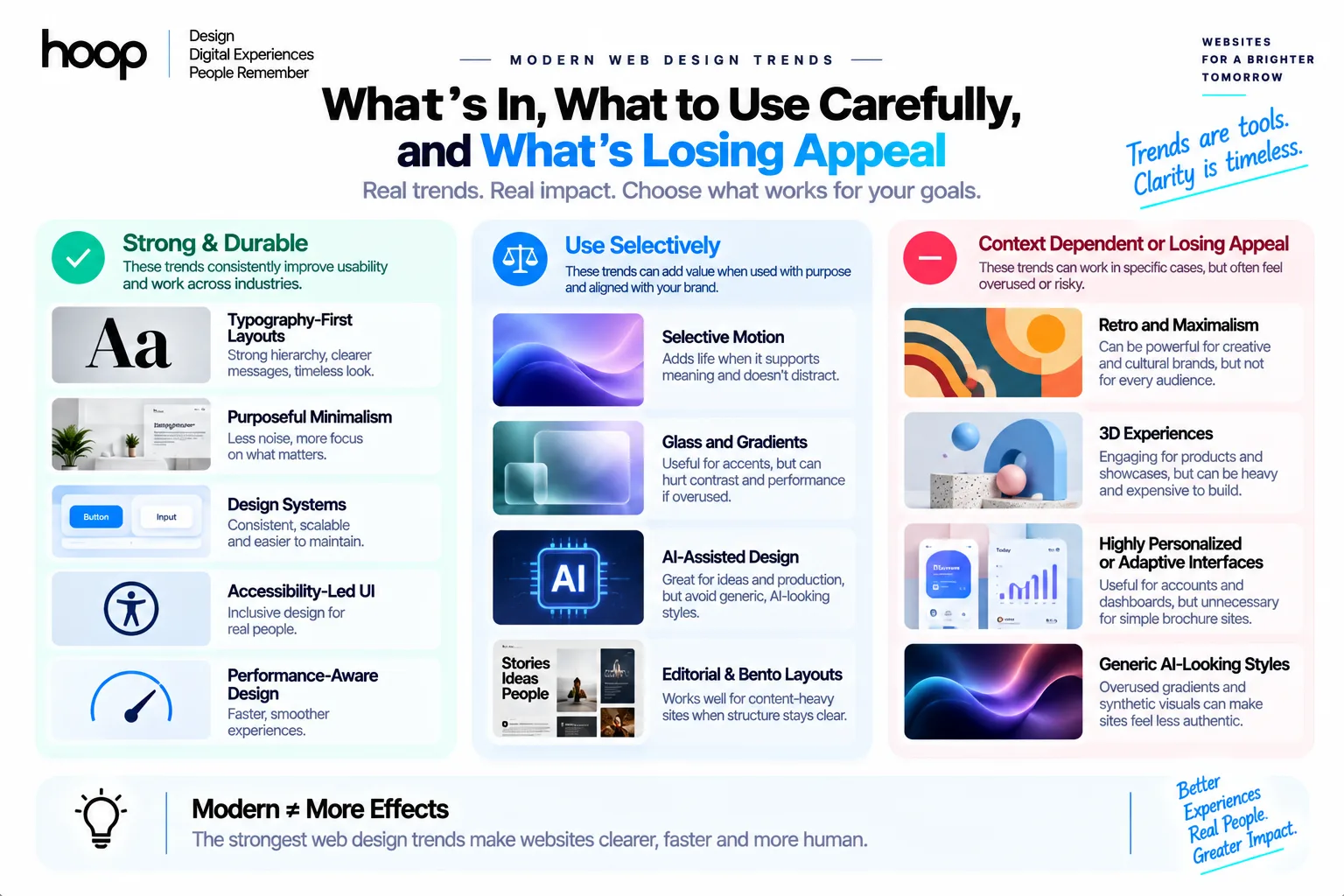
| Trend | Best Use | Main Risk | Recommendation |
|---|---|---|---|
| Typography-first layouts | Editorial, SaaS, portfolios | Oversized empty messaging | Use type to create hierarchy |
| Purposeful minimalism | Services, products, apps | Hidden controls and weak cues | Remove noise, not guidance |
| Design systems | Large sites and products | Generic component sameness | Customize tokens and patterns |
| Selective motion | Apps, products, storytelling | Slow or distracting pages | Animate state and meaning |
| AI-assisted design | Concepts and production | Generic generated aesthetics | Keep human art direction |
| Glass and gradients | Navigation and accents | Contrast and performance | Use effects selectively |
| Retro and maximalism | Creative and cultural brands | Visual overload | Match style to audience |
| 3D experiences | Products and showcases | Heavy rendering cost | Provide lightweight fallbacks |
| Accessibility-led UI | Every website | Treating compliance as styling | Design for usable states |
| Performance-aware design | Every website | Decorative complexity | Budget visual cost early |
Which Web Design Trends Are Already Overused?
A trend becomes tired when designers repeat the surface appearance without the original purpose. Modern websites often feel dated fastest when several fashionable effects appear together.
Common warning signs include endless card grids, purple gradient heroes, vague slogans, scroll hijacking, glass panels on every section, auto-playing background video, decorative cursor effects, and animation that delays reading.
None of these techniques is automatically bad. The problem begins when the technique cannot answer a simple question: what user problem does this design choice solve?
How to Decide Whether a Trend Fits Your Website
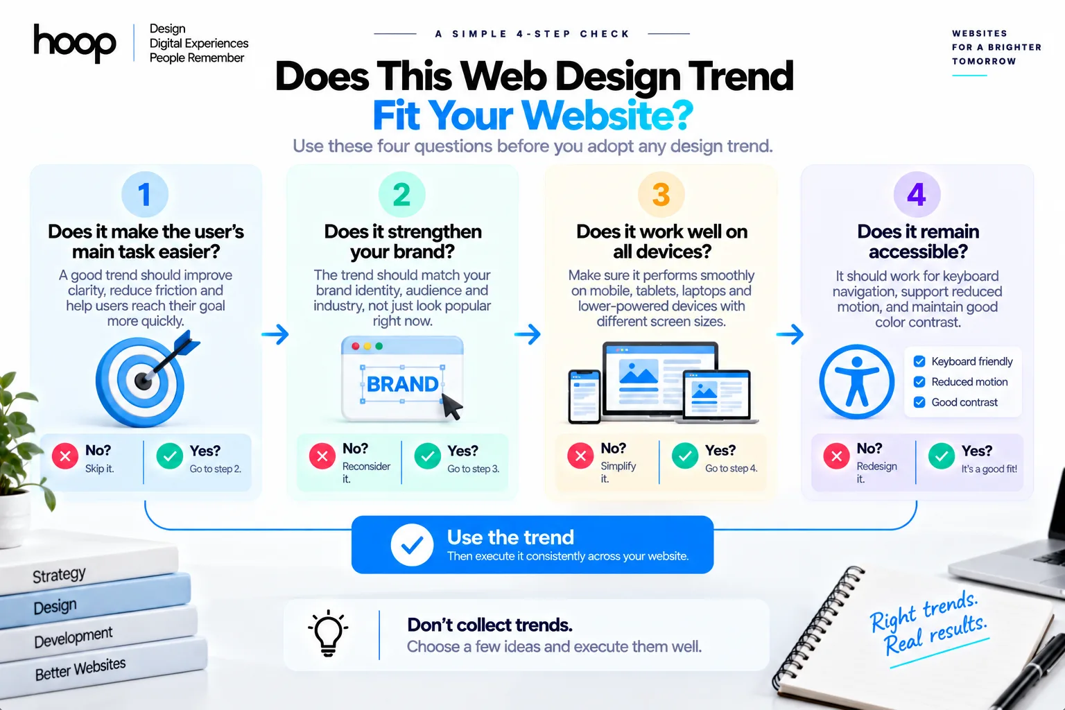
To decide whether a trend fits your website, start with the user task and brand character before choosing the visual treatment.
Test the trend against 4 questions
- Does the trend make the main task easier to understand?
- Does the trend strengthen a distinctive brand idea?
- Does the trend remain usable on mobile and lower-end devices?
- Does the trend still work with keyboard navigation, reduced motion, and high contrast needs?
Prototype before committing
A Figma prototype or small coded experiment can expose navigation, readability, motion, and performance problems before the entire site adopts the treatment.
The strongest modern websites do not collect trends. The strongest modern websites choose a small number of visual ideas and execute them consistently.
Modern Web Design Is Becoming More Intentional
The most durable modern web design trends share one quality: each design choice has a job. Typography creates hierarchy, motion explains state, components create consistency, and accessibility protects usability.
Trendy websites age quickly when visual effects carry more weight than information and interaction. Distinctive websites age better when the visual system grows from the brand, user needs, and technical reality.
If your current website feels dated, inconsistent, or overloaded, Hoop Interactive can rebuild the experience around current user behavior through website redesign services while preserving the parts that already work.
“The strongest modern websites do not collect trends. They choose a small number of visual ideas and execute them consistently.”
Key takeaways
- 01Consistency reads as modern; novelty on its own does not.
- 02Minimalism is still current, but only when it removes noise rather than guidance.
- 03AI accelerates production; the recognizable AI look is now a liability.
- 04Run any trend through four questions: task, brand, devices, accessibility.
Written by
Sahar
Content Writer
Frequently Asked
Questions
Everything you need to know before booking a strategy call. Can't find your answer? Contact us directly.
The biggest durable trend is clarity through stronger systems. Typography, responsive components, accessible interaction, and purposeful motion matter more than one visual effect.
Yes. Minimalism remains popular, but current design favors useful simplicity rather than interfaces that hide controls, labels, or navigation.
Yes. Purposeful animation still feels current. Constant scroll effects, delayed content, and decorative motion increasingly create fatigue.
Yes. AI speeds concept generation, content drafting, visual exploration, and production. Distinct art direction remains necessary because generic AI aesthetics are already common.
No. A business should adopt a trend only when the trend supports usability, brand positioning, performance, accessibility, or a specific user task.